-

-

In stressful times, I sometimes cope by obsessing over finding the perfect colour palette. This has not necessarily been the healthiest of habits, but over the years I’ve converged on a delightful set of hues I’m happy to colour-code my life with.
I call the palette “Glimmerized”, and I’m publishing it here partly for my own future reference, and partly to discourage myself from tweaking it forever.
Glimmerized is based on five main colours: my favourite pink and blue, a purple in between, and a complementary green and yellow. The pink-green and blue-yellow combinations are inspired by opponent process colour theory and systems like NCS; I had those in mind when I created the Owl Beamer colour theme during another colour obsession phase a while back. But I didn’t attempt to choose perfectly opposing colours, lest I be tempted into deeper rabbit holes into the colour perception literature.
Instead, I chose a handful of colours I liked — with round coordinates in the OKLCH colour space — and built curves to let me generate any number of shades and tints of each hue.
R08 #e50088
oklch(0.6 0.25 355)
- R01
- R02
- R03
- R04
- R05
- R06
- R07
- R08
- R09
- R0a
- R0b
- R0c
- R0d
- R0e
- R0f
P08 #8613d1
oklch(0.5 0.25 305)
- P01
- P02
- P03
- P04
- P05
- P06
- P07
- P08
- P09
- P0a
- P0b
- P0c
- P0d
- P0e
- P0f
B08 #007aff
oklch(0.6 0.23 255)
- B01
- B02
- B03
- B04
- B05
- B06
- B07
- B08
- B09
- B0a
- B0b
- B0c
- B0d
- B0e
- B0f
G08 #00c669
oklch(0.7 0.23 160)
- G01
- G02
- G03
- G04
- G05
- G06
- G07
- G08
- G09
- G0a
- G0b
- G0c
- G0d
- G0e
- G0f
Y08 #ffc500
oklch(0.85 0.2 90)
- Y01
- Y02
- Y03
- Y04
- Y05
- Y06
- Y07
- Y08
- Y09
- Y0a
- Y0b
- Y0c
- Y0d
- Y0e
- Y0f
Glimmerized’s greyscale has a hint of purplish-blue to it.
K00 #0c061e
oklch(0.15 0.05 290)
- K00
- K01
- K02
- K03
- K04
- K05
- K06
- K07
- K08
- K09
- K0a
- K0b
- K0c
- K0d
- K0e
- K0f
- K10
Themes like Solarized, Dracula, and Fairyfloss taught me how nice it is to use colours you like when you spend all day looking at them. So I’m very happy to now use Glimmerized in my text editor, website, calendar, and to-do list — hopefully for a long time to come!
-

Ten years ago, I discovered that a disproportionate number of posts on Twitter had exactly 140 characters. Five years ago, I found the spike had shifted to the new 280-character limit. Now, Twitter has imploded and lots of people have migrated to Bluesky — what does the post length distribution look like on the new platform?
Length distribution of two million 2024 Bluesky posts, fit to an exponential curve.
Once again, we reproduce the spike approaching the character limit, with 300-character posts accounting for over half a percent of the entire dataset — more common than any other length greater than 50.
Once again, we also see the effects of bots: two bots are responsible for posting random strings of length 46 and 256 every few seconds, causing those lengths to be overrepresented.
But this might be my favourite of the charts I’ve made in this series. Take a close look at the 140 and 280 character marks: a larger-than-expected number of posts are exactly those lengths or slightly shorter. The curve abruptly reverts to its original course — an exponential decay curve — immediately after those milestones. That’s exactly the behaviour we expect (and observe!) when people compose posts that are a bit too long, then edit them down to fit within a character cap.
It’s entirely possible that these might be the exact same spikes we saw in my last two charts in this series, if people are reposting their old tweets from yesteryear on Bluesky. But I suspect this is more likely evidence of people crafting messages to be cross-posted to multiple platforms, in which case they may be using tools that recommend smaller limits than those supported by Bluesky. Time will tell what hypothesis is right!
-
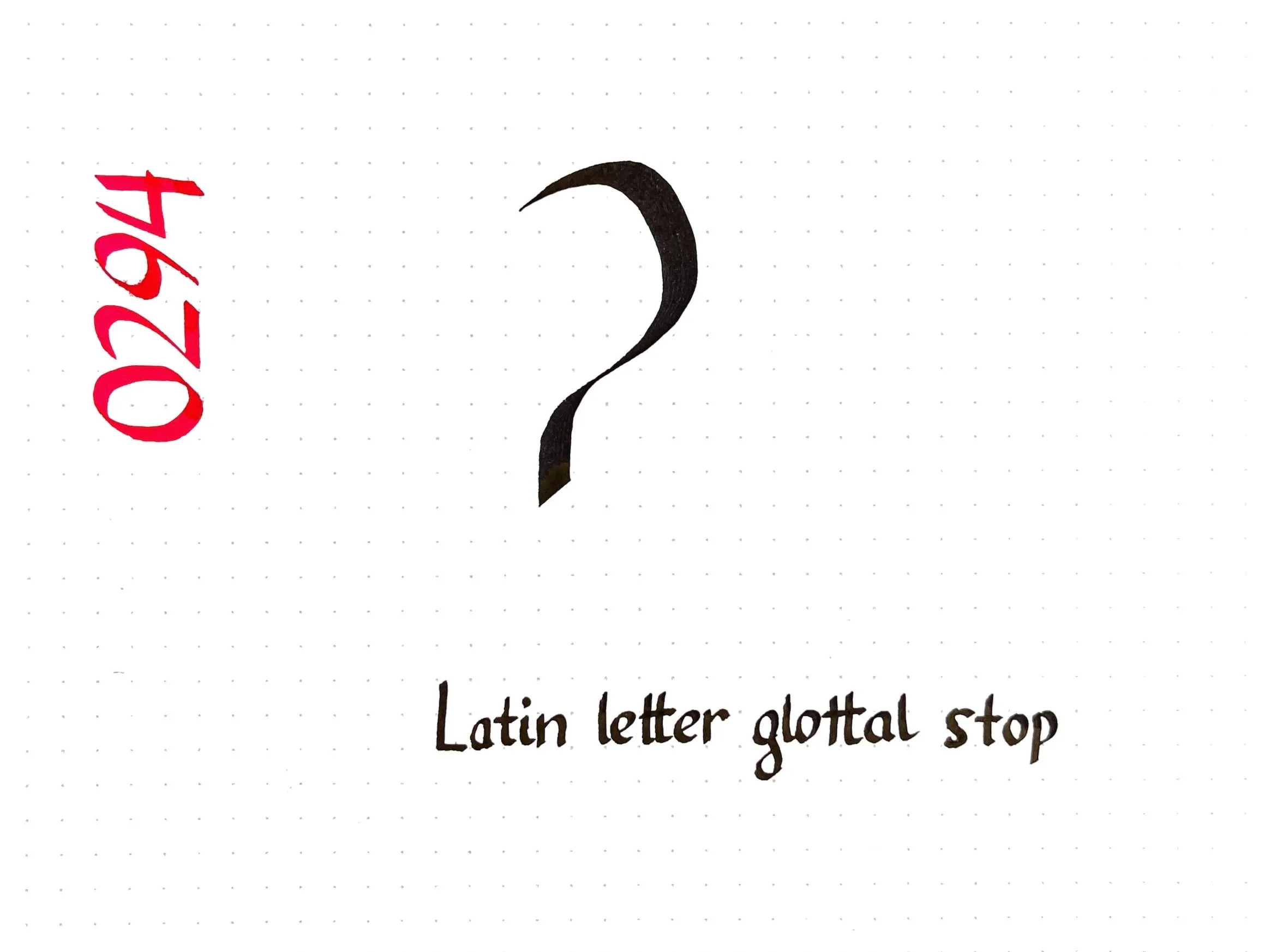
Today’s Unicode calligraphy highlights the International Phonetic Alphabet symbol for the glottal stop, the sound between the syllables of “uh-oh”. (It can also be heard if you say the phrase “glottal stop” in a Cockney accent!)
In Squamish orthography, the glottal stop is represented by the digit 7 instead of ʔ, as in Sḵwx̱wú7mesh.
-
Numbers like and are irrational. Are they called that because they are unreasonable? Or is it just because they just can’t be expressed as a ratio of two integers?
As it turns out, this question is even harder to answer in Ancient Greek. On the one hand, the word used by (e.g.) Euclid to describe irrational lengths (ἄλογος) comes from adding the negative prefix ἄ- to the word for ratio (λόγος). On the other hand, λόγος and ἄλογος had a lot of other meanings.
Ἄλογος could mean unexpected, which would be an appropriate description of the newly-discovered irrational numbers. Or it could mean unspeakable — in the literal sense, although the figurative sense fits with the (possibly fictitious) cover-up by the Pythagoreans. The word could also mean speechless or incapable of reasoning.
It’s fascinating to see how translators (and later mathematicians) decided to resolve the polysemy of ἄλογος:
- Latin translations of Greek works used ratio for λόγος and irrationalis for ἄλογος. These were actually imported into mathematical English before their non-technical meanings.
- Early Arabic mathematicians called a deaf root (جذر أصم) in reference to the “speechless” meaning of ἄλογος. This got translated back to Latin as surd, a now-archaic term for (irreducible) roots.
- In modern Arabic, the phrase is “non-fractional number” (عدد غير كسري).
- In modern Greek, irrational numbers are now called inexpressible (άρρητος).
-
-
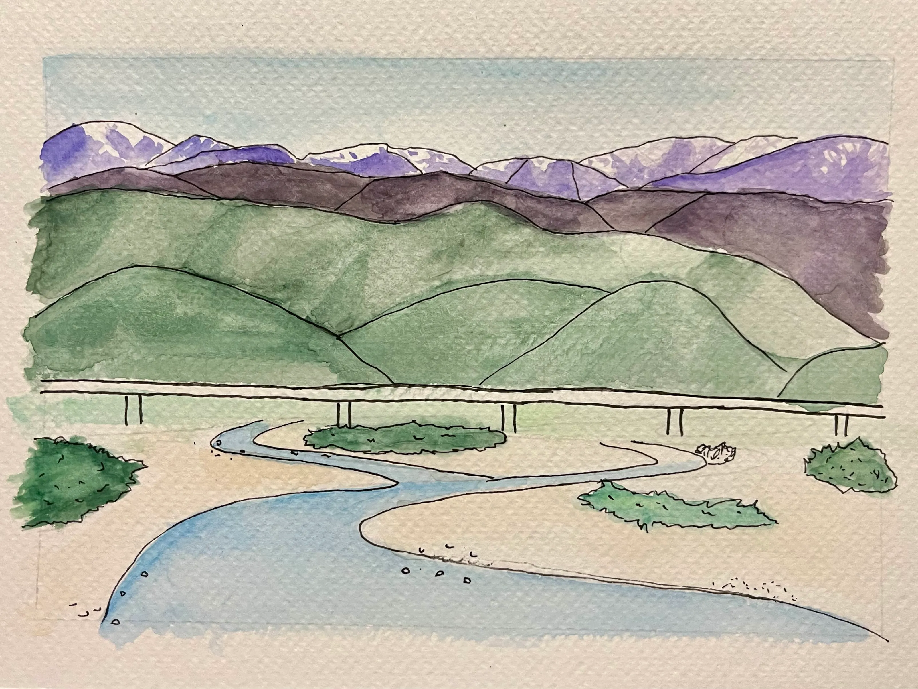
This weekend I finally faced my fears and did a watercolour painting, an art I’ve long wanted to try but was too intimidated to start. The result is not what I’d call a masterpiece, but I’m proud to be taking another step forward on my artistic journey.
The first intimidating thing about starting any art is finding something to actually make. I procrastinated for a long time picking up cross-stitch and calligraphy before landing on Pokémon sprites and Unicode characters respectively as subjects.
Fortunately, painting has a lot of overlap with the landscape photography I already enjoy doing, so I was able to overcome that hurdle by scrolling through my camera roll.

A view from the Hokuriku Shinkansen.
Before I could paint the landscape, though, I first had to sketch the landscape. Sketching is a whole art in and of itself — one which I have little experience in — so I could easily fall into a rabbit hole trying to perfect my sketching skills before even picking up a brush.
Tracing, though, seemed a little less scary. I feel like I could trace the essential outlines of my photo without overthinking it too much, at least digitally.
My traced outline of the mountain landscape. I didn’t use all the details in the painting, but it was quick and satisfying to put together on my iPad.
Once the outline was done, I used my Cricut to exactly reproduce my digital penstrokes on a physical medium I could paint on. This was an overcomplicated solution, for sure, but it also came with the peace of mind that I could always reproduce the sketch if something went horribly wrong in the painting.
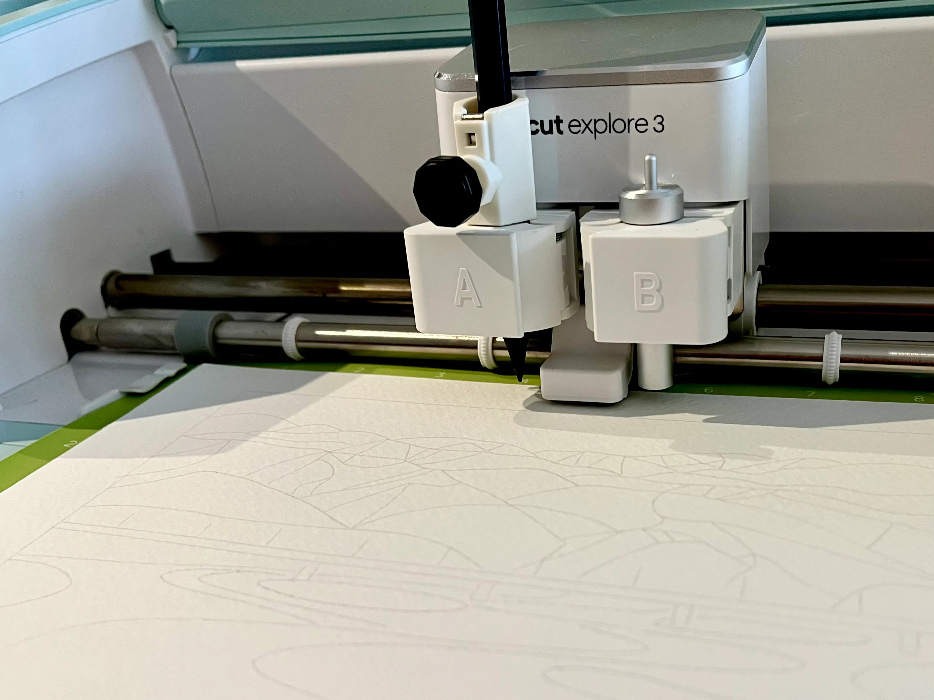
I used a third-party adapter to attach a metal pencil to my Cricut.
And that gave me the courage to paint my first landscape.

-
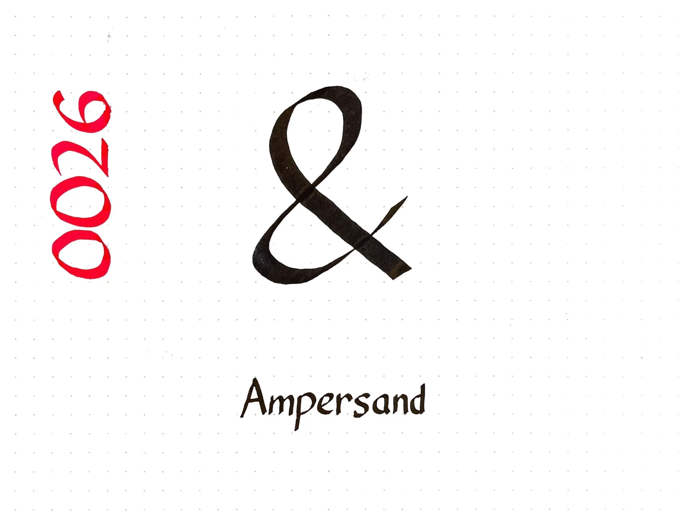
Today’s Unicode calligraphy is the good old ampersand. The name for the character comes from “and per se and”, but despite all sources agreeing on that fact, I couldn’t figure out what the longer phrase actually meant.
Looking at older sources, I think the phrase is supposed to be parsed ”& per se: and”. That is, ”& per se” means the character ”&” by itself, and the second “and” is a spelling-bee-style repetition to indicate that you have finished spelling the word “and”. So one might spell “wear and tear” out loud by saying:
W-E-A-R wear; & per se and; T-E-A-R tear
The same was apparently true for the words I, a, and O, so our national anthem would be spelled “O per se: O; C-A-N-A-D-A: Canada”.
-
-
-
When you feel how depressingly
slowly you climb
it’s well to remember that
Things Take Time.Piet Hein, “T.T.T.”
-
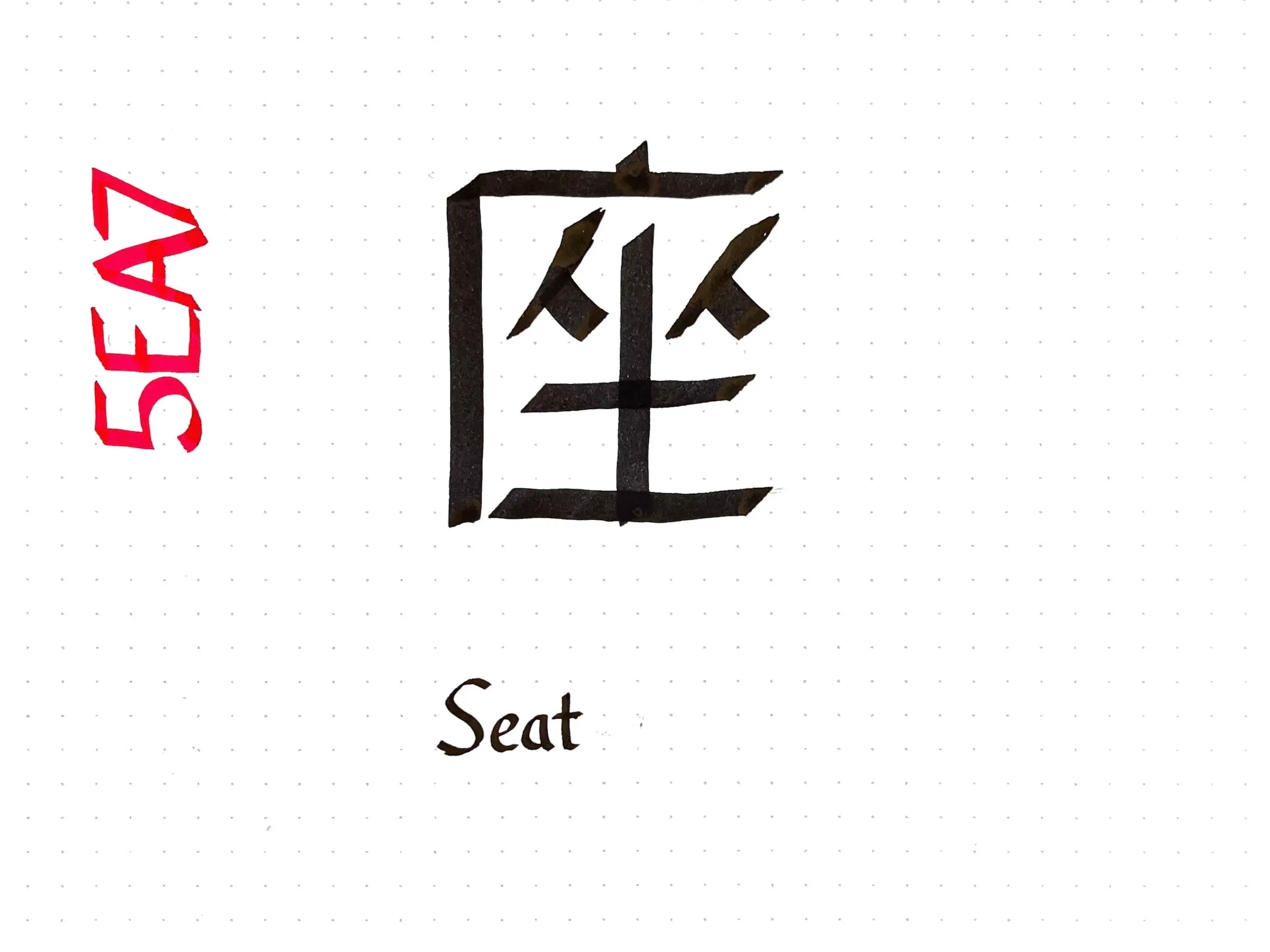
Today’s Unicode calligraphy entry is the kanji for “seat” 座. This one was difficult to write legibly: CJK characters are supposed to be written with a brush, which has a very different pattern of stroke width variation than a Western flat-tip calligraphy pen.
The seat character consists of four components, two of which (人) can represent people. A graphical pun based on rearranging the parts of 座 to evoke “social distancing” won the annual Kanji Creation contest for 2020.
-
Code: The Hidden Language of Computer Hardware and Software, by Charles Petzold, is a well-written and wonderfully detailed introduction to how computers work. It starts with a gentle introduction to binary encodings via Morse code and the telegraph, and then proceeds to build a computer from the ground up from relays to logic gates to circuits to memory to a real CPU. The book does not require any prerequisite knowledge and is fully self-contained, although it becomes increasingly complex at the end as each chapter needs the reader to fully understanding the material that came before it. To anyone interested in computers, the first chapters will be an accessible and enlightening read for some , and I highly recommend it.
On my first read of the book, was 16 (19 in the second edition). I already knew how logic gates could be networked to compute an arbitrary Boolean function, but didn’t see how that could be extended to a fully programmable computer. As Code explains, the key step is to design a feedback circuit that admits multiple stable states. Such a circuit can be used to build a memory array to store data — including “instructions” that can be read conditionally execute other circuits.
-
-
Most Chinese languages, such as Mandarin and Cantonese, pronounce 茶 along the lines of cha, but Min varieties along the Southern coast of China and in Southeast Asia pronounce it like teh. Almost all languages use variants of one or the other, depending on who they got their tea from.
- The Portuguese borrowed chá from Cantonese in the 1550s via their trading posts in Macau.
- The Persians adopted chay from Mandarin, which spread throughout Central Asia.
- The Dutch may have borrowed their word for tea through trade directly from Fujian or Taiwan, or from Malay traders in Java who had adopted the Min pronunciation as teh.
- The Dutch word influenced other European languages, including French (thé), Spanish (té), German (Tee), and English, even after the latter started buying tea directly from Cantonese-speaking merchants
Several articles pointing this out have the headline “Cha if by land, tea if by sea”. This plays on Longfellow’s poem about Paul Revere, in which lanterns are to signal how the British invade: one if by land, and two if by sea.
-
-
Continuing a decades-old tradition of mine, I present to you a collection of unusual signs, scenes, and objects in Japan that made me think: “gee, that’s random.”
Famously, everything in Japan has a mascot. I could have dedicated an entire post to cataloguing mascots, from Ishikawa Prefecture’s (石川県) mustachioed Hyakuman-san (ひゃくまんさん) to Pipo-kun (ピポくん) of the Tōkyō Police. But the mascot that made me do the largest double-take was that of the underground shopping mall Yaechika (ヤエチカ), which is represented by… a chibi version of the Dutch merchant Jan Joosten van Lodensteijn.
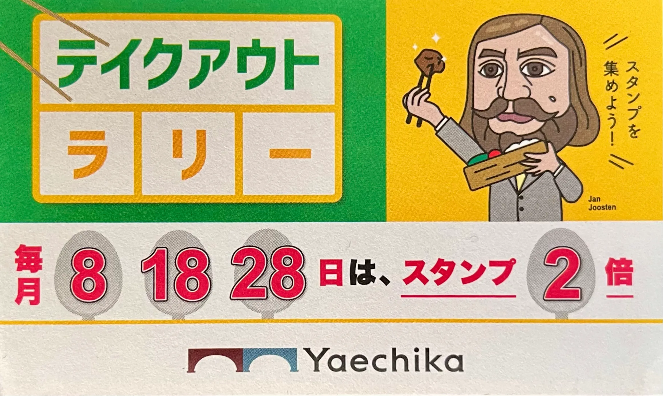
Jan Joosten says “Let’s collect stamps!” from the various shops in the mall.
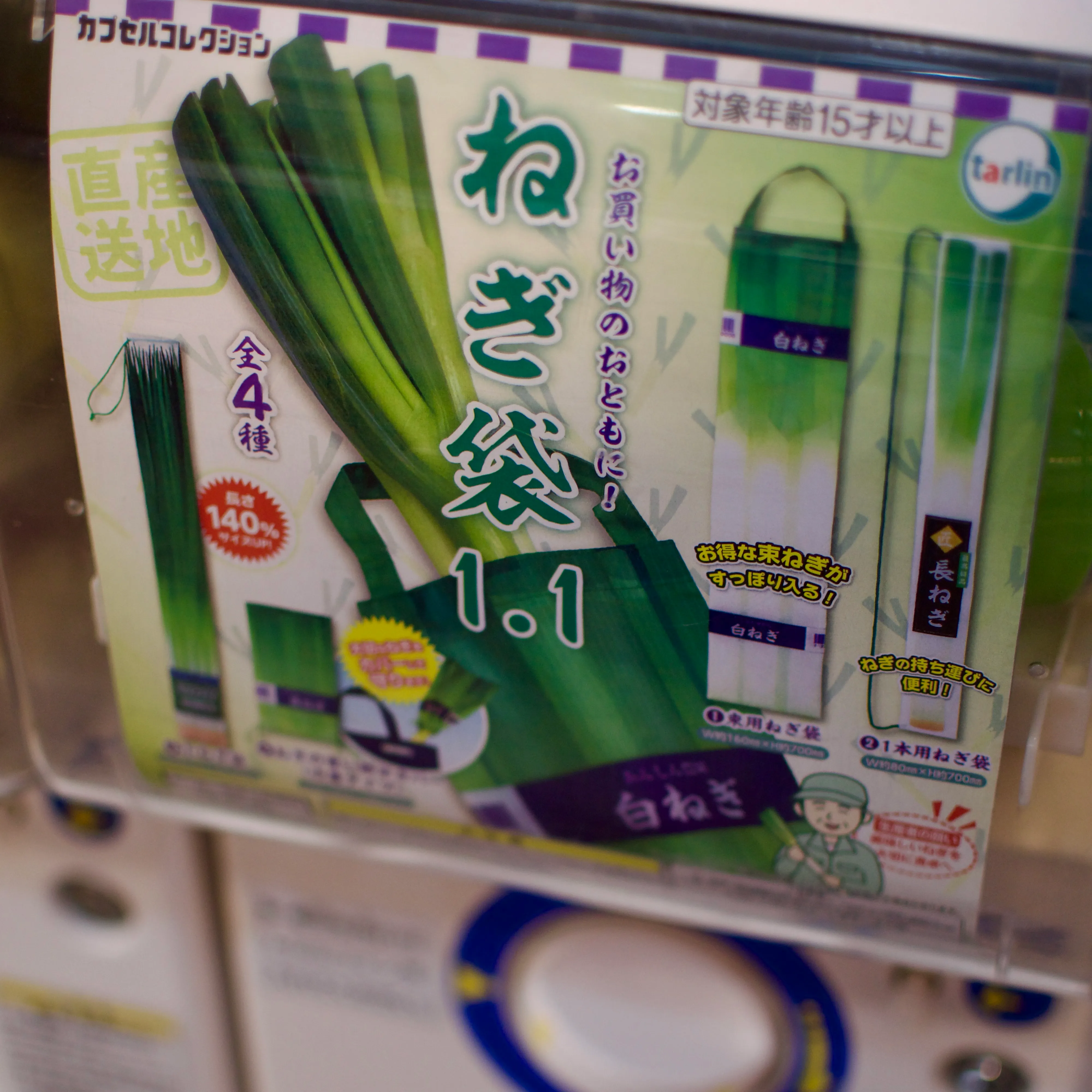
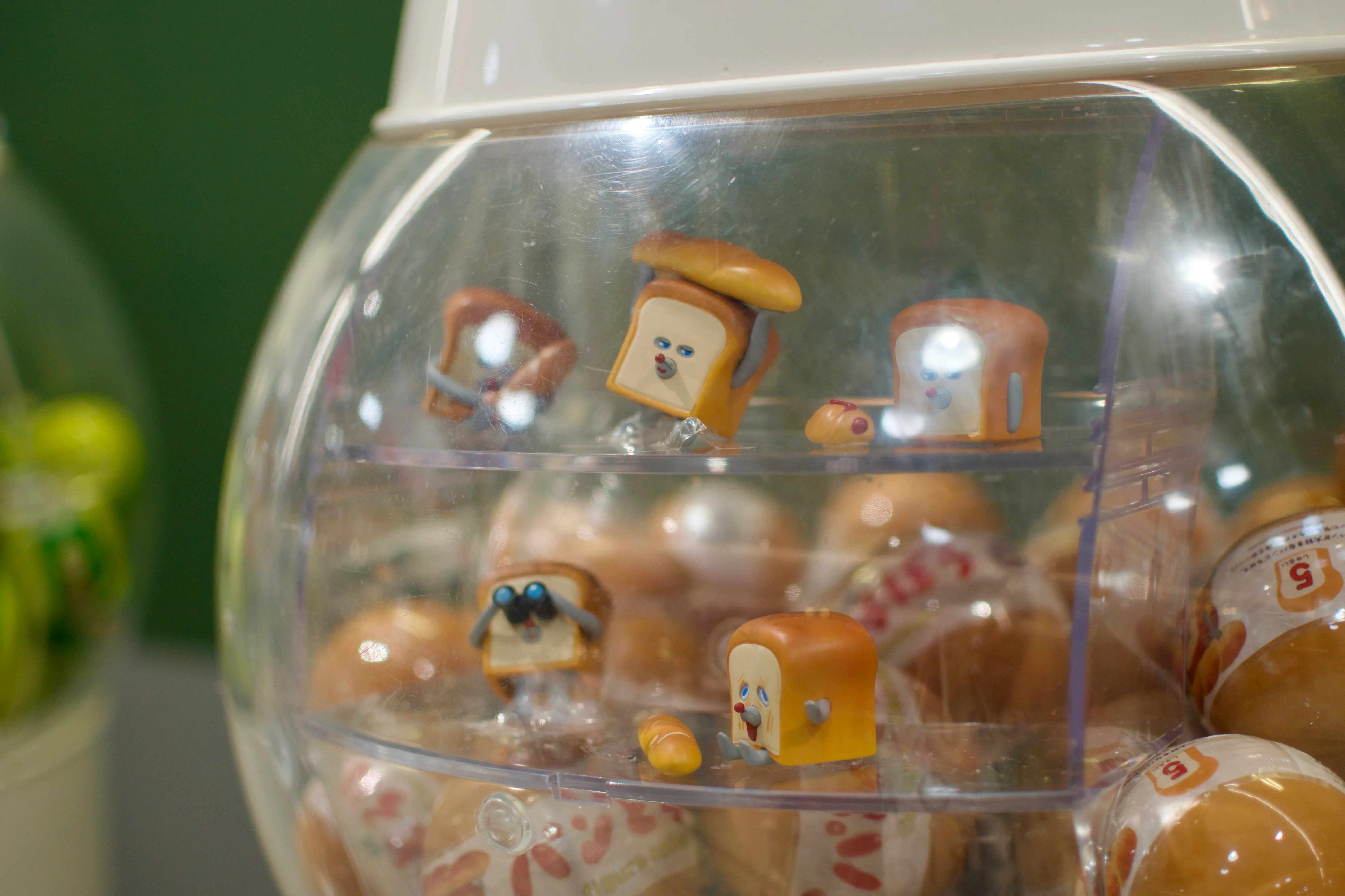
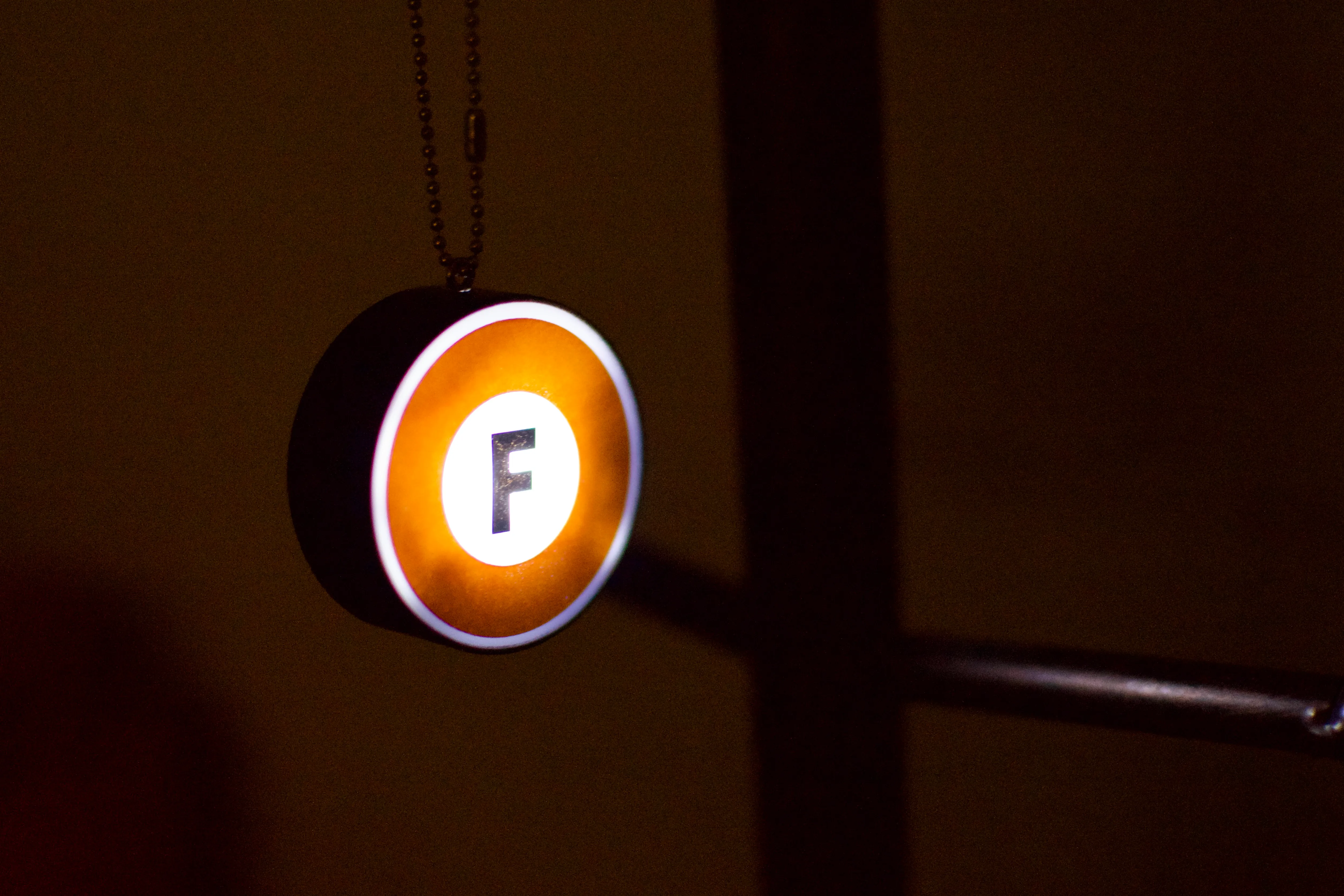
Gashapon (ガシャポン) — capsule toy vending machines — are another staple of the Japanese commercial experience. The vast majority of gashapon sell figurines based on popular anime, manga, and game characters, but there is a long tail of products for niche interests. I myself got a light-up ornament representing the Fukutoshin Line from a Tōkyō Metro branded blind box.
Niche gashapon toys: bags for green onions, figurines from the children’s book Pan-dorobō, and a metro-themed ornament.
Japan is frequently described as a place where tradition meets modernity, where the old coexists with the new. That cliché is certainly true, but it doesn’t capture the full range of temporal incongruities about the country:
- Japan’s train system is decades ahead of us in terms of speed and convenience — but many of the actual trains are almost twenty years old and run on sixty-year old tracks.
- Paying with cash is much more common than it is in Canada — but so is paying with one of a wide variety of mobile payment options.
- Japan is near the top of the list of mobile phones per capita — but you can also find honest-to-goodness pay phones still operating in the wild:
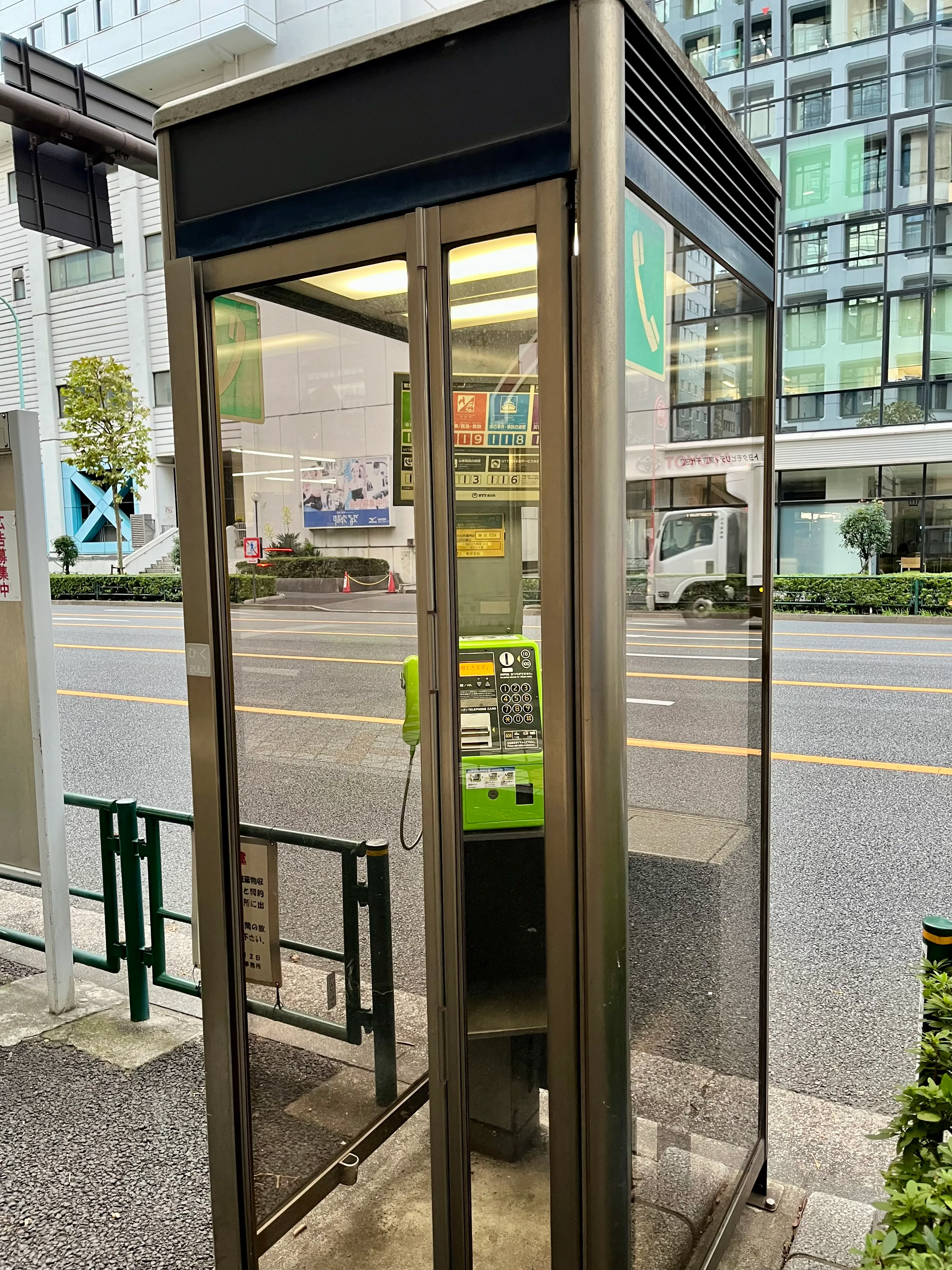
Although pay phones still apparently exist in Canada, they’re less rare in Japan.
I was determined on this trip to eat yaki-imo (焼き芋), i.e. a plain roasted sweet potato. I can report that it is a very satisfying snack! There are plenty of other sweet potato flavoured treats at this time of year.1
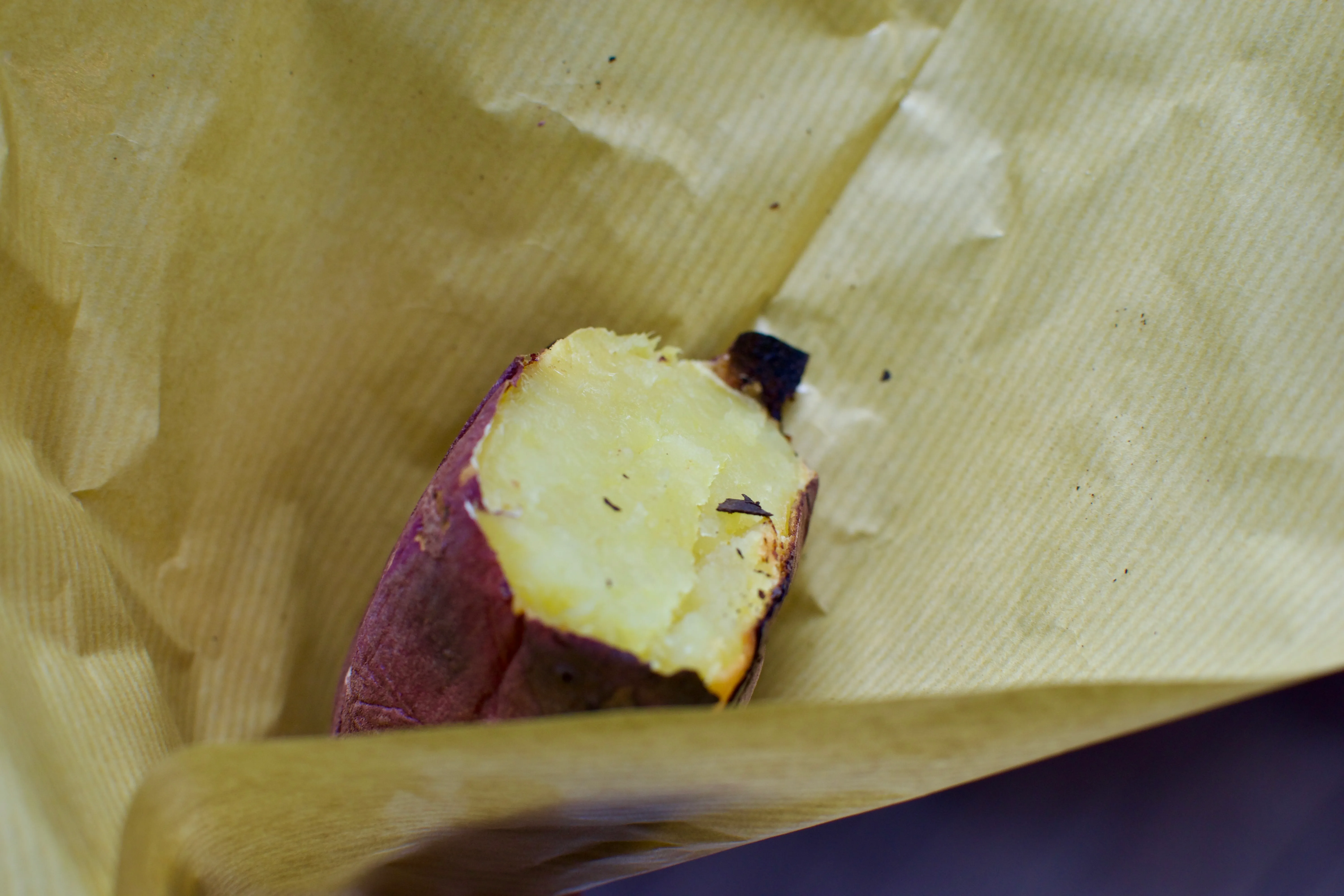
A roasted sweet potato from a shop called Ms. Yakiimo.
Other commercial entries in the “Gee, that’s random” files include
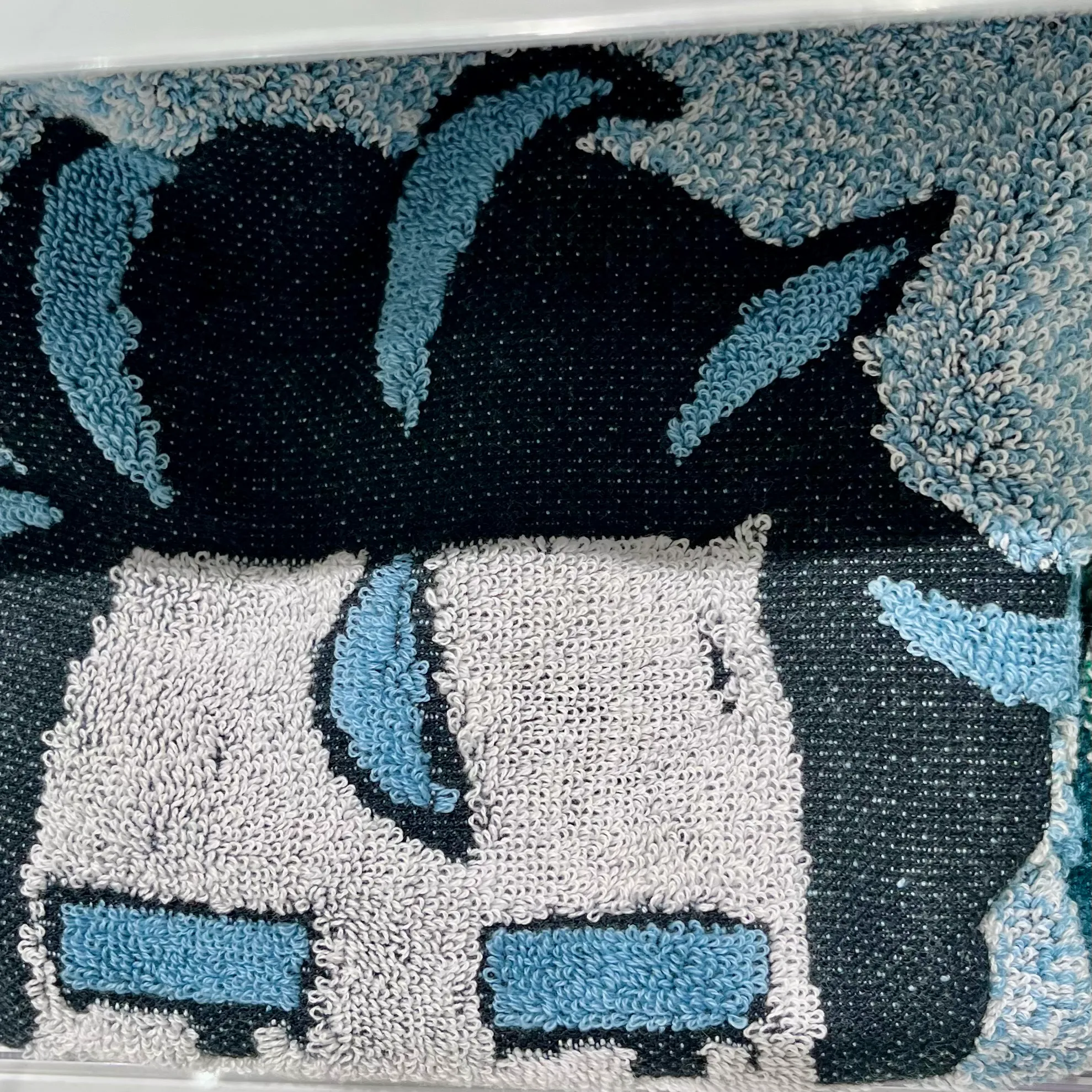
- a face cloth of the Pokémon gym leader Larry folded in a way I found humorous,
- an ad for tap water,
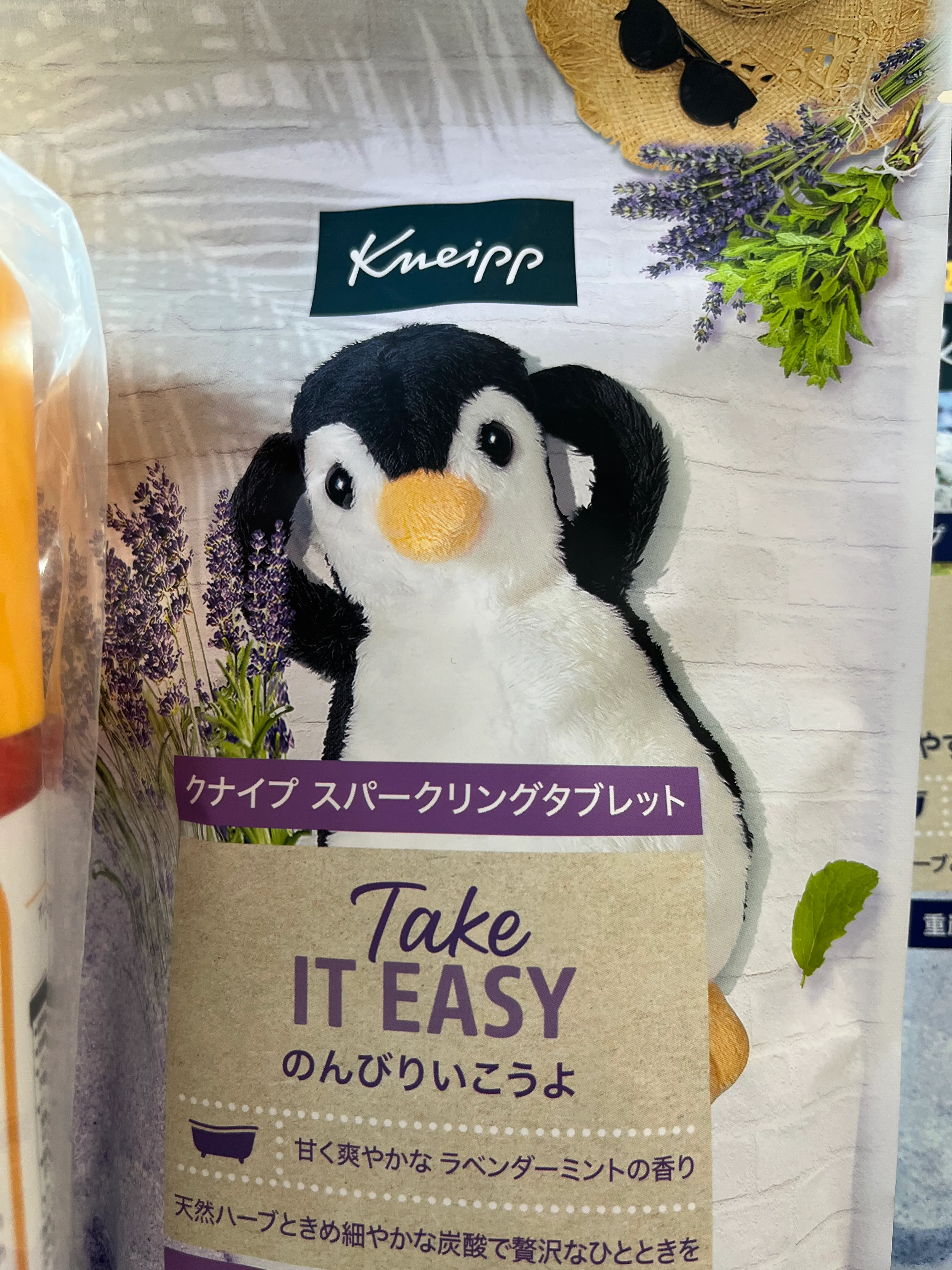
- an extremely stressed-out penguin on the packaging for bath bombs, and
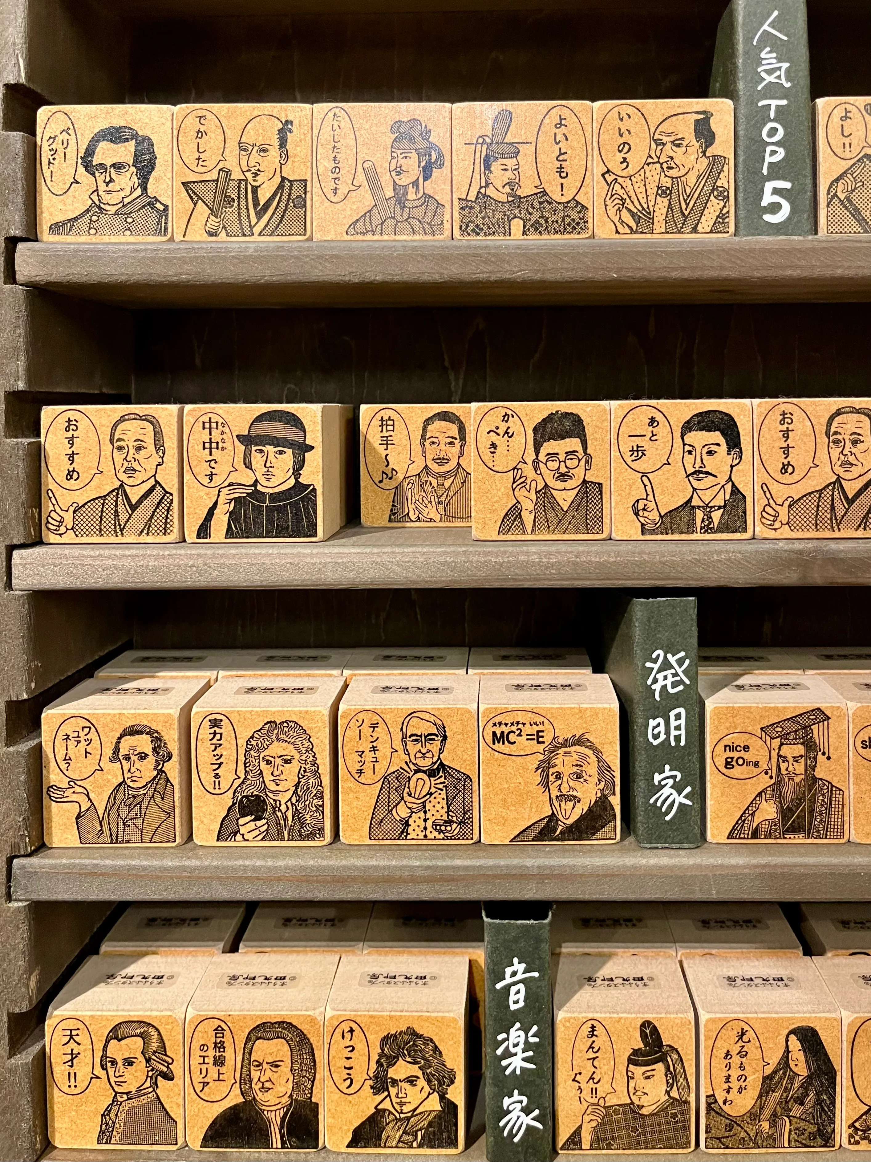
- a collection of stamps featuring historical figures, presumably for teachers?2
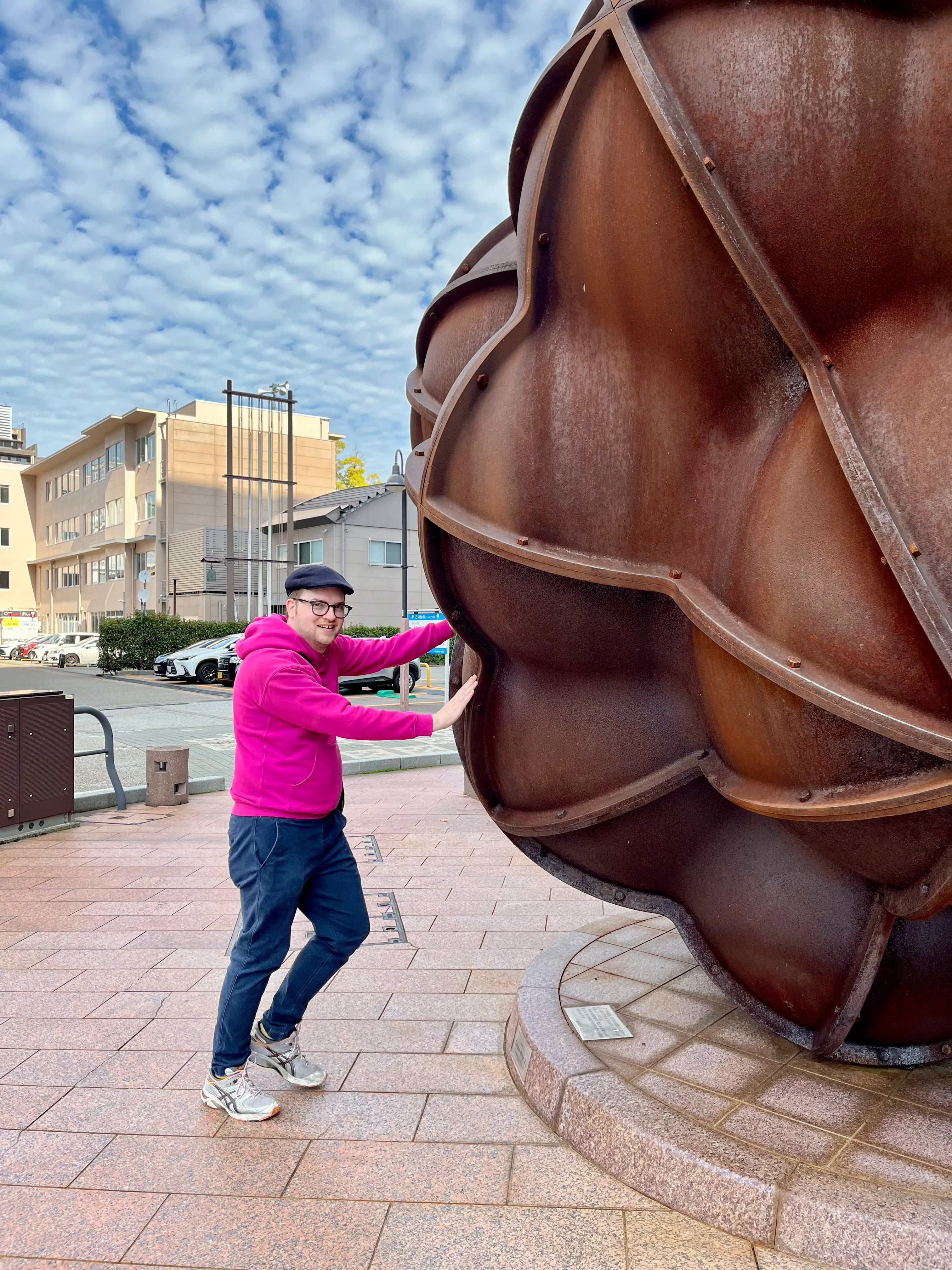
Some of my favourite pieces of Japanese media are the Katamari Damacy video games and their Shibuya-kei soundtracks. I didn’t find anything related to either on our trip — I didn’t expect to, considering they’re twenty-plus years old and were niche even in their time — but I did see a bunch of things that reminded me of the game. Case in point: this public art installation in Kanazawa,3 which looks all the world like a katamari.
The iron sculpture is Corpus Minor #1, by Janne Kristian Virkkunen. The weird character rolling a ball is the Prince, by Takahashi Keita.
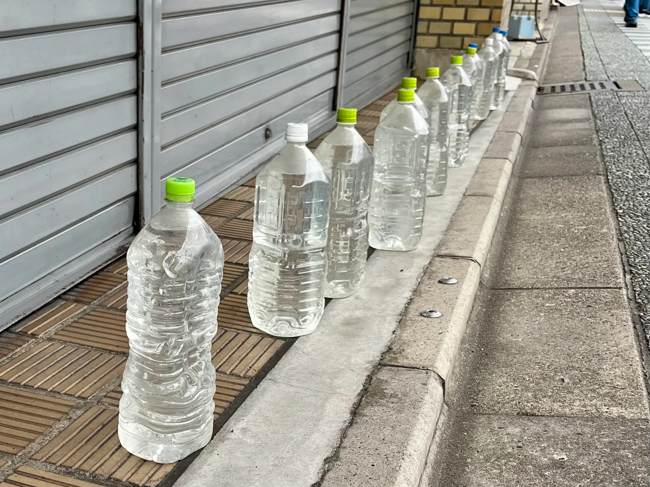
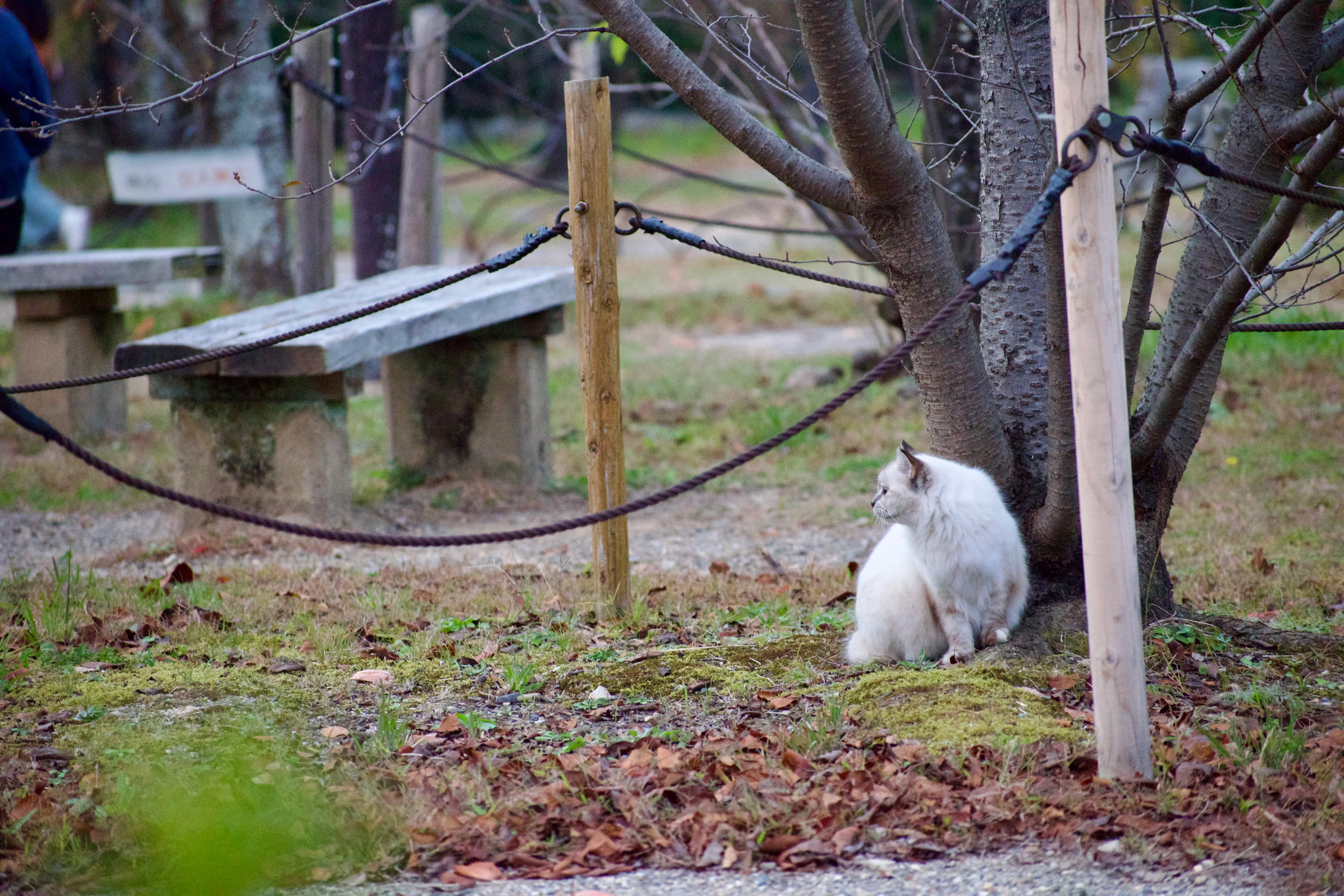
Speaking of things that reminded me of Katamari Damacy, rows of water-filled plastic bottles were a common sight in Kyōto’s Gion (祇園) district. This is an apparently widespread, but ineffective, way to scare away stray cats.
There are many stray cats in Kyōto’s Maruyama Park, which nearby residents try in vain to ward off with water bottles.
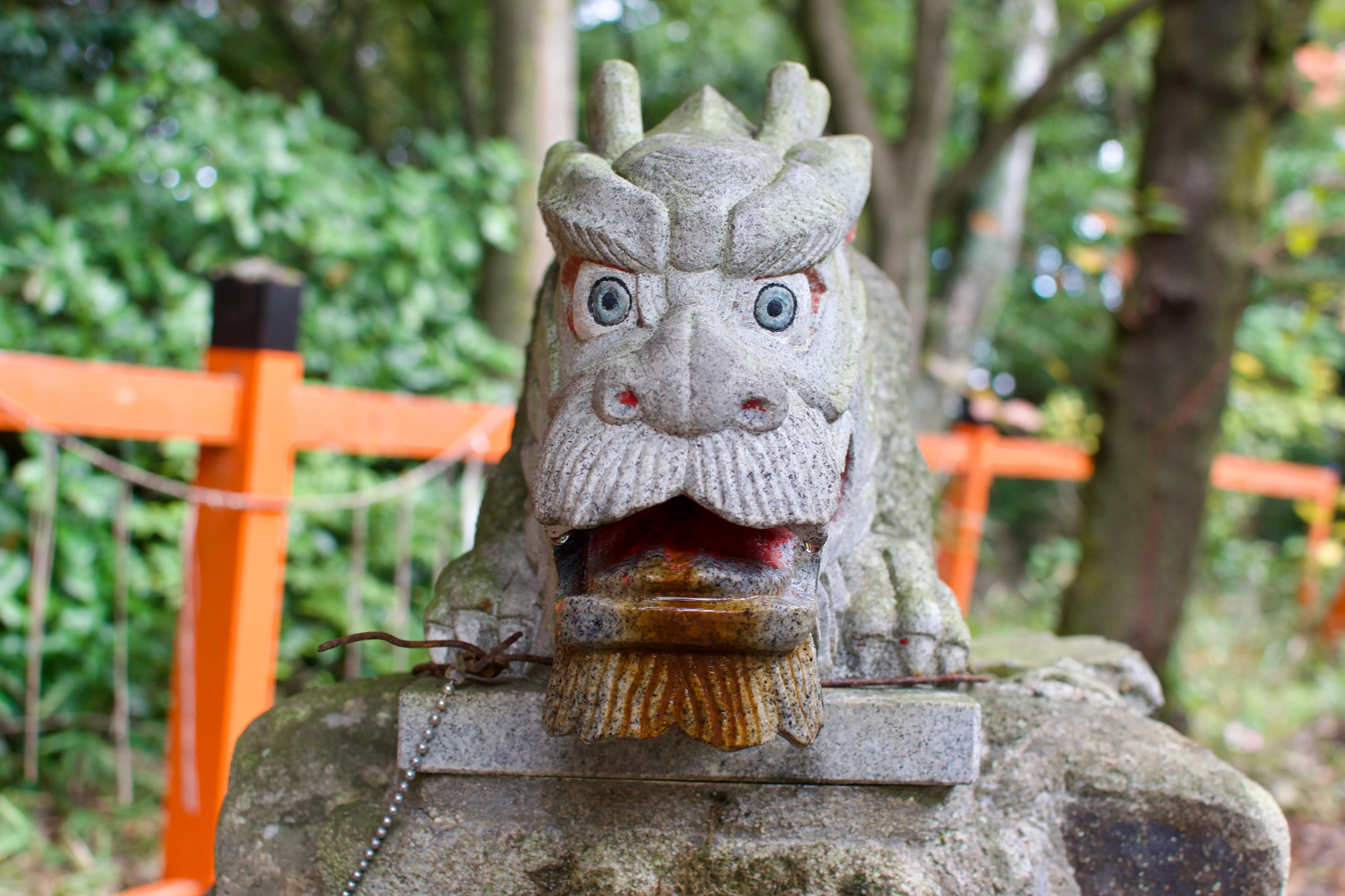
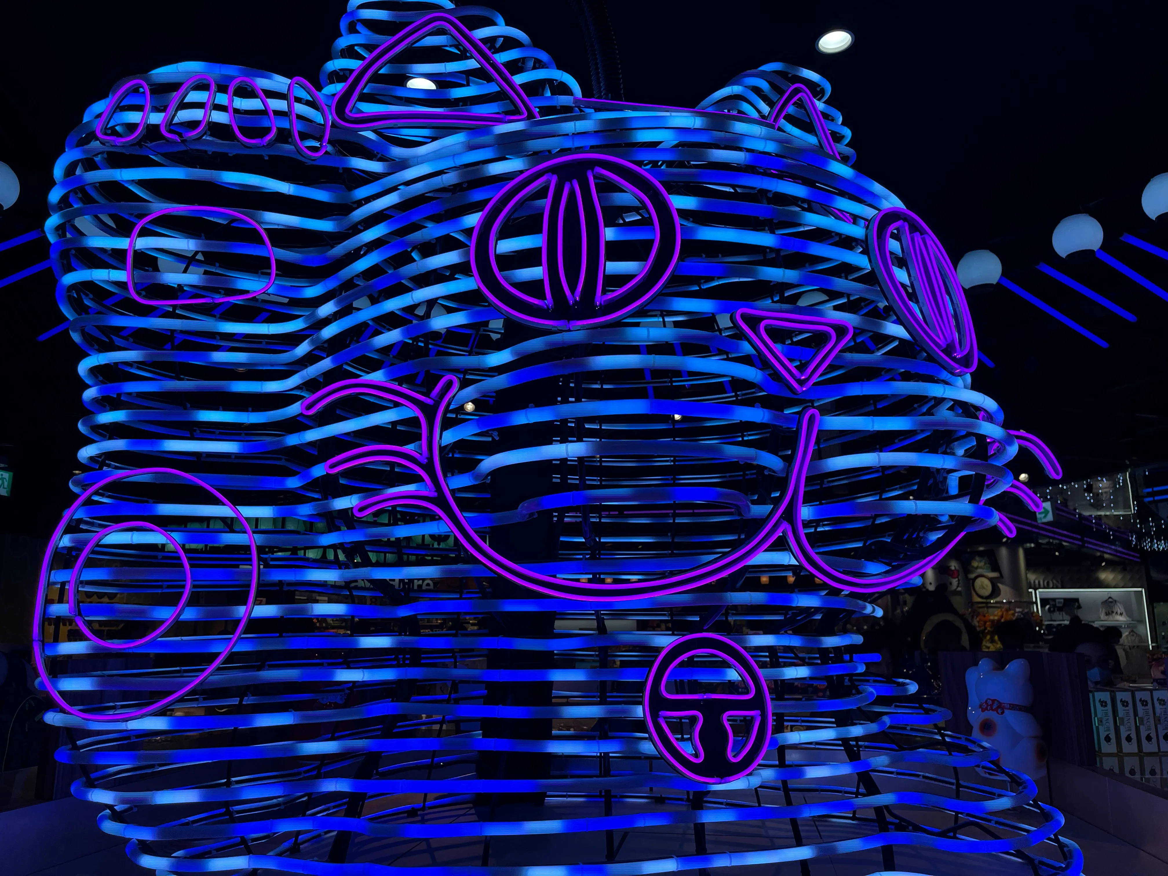
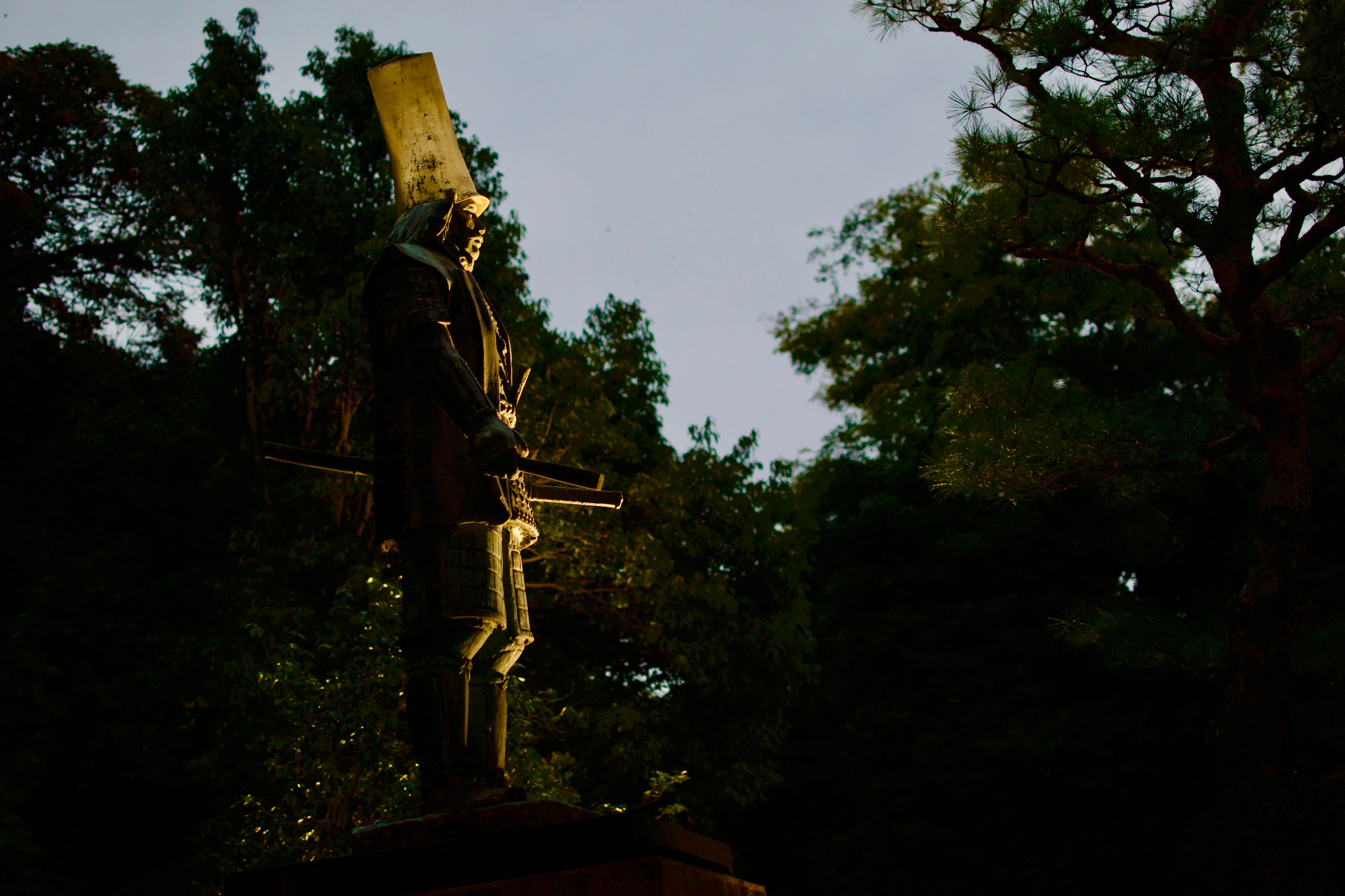
Finally, I have a collection of statues that stuck out at me at a particular angle:
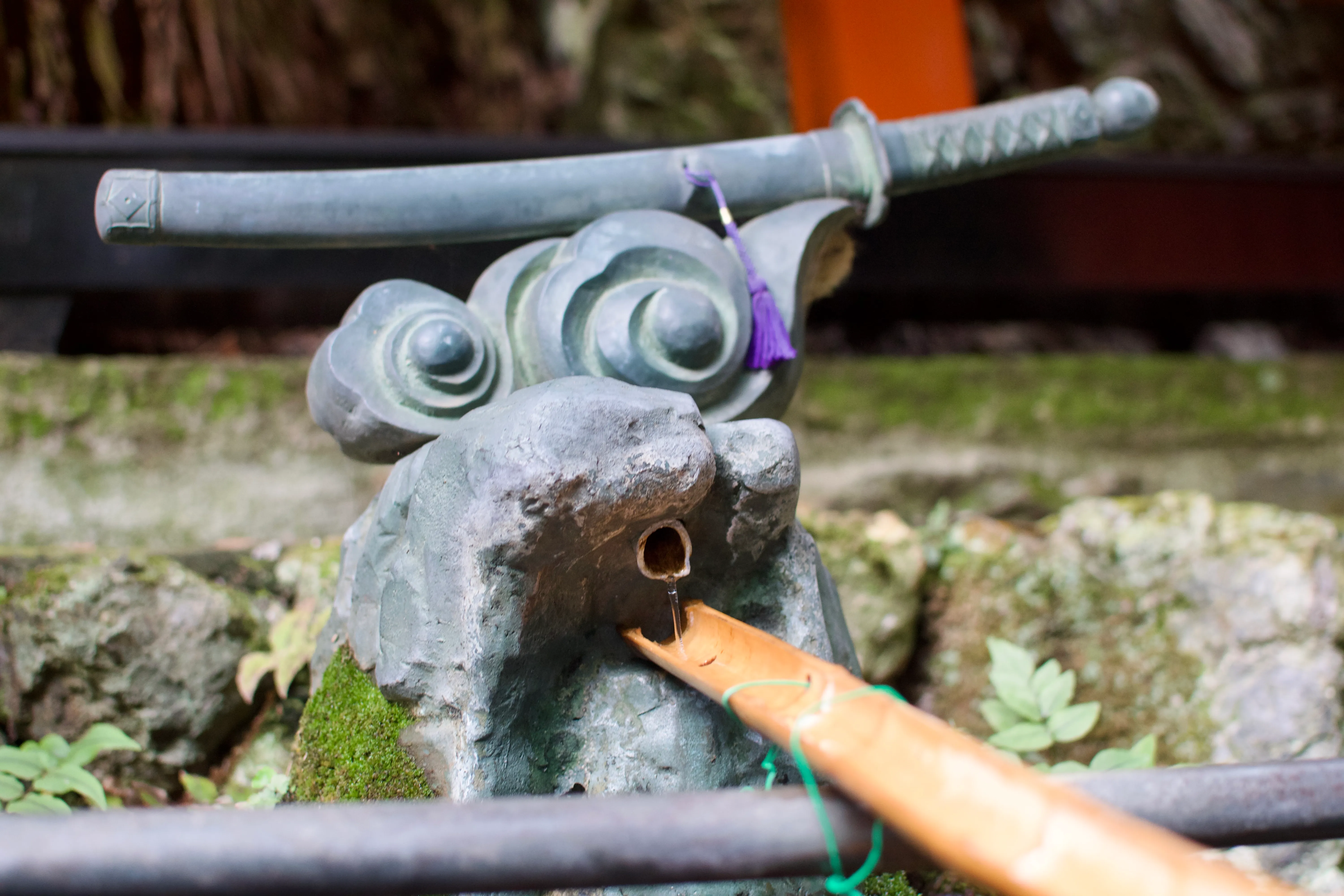
- A doofy dragon fountain at Fushimi Inari-taisha (伏見稲荷大社),
- A glowing maneki-neko (招き猫) in Narita Airport (成田国際空港),
- A statue of Maeda Toshiie (前田利家) with a tall gold-plated hat in Kanazawa (金沢市), and
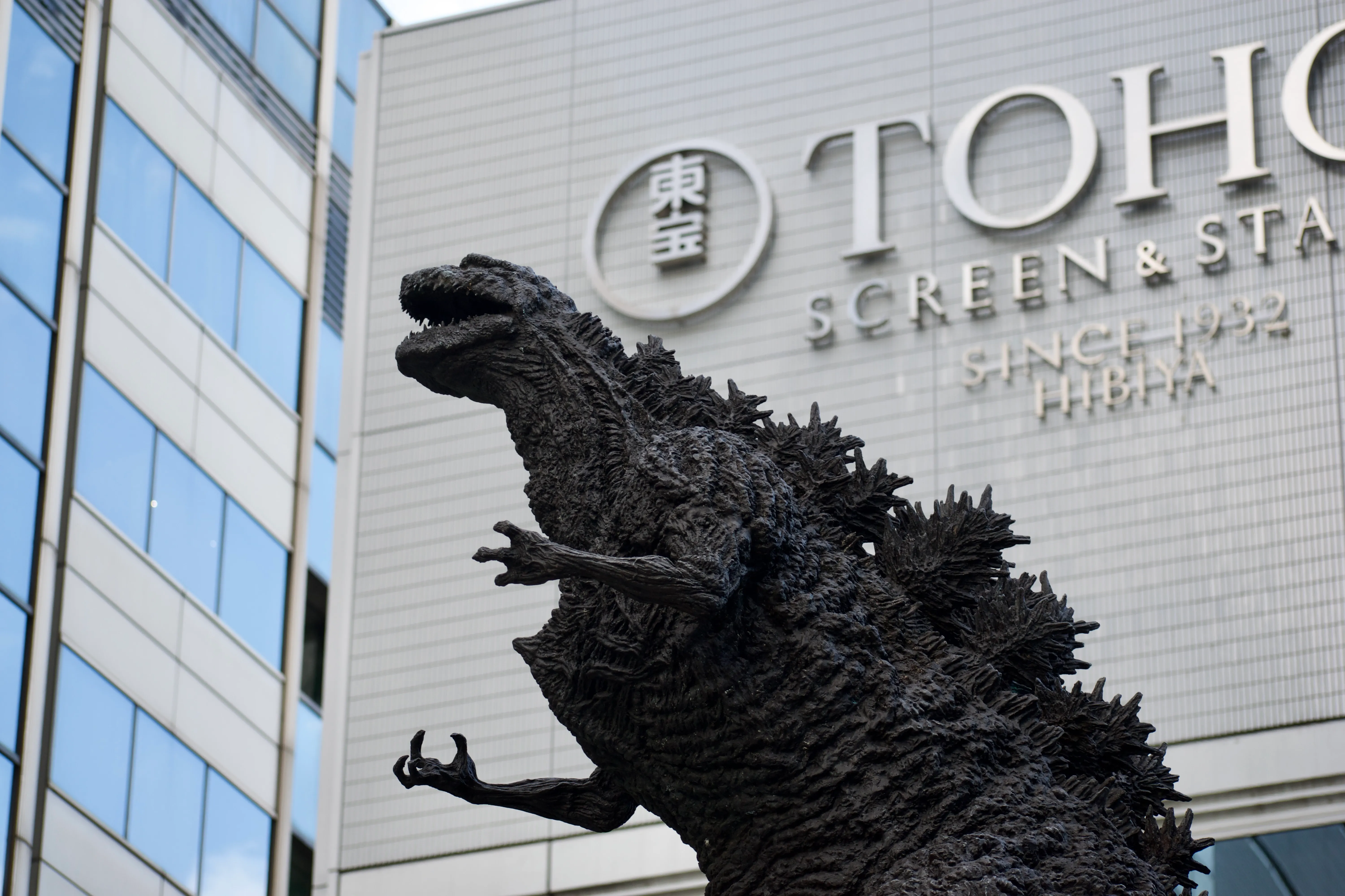
- A statue of Godzilla in front of Tōhō headquarters.
Gee, that’s a random collection of statues!
-
I had Seven-Eleven’s sweet potato ice cream bar, which weren’t bad but fall short of my favourite red bean bars. As a side note, I can confirm that the excellent reputation of Japanese convenience stores is well-deserved; we made frequent use of Family Mart and Seven-Eleven. The latter is so successful that it has its own bank and took over the American 7-Eleven, which is now a fully-owned subsidiary of the Japanese chain.
-
I recognize eleven of the twenty historical figures: Matthew Perry, Oda Nobunaga, Tokugawa Ieyasu, Isaac Newton, Thomas Edison, Albert Einstein, James Watt, Wolfgang Amadeus Mozart, Johann Sebastian Bach, Ludwig van Beethoven, and Murasaki Shikibu.
Many of their exclamations are puns — for example, Commodore Perry says “Perry good”, Newton and Edison have bilingual puns involving an apple and an electric light, and Einstein has a furigana pun indicating that the equation actually stands for a phrase meaning “extremely good”.
Originally, I had confused Bach for Gottfried Leibniz, since they had similar faces and Bach’s pun referencing “Air on the G String” would also work in Japanese as a pun on “area under a curve”. Leibniz, however, had a much poofier wig and would not be filed under “musicians”.
-
Kanazawa is home to the 21st Century Museum of Contemporary Art and has a few related installations around the city.
-
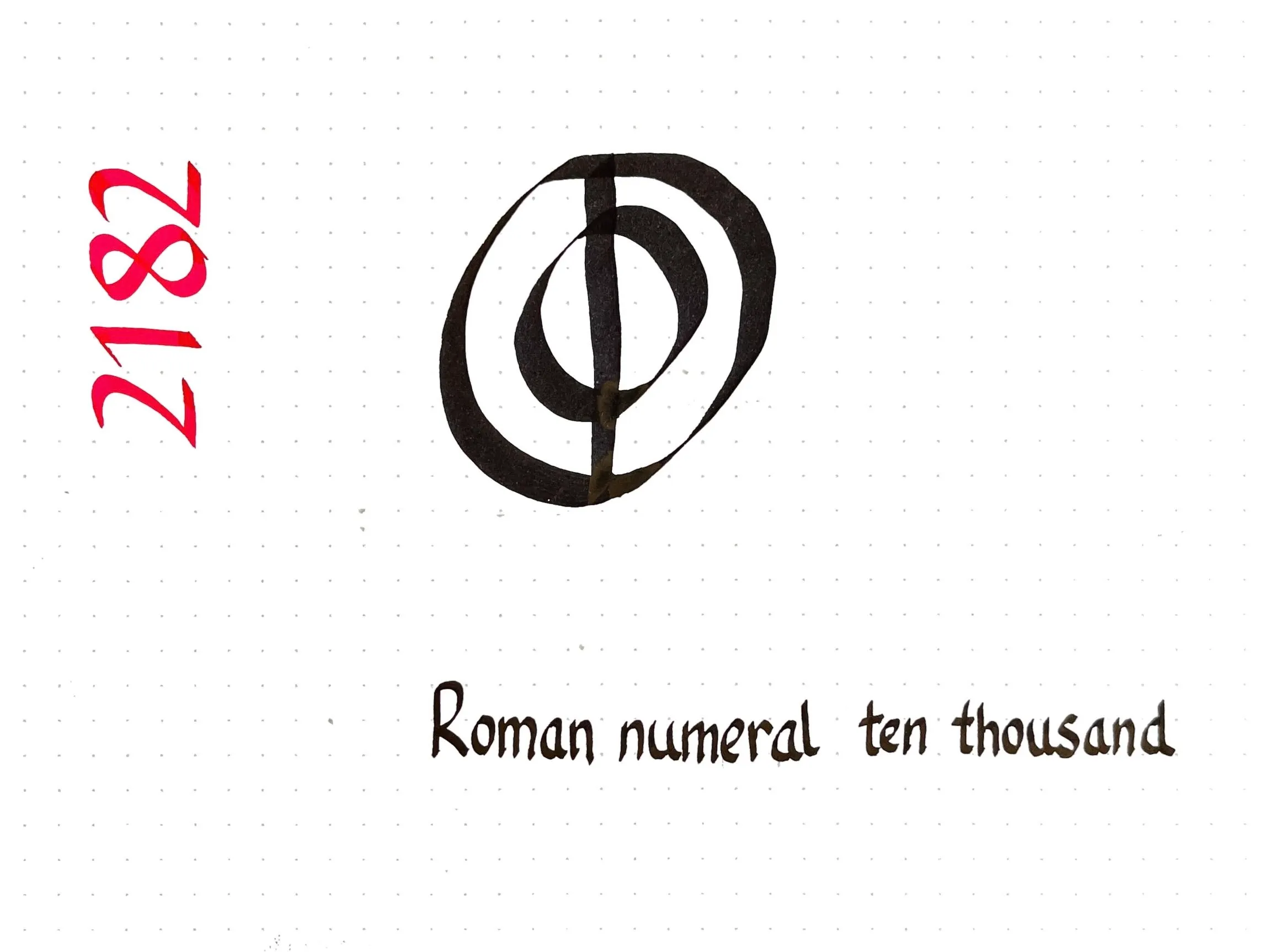
Today’s Unicode calligraphy is a roman numeral I had no idea existed!
As it turns out, the system of Roman numerals I learned as a child (I=1, V=5, X=10, L=50, C=100, D=500, and M=1000) is a medieval standard. The ancient Romans did not often write numbers much larger than a hundred, and when they did, they used a slightly different system.
Composite symbols with a backwards C were used for big numbers: IↃ=500, CIↃ=1000, IↃↃ=5000, and CCIↃↃ = 10000. The modern numeral for five hundred, “D”, comes from writing IↃ more concisely. There are also concise forms for one thousand (ↀ), five thousand (ↁ), and ten thousand (ↂ) although those forms are now of only historical interest.
-
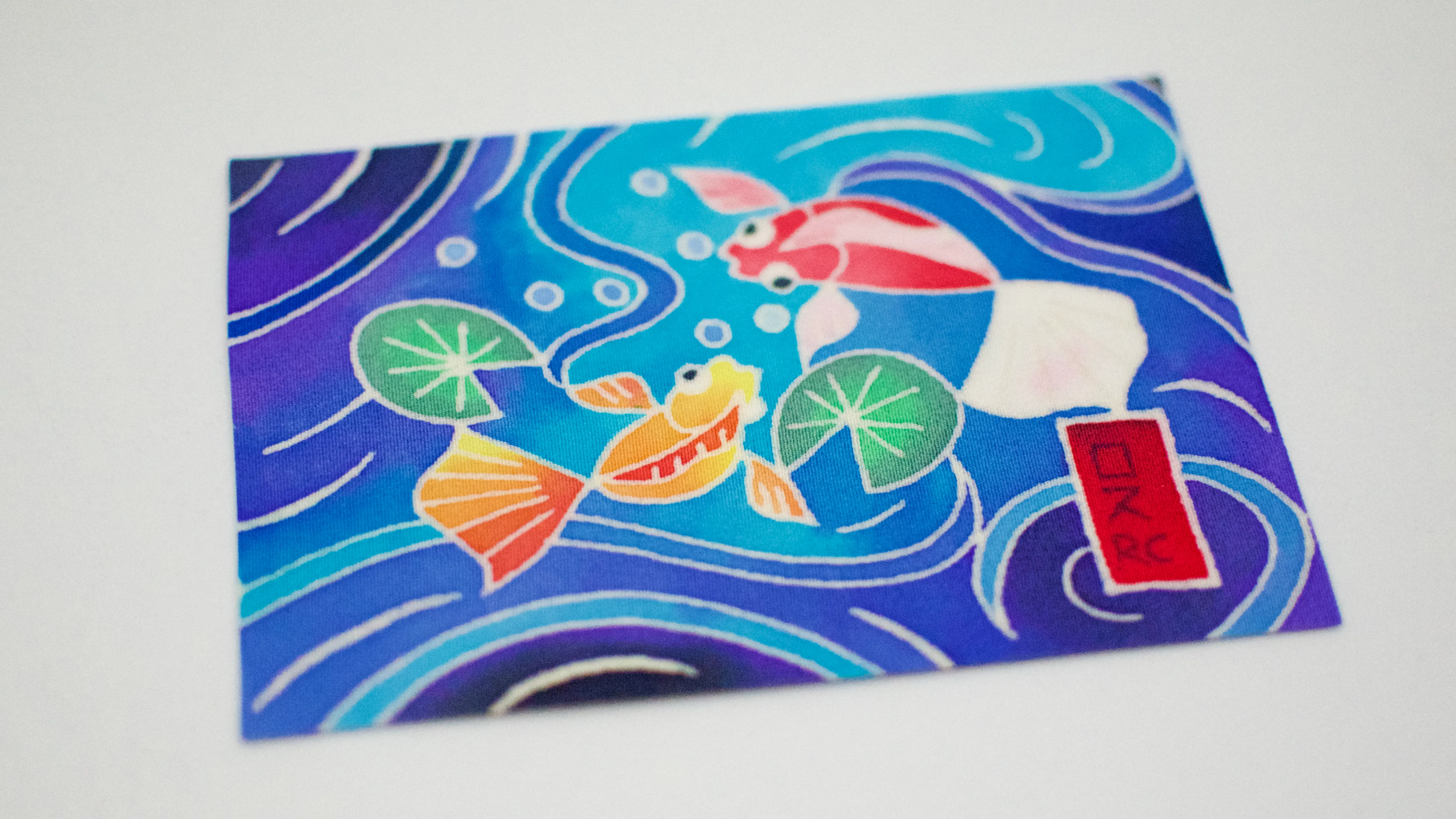
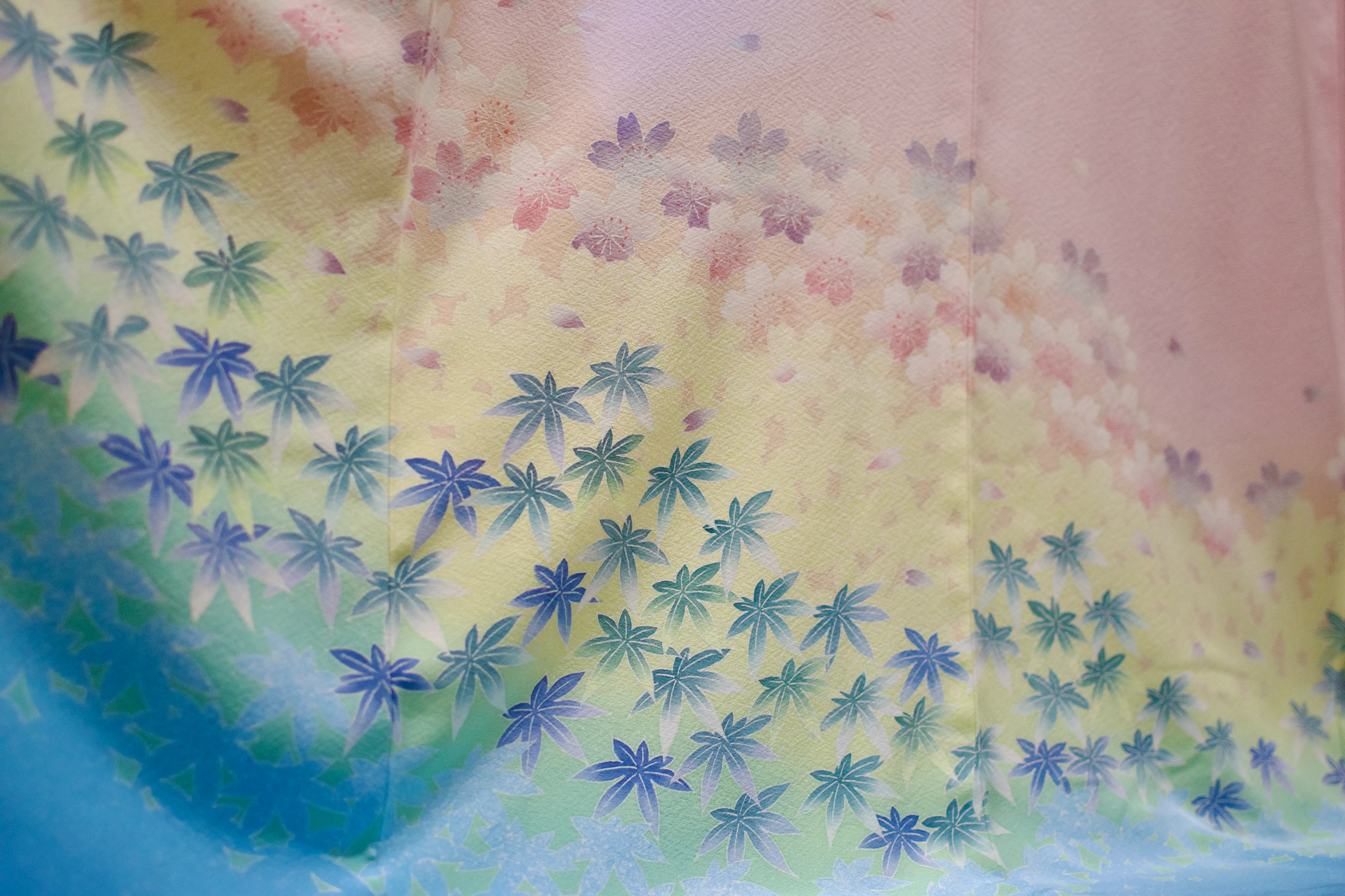
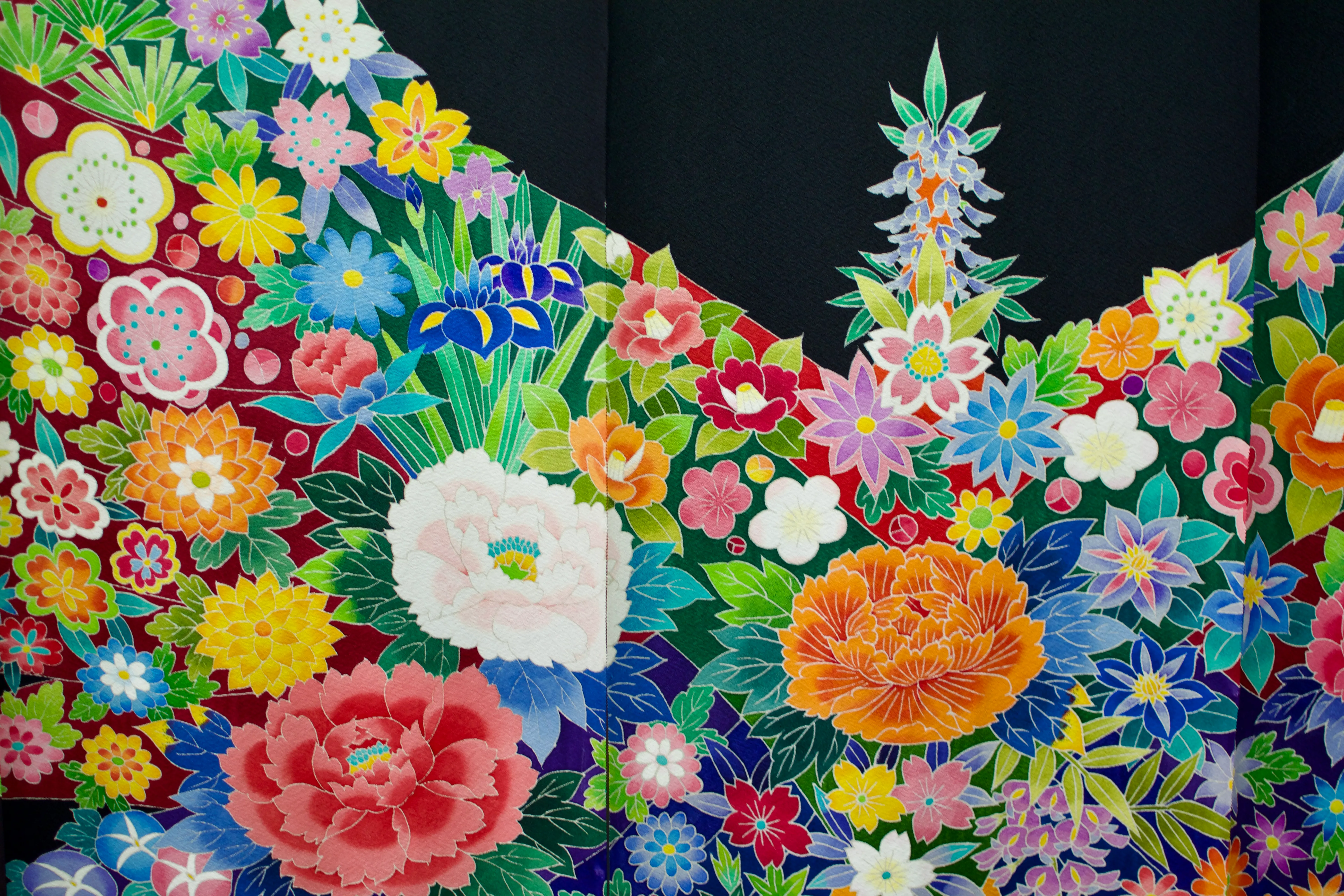
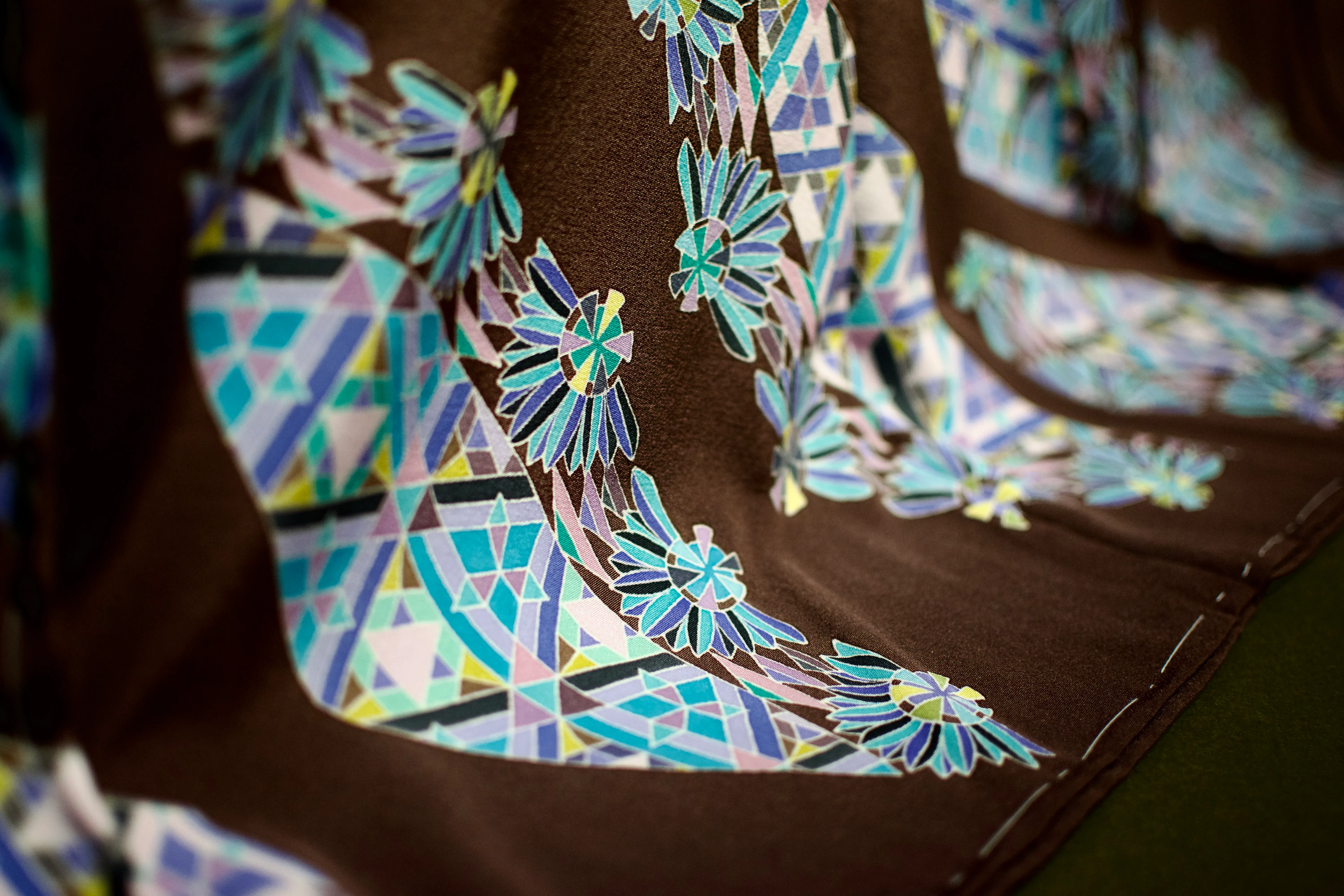
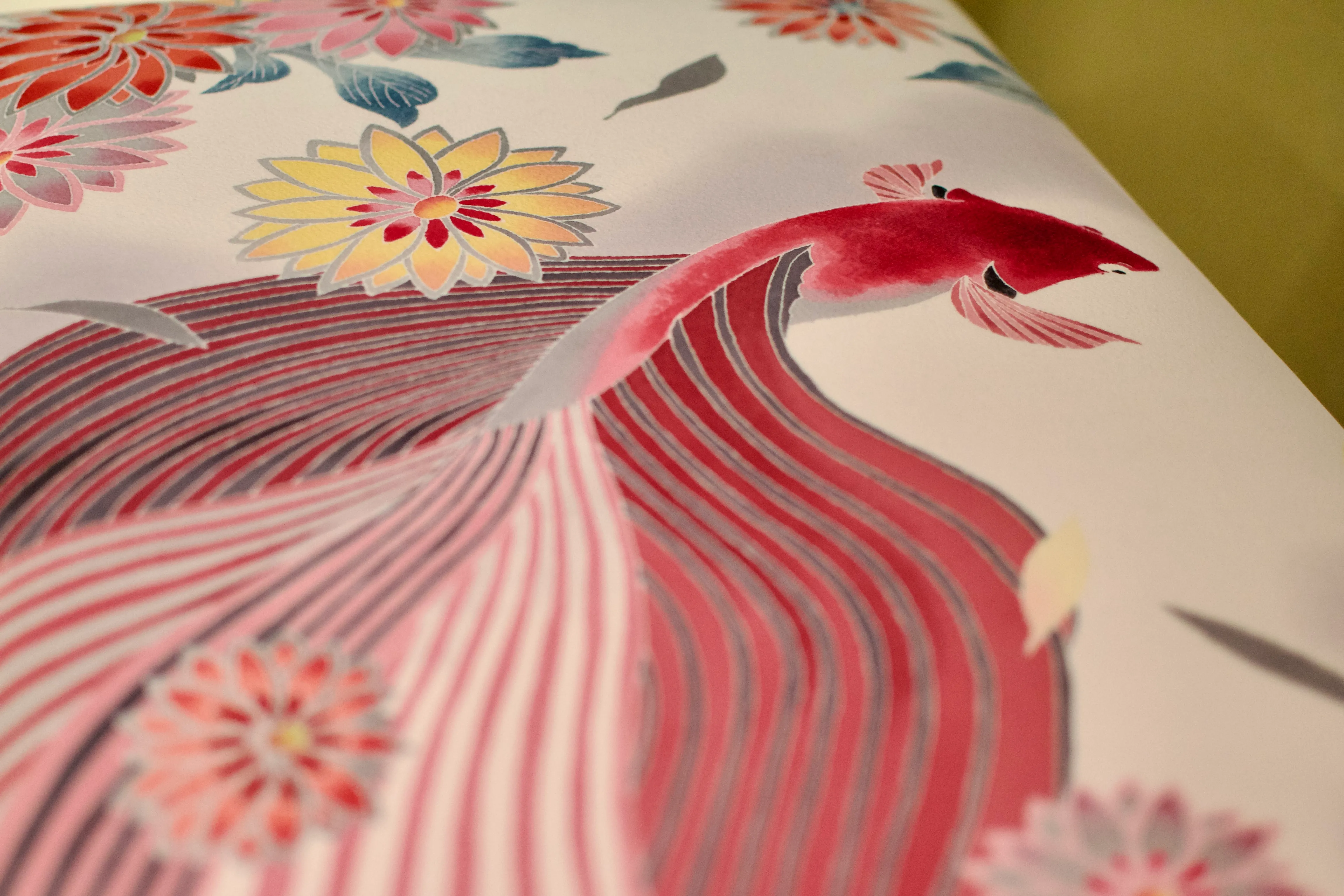
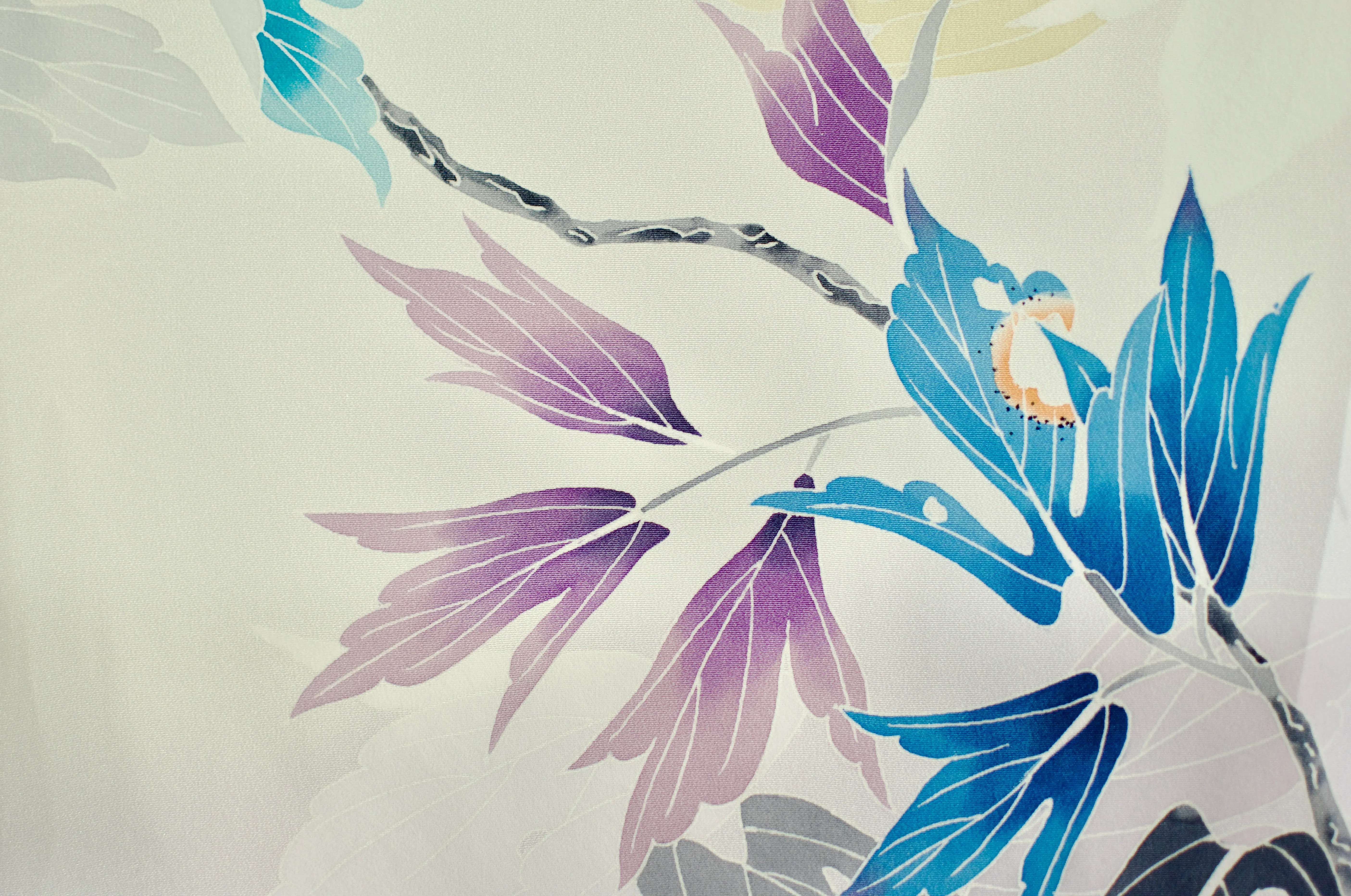
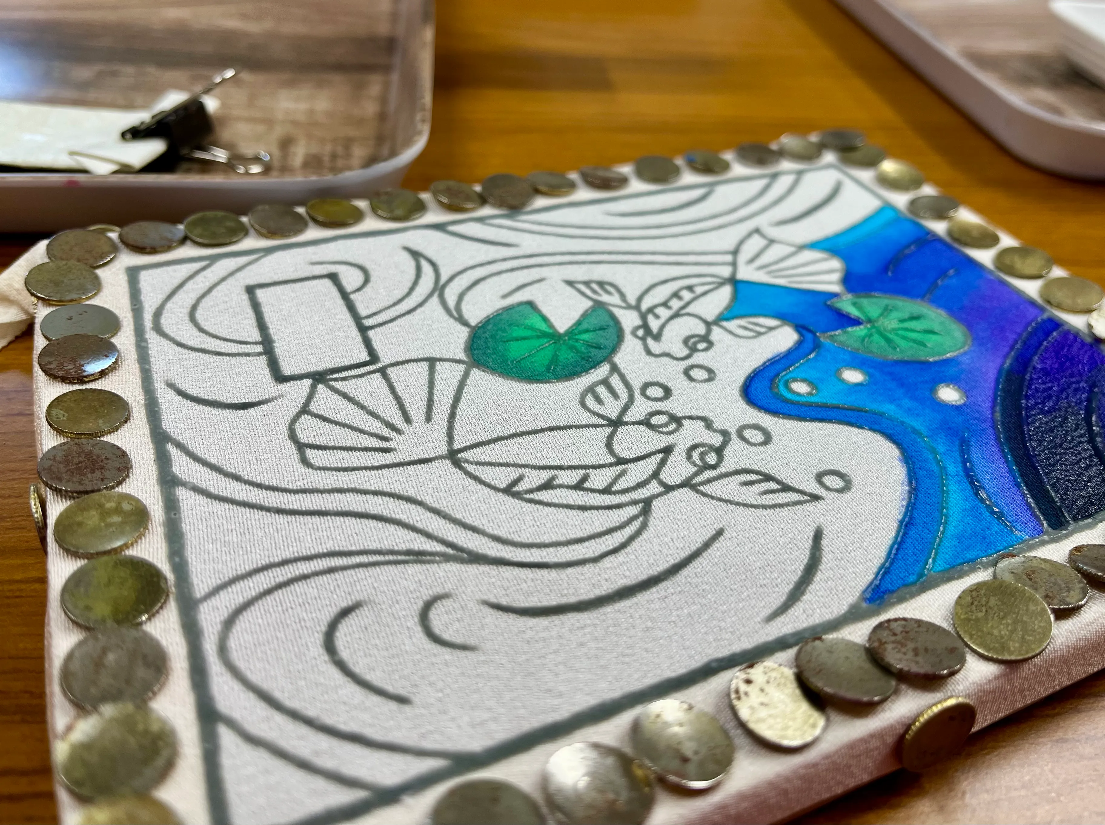
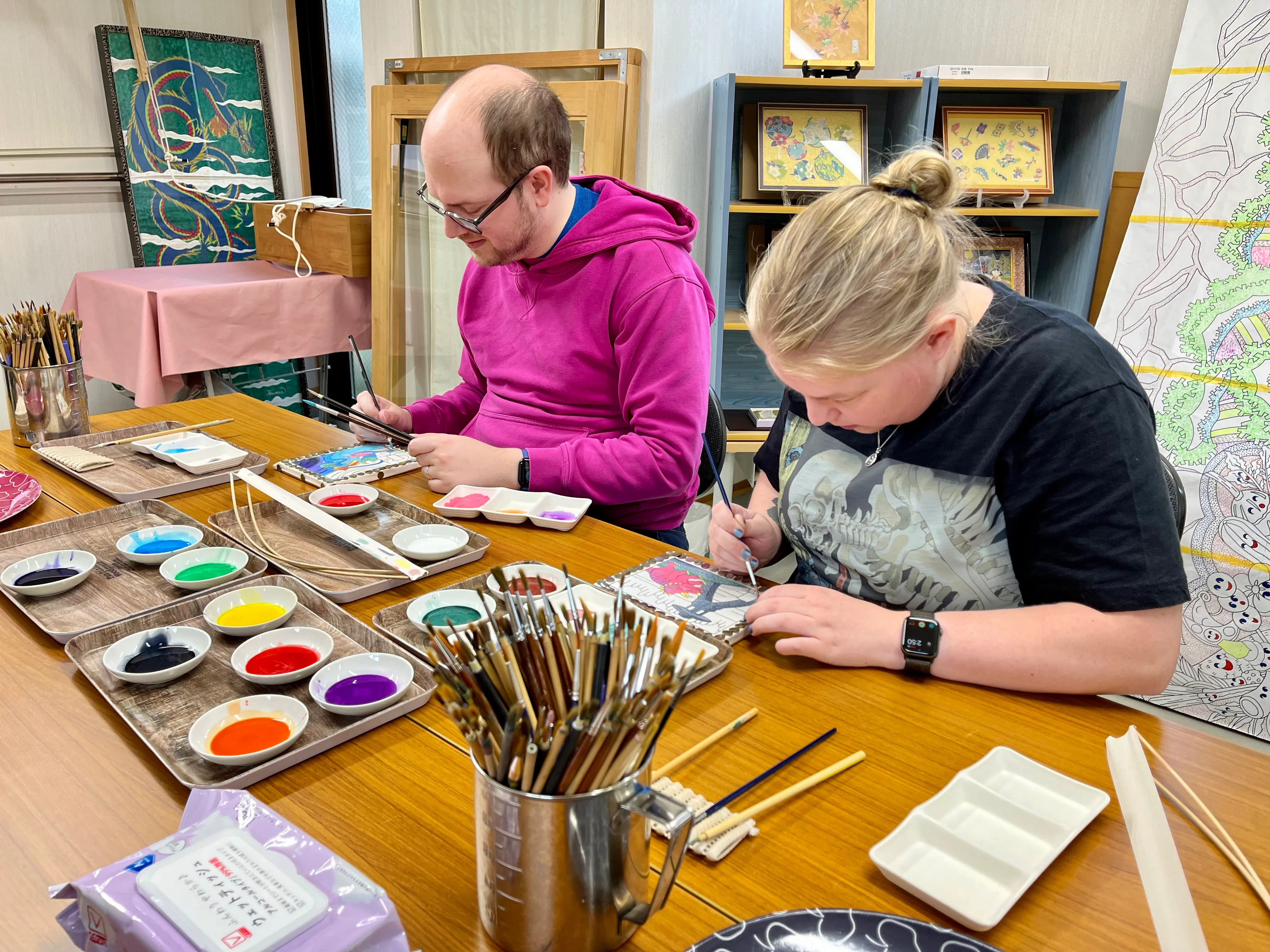
Yūzen (友禅) is a kimono dyeing technique that involves painting a pattern on the fabric inside the outlines drawn with a resist paste to prevent the dye areas from mixing together. In Kanazawa, we had the opportunity to learn and practice yūzen with the kind help of artist Hirano Toshiaki (平野利明) at the Yuzen Yomei studio.
Kaga yūzen — the style of yūzen unique to the historic province of Kaga — is characterized by lifelike designs such as insect-nibbled leaves.
Examples of yūzen displayed at the Kaga Yuzen Kimono Center.
Although less time-consuming than earlier freehand techniques, yūzen is still a skill-intensive multi-step process. Thankfully, the artisans at Yūzen Yomei made things easy for us by creating and outlining the designs ahead of time, so we only needed to worry about the colouring process.
We are incredibly grateful to Hirano-sensei for welcoming us into the studio. It was a very special experience — the highlight of the entire trip — and I hope to one day return to see them again!
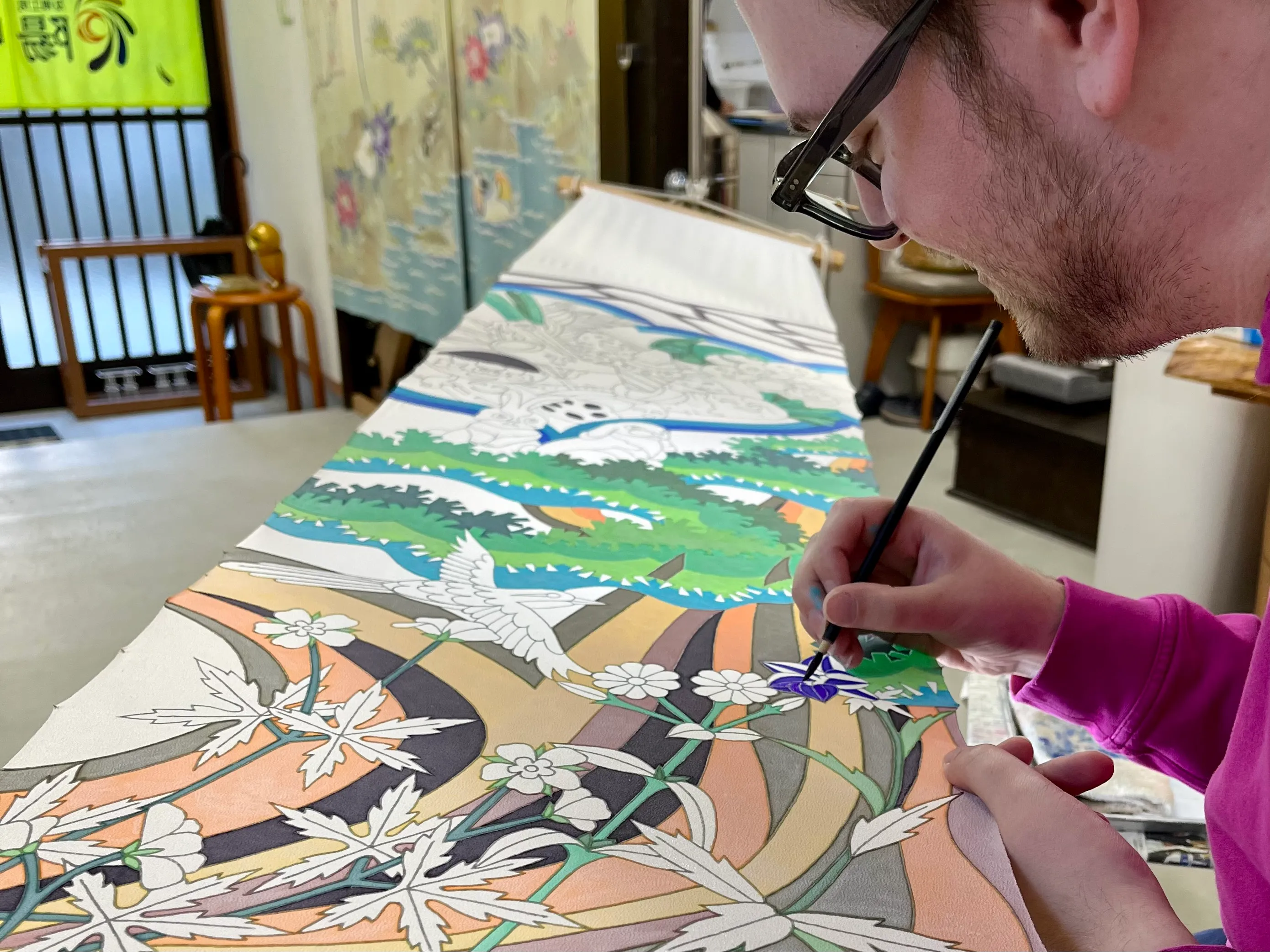
We were honoured to contribute to a large collaboration piece for a local hospital.
-
Every day at five o’clock in the evening, many cities in Japan perform a test of their emergency broadcast systems. To avoid alarming or annoying their residents, the test consists of a pleasant melody to mark the end of the day.
Here are the melodies from Tōkyō and Kanazawa as I recorded them.
In Chiyoda, Tōkyō, the melody is the children’s song “Yūyake Koyake” (夕焼小焼)
In Kanazawa, the melody is the Westminister Quarters.
-
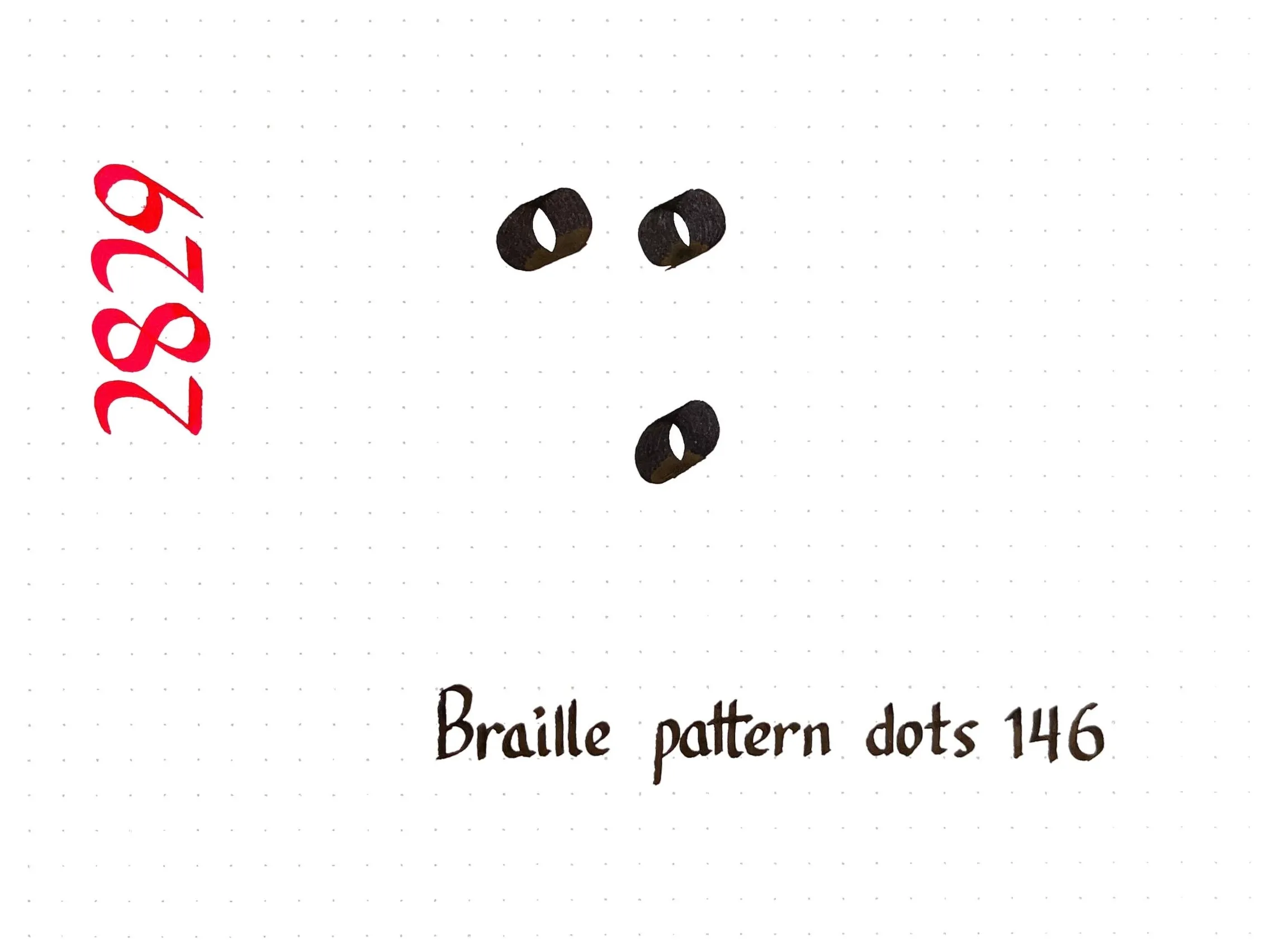
I need to practice my calligraphic dots and circles, so today’s character comes from Braille.
Did you know that Braille is slightly different in every language? The twenty-six letters of the Latin alphabet are generally the same across languages, but beyond that there is a lot of variation. For example, I wrote ⠩, which represents:
- the digraph “sh” or the word “shall” in English Braille,
- sounds similar to “sh” in Devanagari Braille (श) and Arabic Braille (ش),
- the accented letter î in French Braille,
- the digraph “ei” in German Braille and its equivalent “ει” in Greek Braille, and
- nothing at all in Spanish Braille!
Chinese, Japanese, and Korean have their own entirely independent Brailles. The symbol ⠩ represents the syllable く (ku) in Japanese Braille, the final “yan” in Mainland Chinese Braille, and the vowel ㅠ (yu) in Korean Braille.
-

Tōkyō -
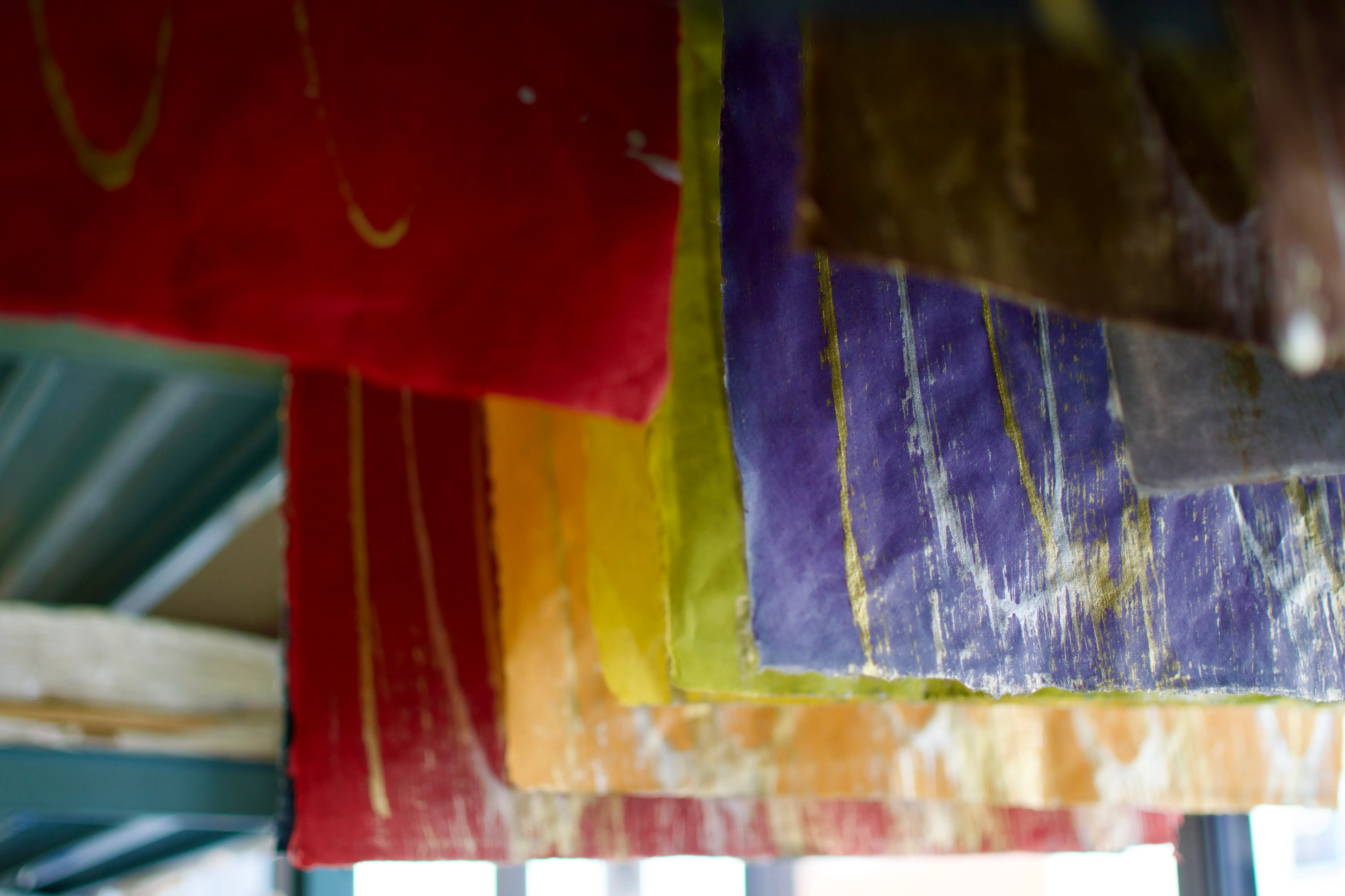
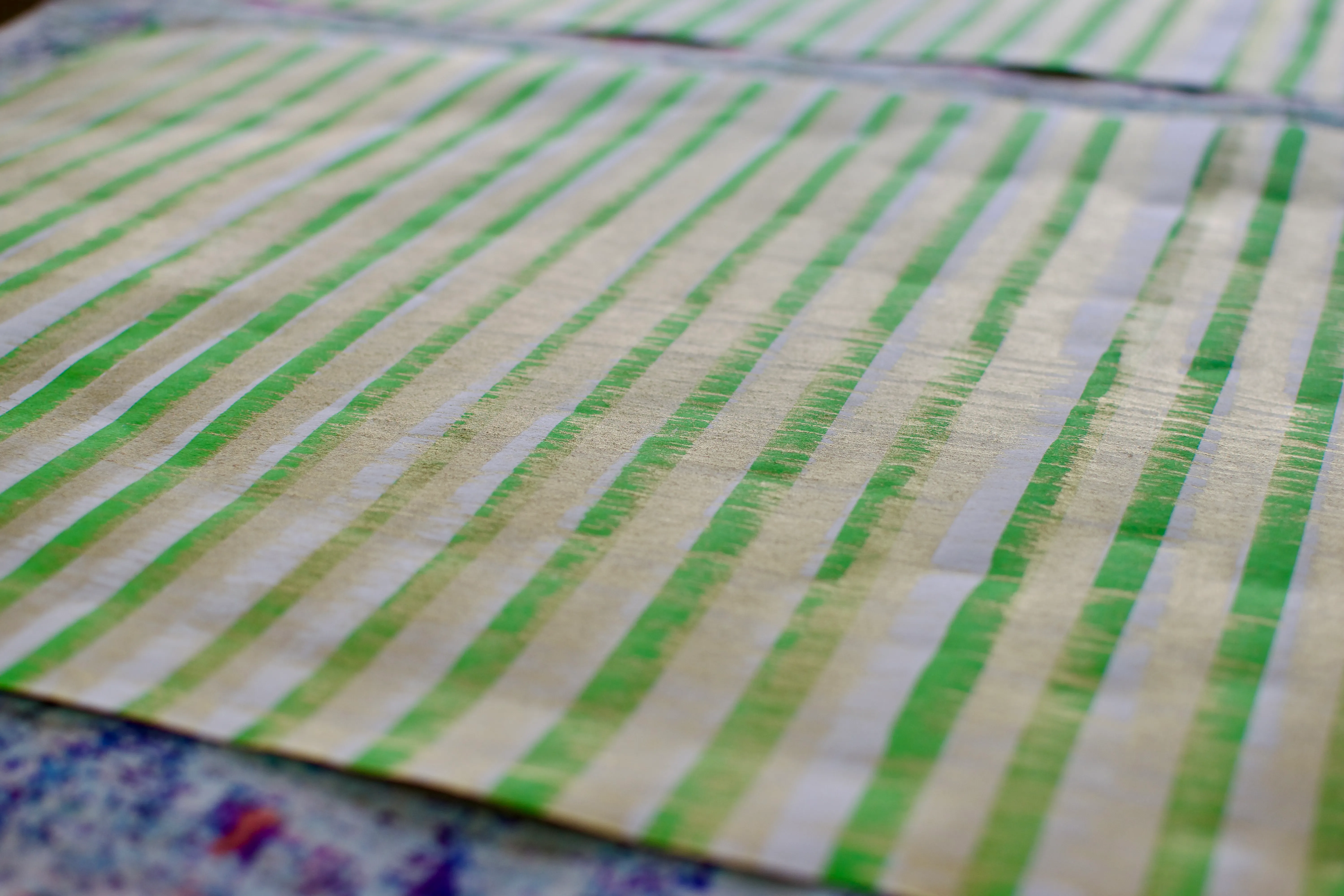
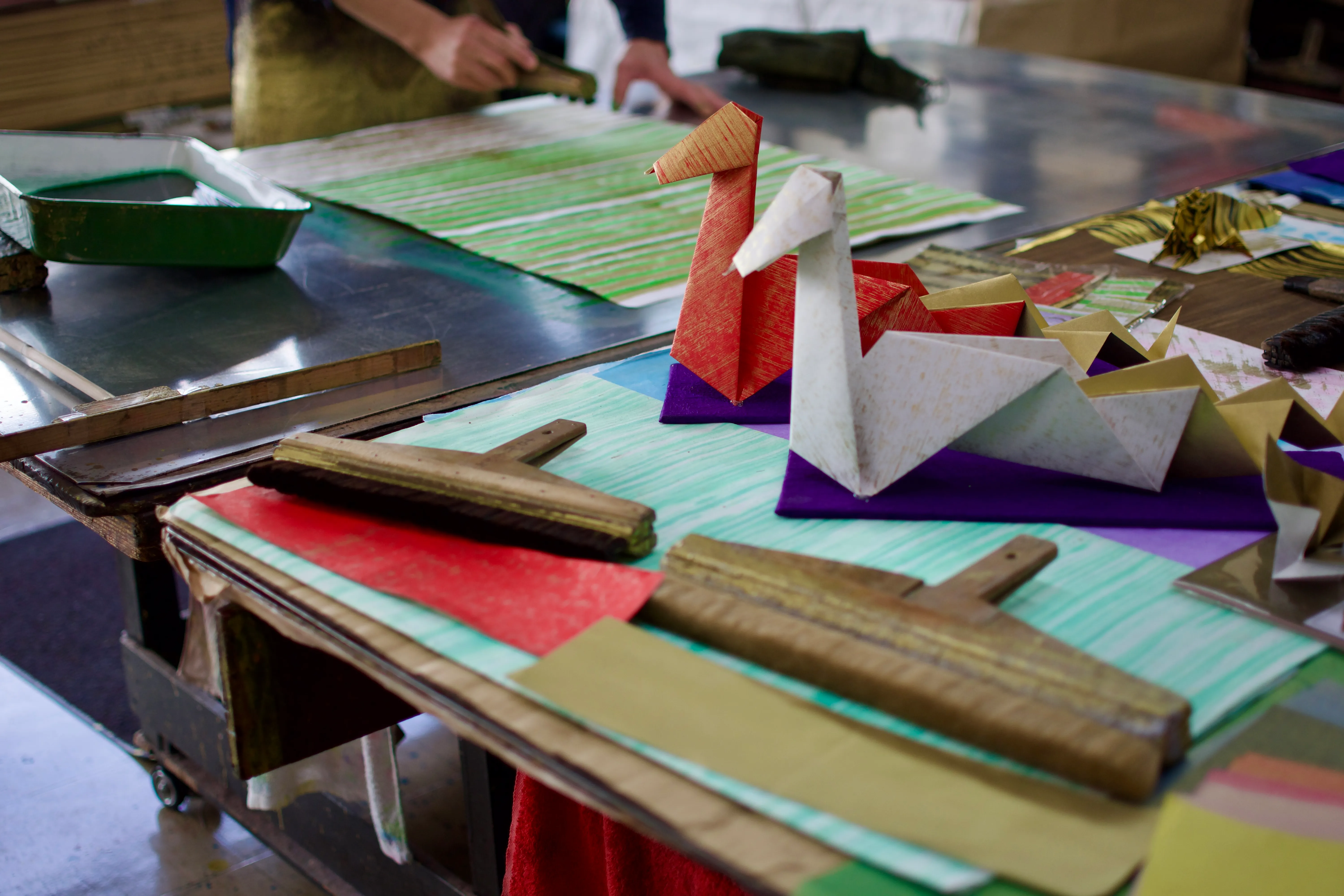
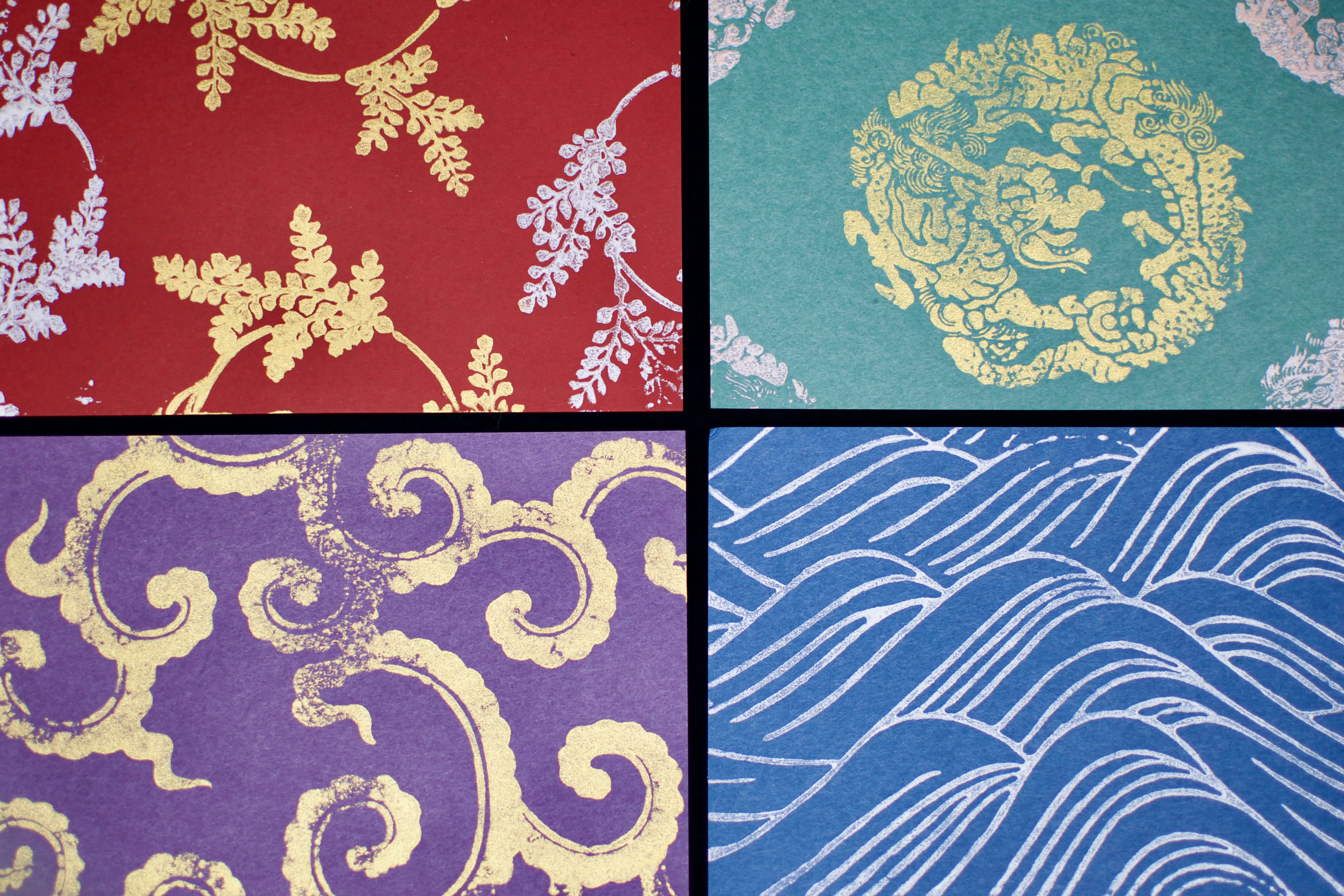
I visited the Ochanomizu Origami Kaikan (お茶の水おりがみ会館) as a fun little diversion in Tōkyō. The centre is part shop, part school, and part studio. I got to take some photos of the paper-dying process and took home some supplies that might inspire me to make some more origami soon!
Paper is dyed a solid colour and then flattened and compressed.
Origami paper can be dyed, painted, or both depending on the intended pattern. When I visited, the artisan was using a special multi-headed brush to paint green stripes on one side of the paper; the other side had already been painted gold using a very wide, soft brush to achieve a consistent finish. The result is a pattern perfect for folding into snake decorations for the upcoming new year!
The tools, process, and results of making origami paper.
-
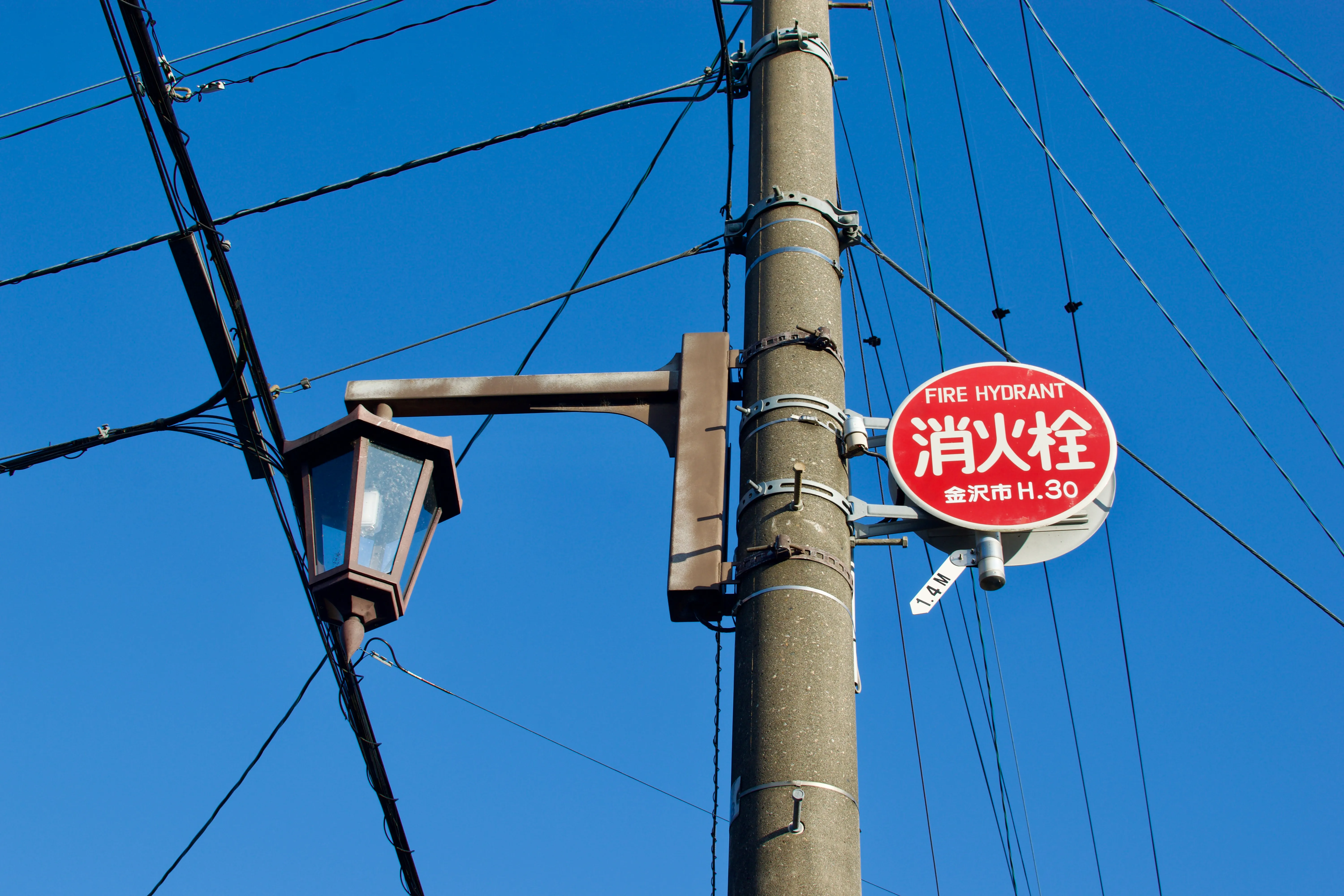
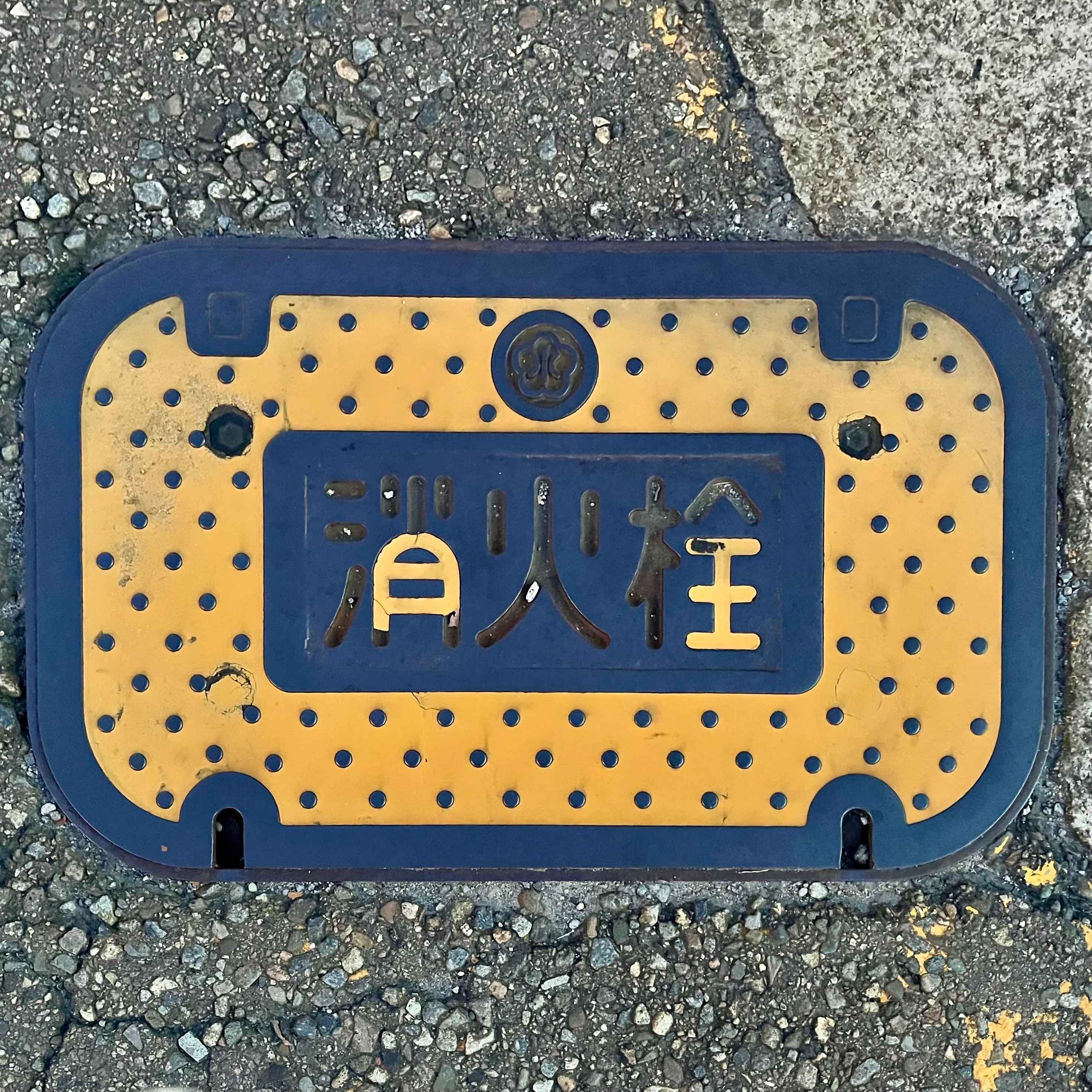
As you might have guessed from an earlier post, I have acquired a minor obsession with the colours of fire hydrants. You can bet I had my eyes peeled in Japan to see how hydrants look there — and the answer was fascinating!
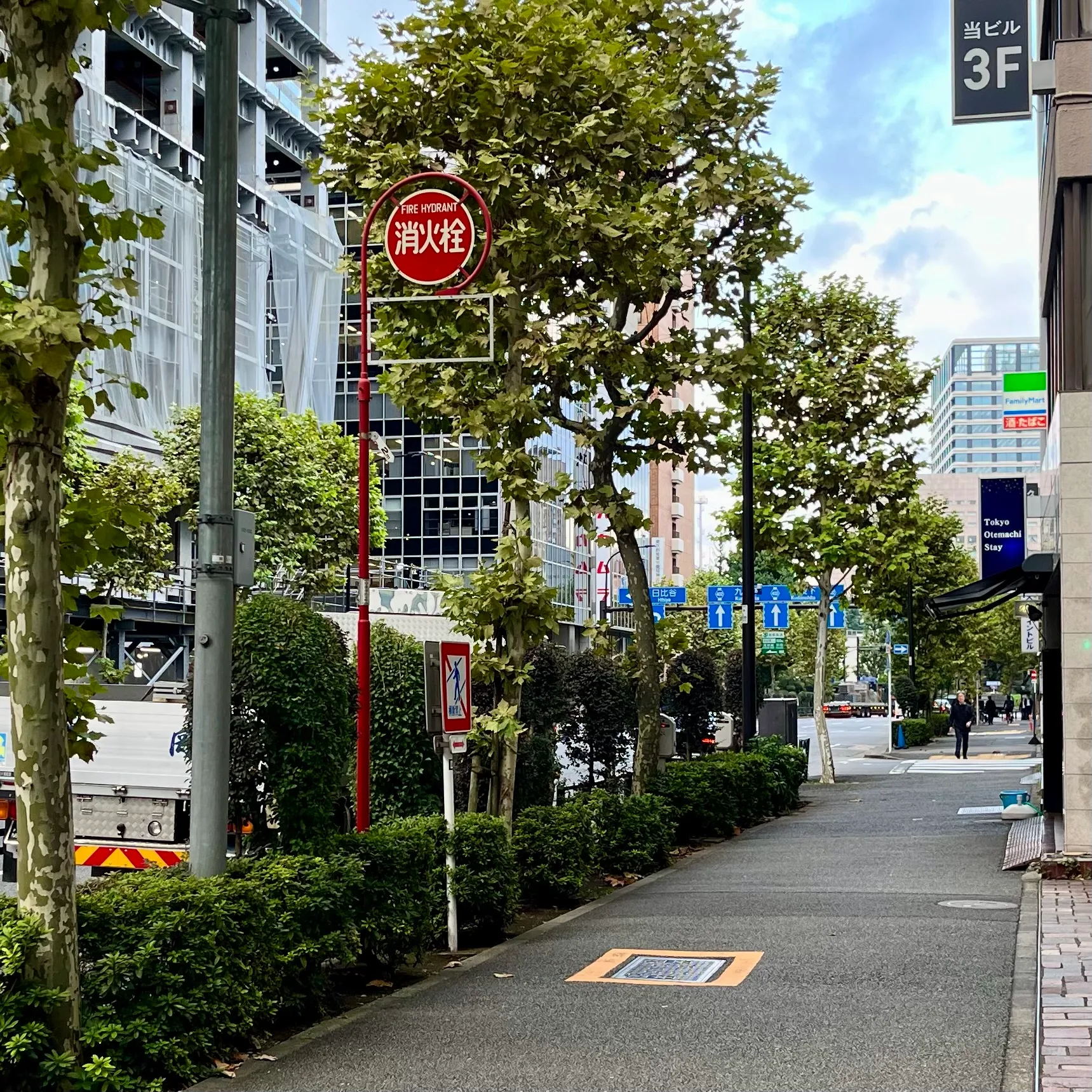
The first things I noticed in Tōkyō were the round red signs everywhere indicating the presence of a fire hydrant (消火栓)… and a distinct lack of fire hydrants.
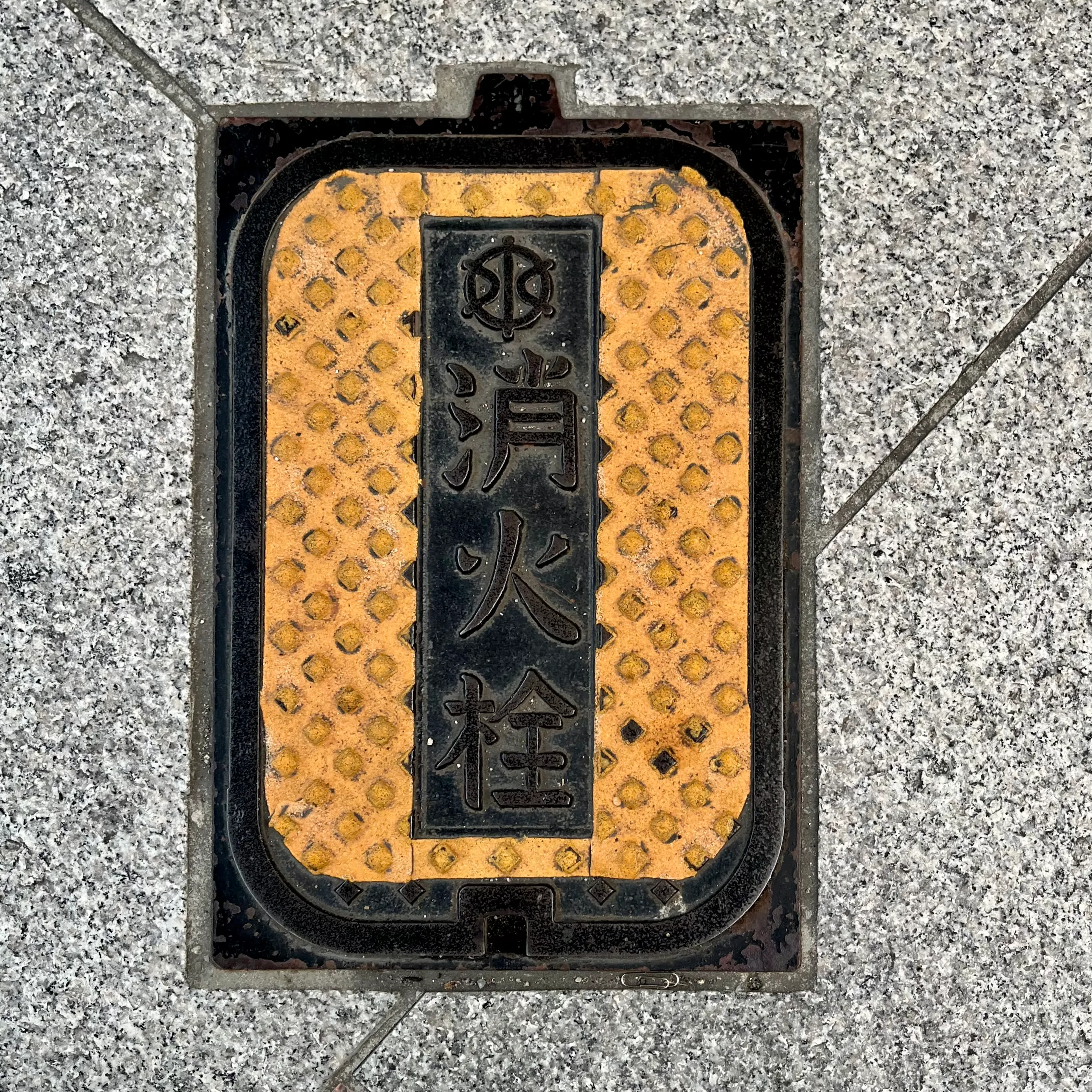
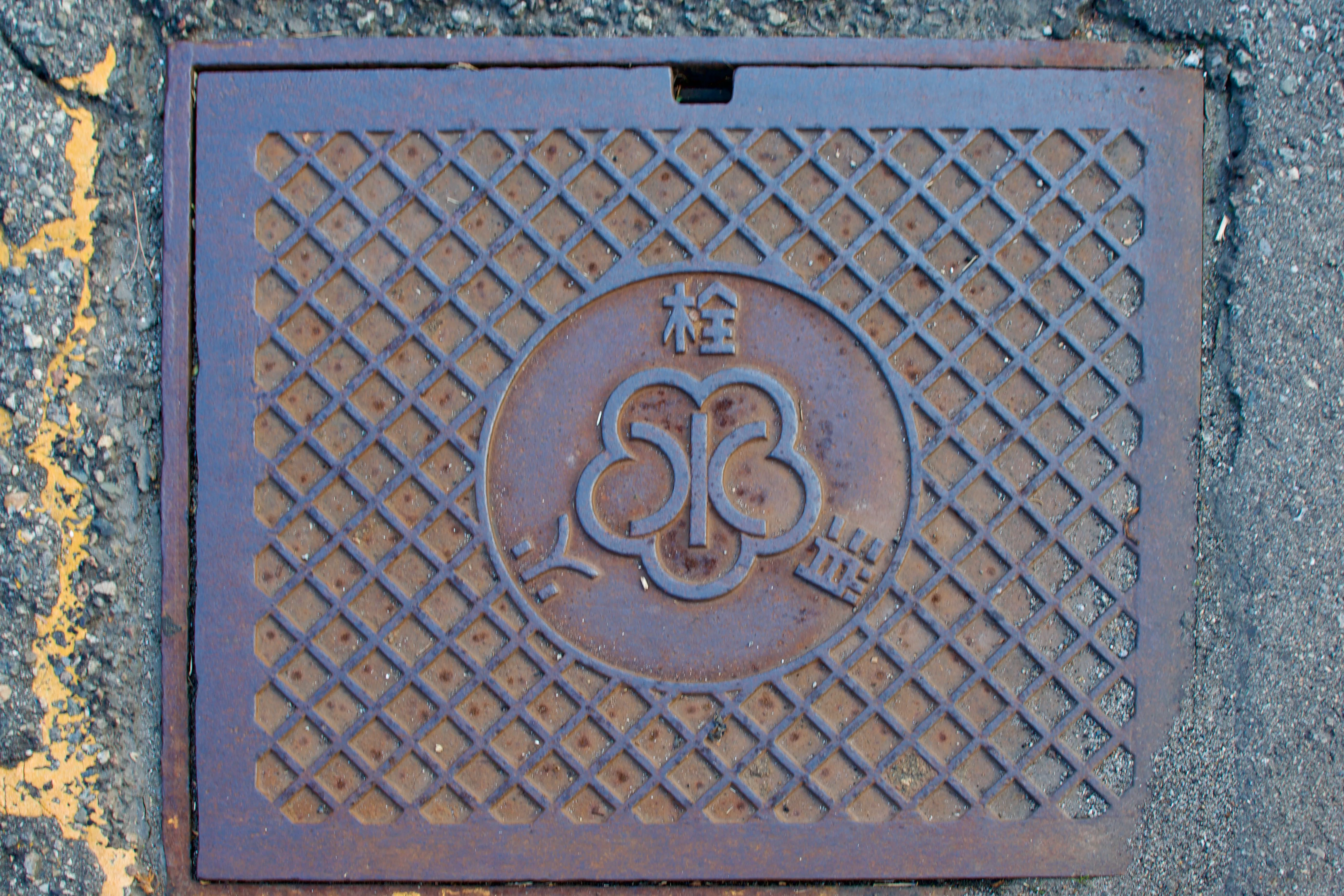
It turns out that hydrants in Japan are generally installed underground except in particularly snow-prone areas. The signs point to the plate on the road or sidewalk that covers the hydrant cap.
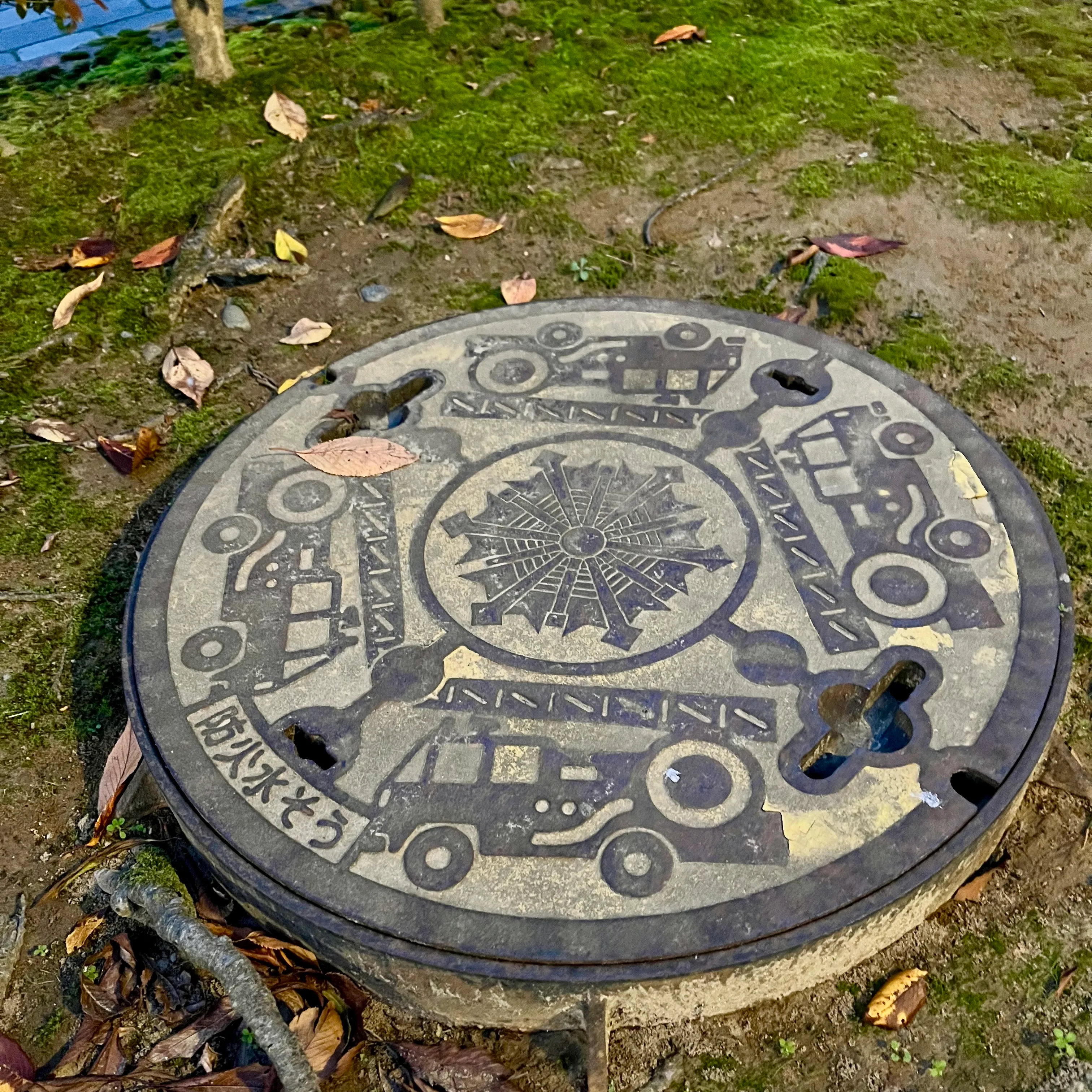
Fire hydrant and fire cistern covers in Tōkyō, Kanazawa, and Kyōto.
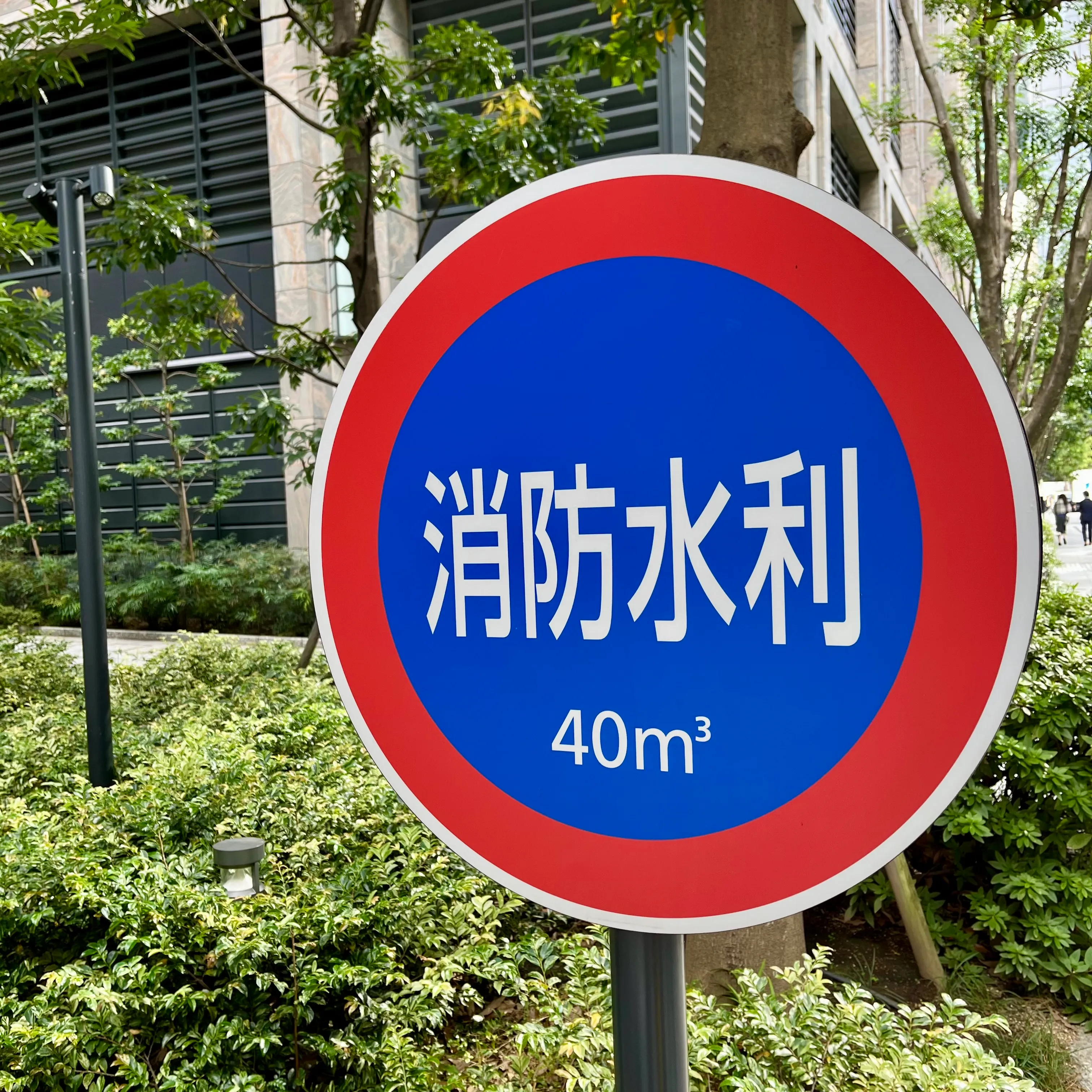
Many parks and private property also have fire cisterns (防火水槽) and other water conservancies (消防水利) that store water to fight fires after a major earthquake, when the main water network may be damaged.
Water conservancies for fire prevention in Tōkyō.
Hoses, pumps, and other fire suppression equipment are scattered throughout the city so that trained residents and disaster volunteers can use them to suppress fires during a major disaster.1
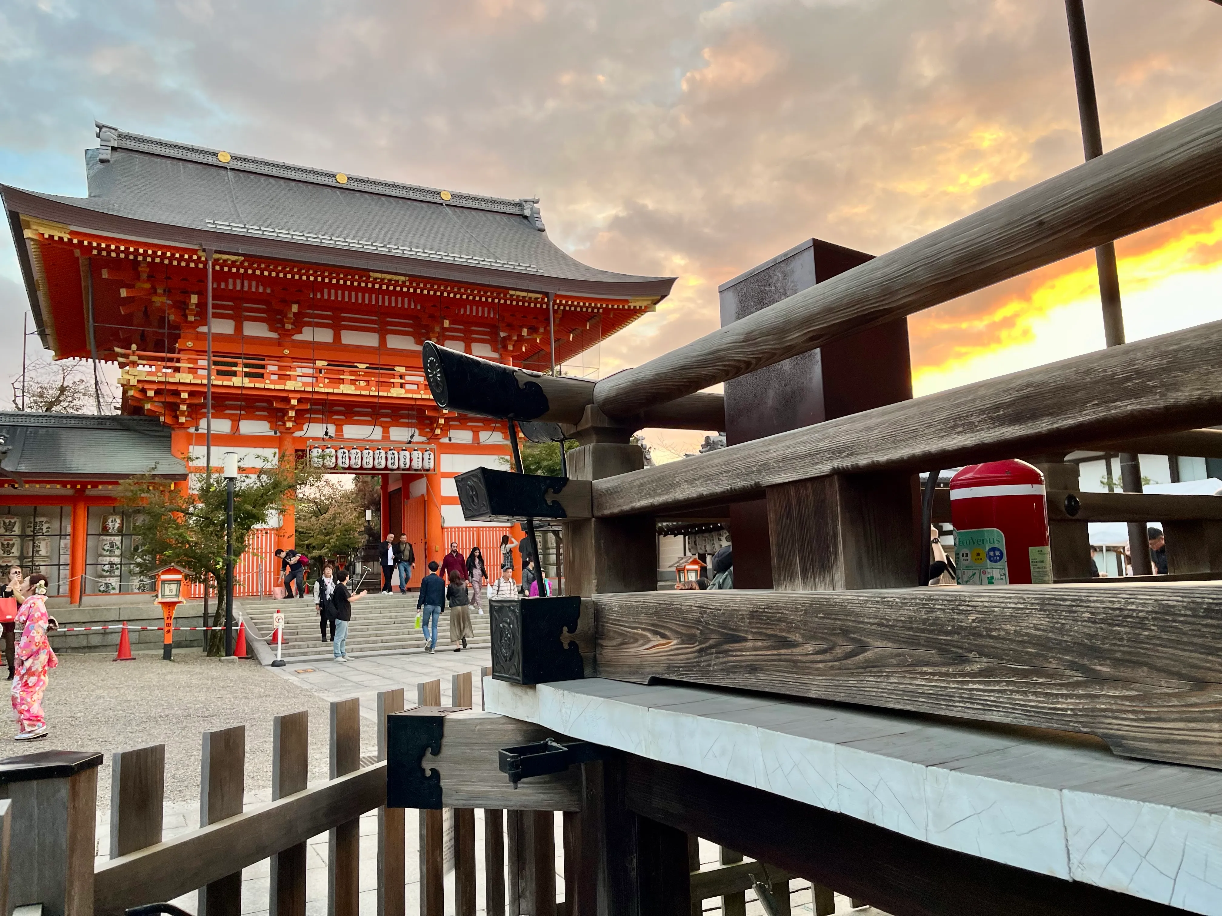
A fire extinguisher tucked in the corner of Yasaka Shrine (八坂神社).
-
Apparently Vancouver has its own neighbourhood volunteer program in its disaster response plans, although it’s not clear whether it’s still active. I’d love to hear more!
-
