A while ago I arbitrarily decided that I needed a favourite three-digit number (don’t ask) and ended up choosing 216. It’s a nice cube number — 6×6×6 — and can also be expressed as a sum of three smaller cubes:
63=53+43+33
The Wikipedia article for the number has a diagram showing one way to reassemble a 6×6×6 cube into three smaller cubes, but I’ve been playing around looking for other, more aesthetically pleasing methods. Here’s one I found.
First, we break the 6×6×6 cube into its 4×4×4 interior, six 4×4×1 faces, twelve 4×1×1 edges, and eight 1×1×1 corners:1 i.e.,
63=43+6⋅42+12⋅41+8⋅40
Decomposing the cube according to its polytope boundaries.
The 4×4×1 faces can be combined with seven of the edges and one of the corners to build a 5×5×5 cube. The remaining five edges can be split into ten 2×1×1 chunks and arranged with the remaining seven corners to form a 3×3×3 cube.
Rearranging the pieces into smaller cubes.
The final three cubes.
There are many more ways to construct three cubes from the pieces of a 6×6×6 cube. What’s your favourite?
As an aside, this decomposition can be done with any size cube and even in any
number of dimensions. An n-dimensional
hypercube of size x≥2
breaks into k-dimensional
polytope boundary chunks as xn=∑k(kn)2n−k(x−2)k.
Baskin-Robbins famously sells 31 flavours of ice cream at a time. But because a standard freezer holds an even number of buckets, they actually display 32 slots and have one flavour appear twice.
(They might also use it for a vegan version of a flavour, which isn’t an exact duplicate but isn’t counted as a distinct flavour either.)
My favourite etymology fact is that “helicopter” is helico-pter — Greek for “spiral wing”. It’s obvious when pointed out, but I’d never have realized it on my own since in English it’s always broken down as heli-copter!
Relatedly, Magic: The Gathering has a creature type called Thopter, which is a rebracketed abbreviation of the word “ornithopter” (from ornitho- meaning bird, and pter meaning wing).
[M]ost of the things we buy have to be paid for twice. There’s the first price, usually paid in dollars, just to gain possession of the desired thing, whatever it is: a book, a budgeting app, a unicycle, a bundle of kale. But then, in order to make use of the thing, you must also pay a second price. This is the effort and initiative required to gain its benefits, and it can be much higher than the first price.
The implication of this sign is that some of the birds in the park are not considered wildlife. Are pigeons wildlife?
It’s easy to confuse the flags of Australia and Aotearoa New Zealand if your eyes don’t know what to look for.
I had always distinguished between the two by the colour of the stars in the Southern Cross, but that’s sometimes hard to tell at low resolution. There’s a much easier way to tell them apart: AUS has a giant extra star in the lower left quadrant.
AUS 🇦🇺
NZL 🇳🇿
Today I learned the reason why Vancouver has two impressive-looking historic train stations: they were built by two different companies to serve as the terminus of two different railways.
Anyways, neither station is currently used by the company that built it, with Waterfront Station serving as the regional public transit hub and Pacific Central Station used by Via Rail, Amtrak, and various intercity bus companies.
The Legend of Zelda: Tears of the Kingdom calls your attention to the sky… but there’s more weird stuff up there than just the floating islands.
If you look into Hyrule’s sky at night, you’ll see the stars do not move while the moon races from one horizon to the other.
This means that the cosmology of the Zelda universe is significantly different from our own; if Copernicus was Hylian he’d have to give up on the heliocentric model.1
That’s not the only astronomical oddity in Tears of the Kingdom. The sun’s position at sunrise and sunset doesn’t make sense. On Earth, the sun doesn’t always rise and set exactly in the east and west. In the (boreal) summer, the sun rises and sets further north, providing us in the Northern Hemisphere with more hours of sunlight each day.
Here in the Vancouver summer, the sun currently rises 38° north of east and sets 38° north of west. In Tears of the Kingdom the sun rises around 4:00 and sets around 9:00,2 so you’d expect them to happen at similar angles instead of due east and west.
This is more evidence towards a geocentric model of Hylian cosmology, since the timing and position of sunrise and set can be explained if the sun orbits a point directly above Hyrule.
The strangest phenomenon I noticed is the fact that moon only appears at night. Sure, we culturally associate the moon with night, but in reality it’s out during the day half the time. This is what gives the moon its phases; the closer the moon is to the sun in the sky, the less of it appears illuminated to us on Earth. If the moon always rises and sets at the same time of day, its phases cannot be explained as the reflected light of the sun!
The simplest explanation would be that Link is observing the rotation of a moon with one luminescent side, but I looked closely and the half-moon has the same face as the full moon. This means that, like Earth’s moon, the Hylian moon is tidally locked3 and always shows the same face.
A model for the cosmology of the world of Zelda.
My best theory is that the moon is made of a fluorescent material and is orbited by a small body that emits ultraviolet or other high-energy light in the non-visible spectrum. Do you have an alternative headcanon theory?
Technically, a fixed starfield is also consistent with a heliocentric model
where stars are small luminous objects embedded on a celestial
sphere rotating around and
at the same rate as the world. But that model doesn’t explain the other
oddities in this post.
Sunrise and sunset times in Tears of the Kingdom varies with location and
elevation. With enough precise measurements, you could in theory figure out
whether the world of Zelda world is flat or round — if you want to be the
Eratosthenes of Hyrule and
compute the size of the planet, please let me know your results!
Speaking of tidal forces, the fact that Hyrule has no discernable tides on its
coastline suggests that its moon is significantly smaller and closer than
Earth’s moon, which would be consistent with the events depicted in Majora’s
Mask.
Julius Caesar’s given name wasn’t “Julius”. That was his full family name — the Caesars being a branch of the Julia family — and his personal name was Gaius.
In his time, he was referred to as Gaius Caesar or simply as Caesar by himself and his contemporaries. Calling him “Julius Caesar” would have been redundant since every Caesar was a Julius.
The Romans had a lot of traditions around names. Gaius Julius Caesar inherited his name from his father, grandfather, and great-grandfather.
Caesar’s great-nephew Gaius Octavius Thurinus also took the name Gaius Julius Caesar when he inherited the assassinated dictator’s estate. To prevent confusion, he’s often called Octavianus, meaning “the guy formerly known as Octavius”. The emperor Caligula, Octavian’s great-grandson, was also named Gaius Caesar; we know him by a nickname he received as a small child.
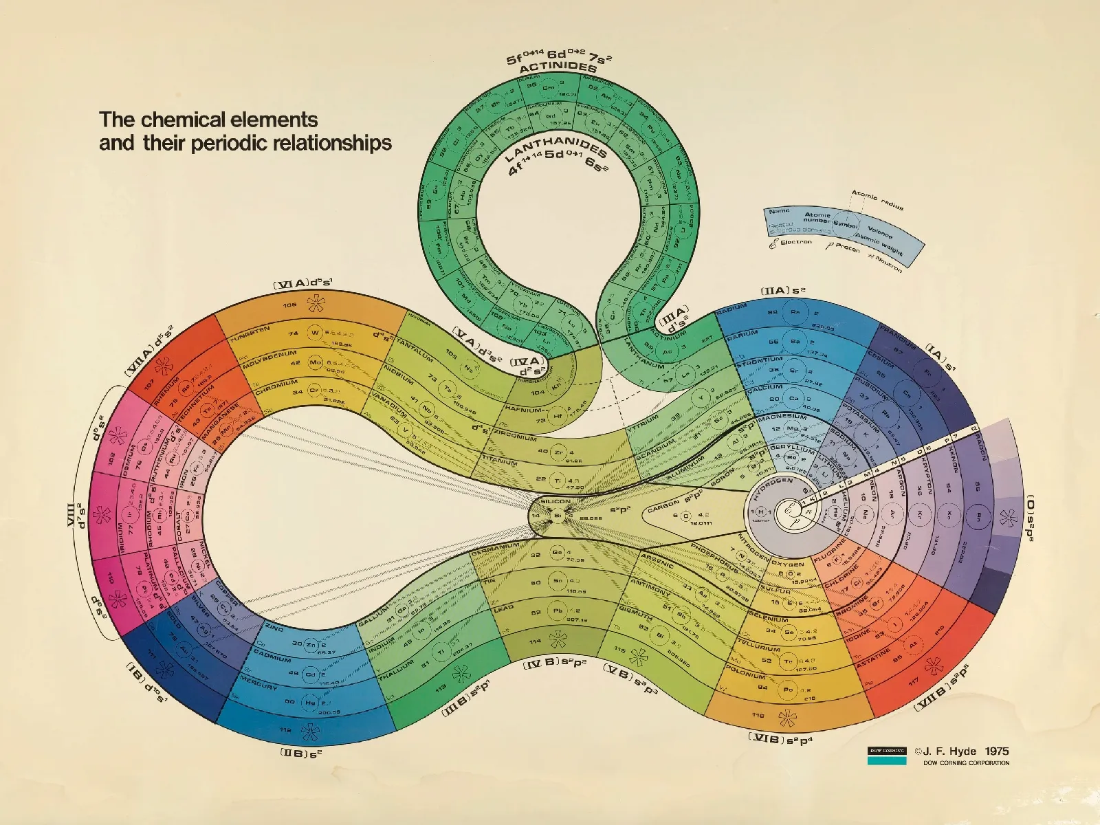
The standard Periodic Table is an iconic data visualization, but it’s not the only way to represent the relationships between elements. This beautiful “ribbon” version was designed by James Hyde in the 1970s.
James Franklin Hyde was a pioneer in the silicone industry, so it’s appropriate that periodic ribbon puts the element silicon in the center and highlights its relationships to the other elements.
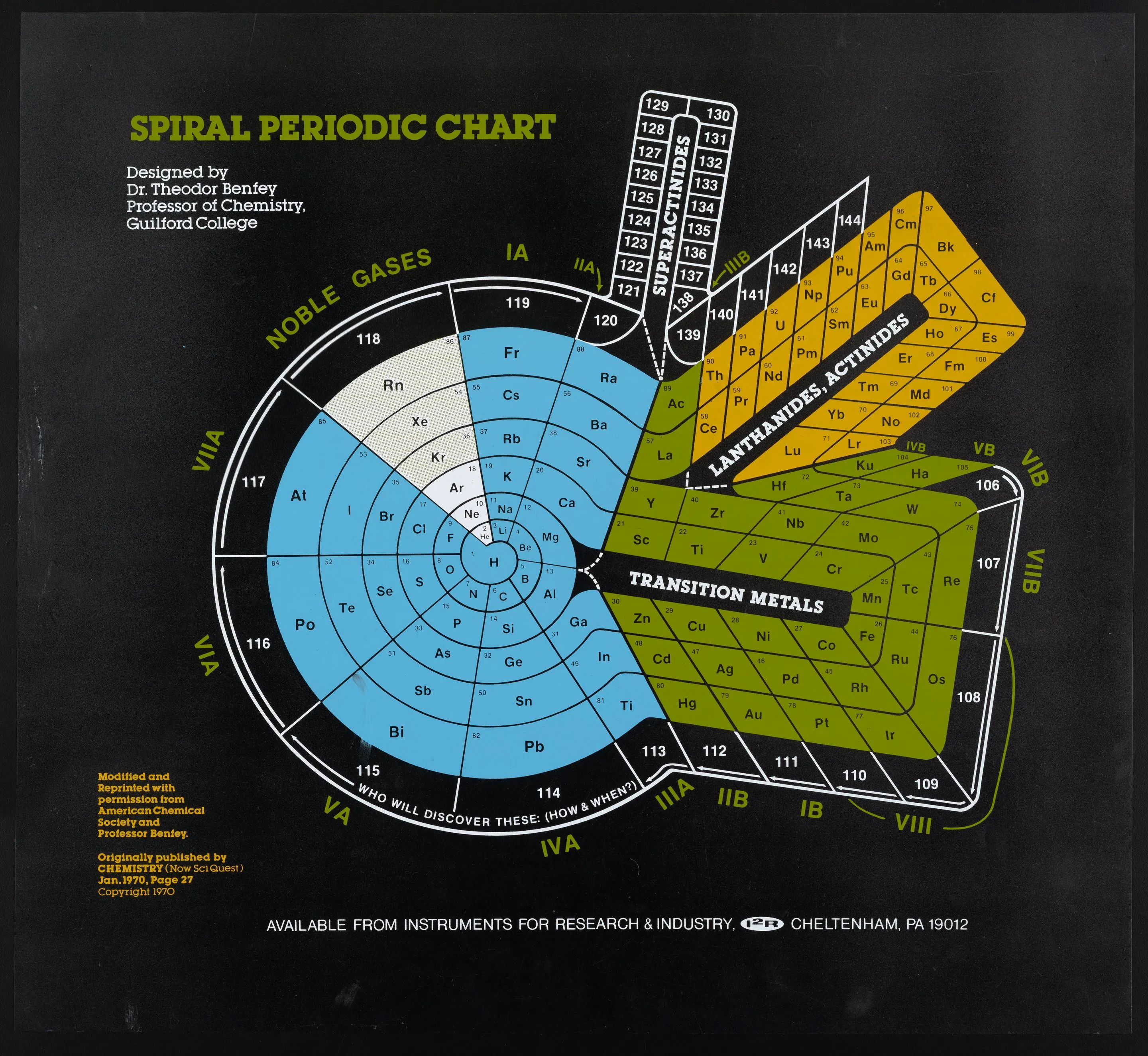
Hyde may have been inspired by the spiral chart published by Theodor Benfey in the same journal a few years earlier.
Between cabbage, lettuce, maple, and holly, two plants are in the rosid clade (related to roses) and two are in the asterid clade (related to sunflowers). Can you guess which is which?
I would have guessed that the trees might be related to a woody rose bush, while the leafy greens would be closer to broad-leaved sunflowers. I would have been wrong. Plants are much weirder than that.
As it turns out, a lot of the categories we use to think about plants — trees, bushes, berries, vegetables, and so on — are not particularly unique from an genetic perspective. Biologist Georgia Ray explains:
On the evolutionary tree of plants, trees are regularly interspersed with things that are absolutely, 100% not trees. This means that, for instance:
The common ancestor of a maple and a mulberry tree was not a tree.
The common ancestor of a stinging nettle and a strawberry plant was a tree.
And this is true for most trees or non-trees that you can think of.
Because of this, there are plenty of plant lists you can play “One of these things is not like the others” with where the intuitive answer is very different from the phylogenetic answer.
If you shuffled all the plants on this taxonomy tree, I would not be able to
tell the difference.
Blueberries are in the order Ericaceae; the others are in Rosales.
Brazil nuts are asterids; the others are rosids.
Papayas are eudicots; the others are monocots.
Every new emoji starts with a formal proposal justifying why it should exist. The proposal for 🫵 starts with four pages of the history of people pointing at the viewer in art.
Only a few emoji are accepted every year, but anyone can submit suggestions for new emoji. For example:
You can find most emoji proposals linked from their Emojipedia page. Here are a few interesting or funny submissions I’ve seen. (All quotations cleaned up.)
One of the oldest drawings to explore this perspective of the pointing finger is that of Pontormo, an Italian painter of the 16th century. A handful of Baroque examples can also be found.
In 1914, influenced by a cigarettes ad and by advertisement rhetoric in general, the British graphic designer Alfred Leete created the first recruitment poster of its kind. Since then, the number of remixes of those posters — in particular of James Flagg’s 1917 “Uncle Sam Wants You” poster — have grown immensely.
The yo-yo has been around for at least 2,500 years, but reached new popularity in the 1920s when Pedro Flores popularized a new method of attaching a string to the axle that allowed the yo-yo to “sleep”.
Since then, several yo-yo booms have swept the world, often on 7 year cycles of boom and bust. Some may say that the yo-yo has its ups and downs.
Currently, emojis only depict people assigned female at birth in a role of pregnancy. If emojis are designed in a manner to be as inclusive as possible this emoji should present its gender more ambiguously.
Additionally, a major gap in the emoji inventory is a manner to depict satisfaction after eating a great meal.
The oldest known example of a knitted object dates back to 11th century Egypt but the complexity of the design of those ancient Egyptian socks suggest that knitting was not new, even then.
The interest in dinosaurs is even stronger than the Google Trends comparisons suggest. People do not search for news on dinosaur attacks, as they would on sharks, lions, snakes, and alligators. The prudent individual rarely searches for dinosaur-skin shoes, nor do they look for an available source of local dinosaur sushi.
Books about dinosaurs range from nonfiction descriptions of the now-extinct animals, to fictional thrillers, like Michael Crichton’s Jurassic Park, to the 488 (!!) books identified as “Dinosaur Erotica” in Amazon’s Kindle store.
The CRC Handbook of Chemistry and Physics is a 2600-page tome of random facts and figures, from the speed of sound in various media to the chemical composition of the human body.
My sixth-grade teacher’s copy was one of the most fascinating objects of my childhood, and it still makes me giggle with delight.
To give a taste of what the book is like, here’s an abridged version of section 15-39 “Density of various solids”. The idea that someone would need a handy reference for the density of cardboard, sandstone, butter, and thirty-eight different kinds of wood is hilarious — but they must be the most interesting person in the world!
Material
Density
Amber
1.06–1.11
Asbestos
2.0–2.8
Asphalt
1.1–1.5
Beeswax
0.96–0.97
Bone
1.7–2.0
Brick
1.4–2.2
Butter
0.86–0.87
Cardboard
0.69
Chalk
1.9–2.8
Charcoal, oak
0.57
Charcoal, pine
0.28–0.44
Clay
1.8–2.6
Cork
0.22–0.26
Diamond
3.51
Gelatin
1.27
Glass
2.4–2.8
Granite
2.64–2.76
Ice
0.917
Iron, cast
7.0–7.4
Limestone
2.68–2.76
Paper
0.7–1.15
Polyethylene
0.92–0.97
Porcelain
2.3–2.5
Quartz
2.65
Rubber, hard
1.19
Sandstone
2.14–2.36
Sugar
1.59
Wood, balsa
0.11–0.14
Wood, bamboo
0.31–0.40
Wood, cedar
0.49–0.57
Wood, mahogany
0.66–0.85
Wood, oak
0.60–0.90
I’m on a quest to explore the creeks and waterways of Vancouver, Burnaby, and New Westminster. First, I need to understand how the topography of my neighbourhood determines the flow of water and the formation of streams.
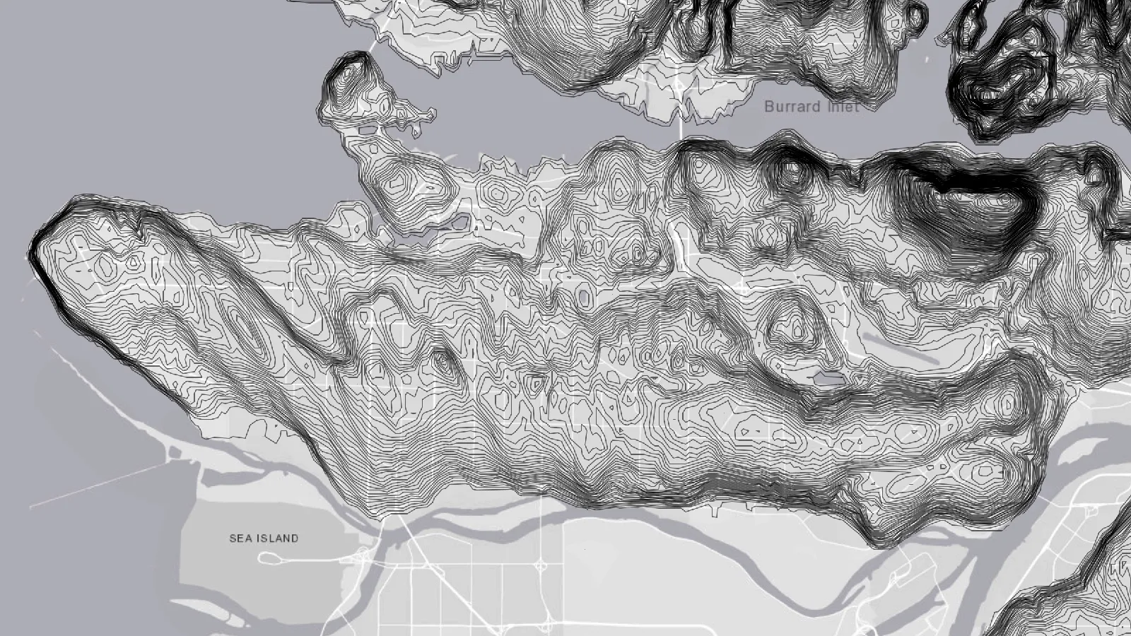
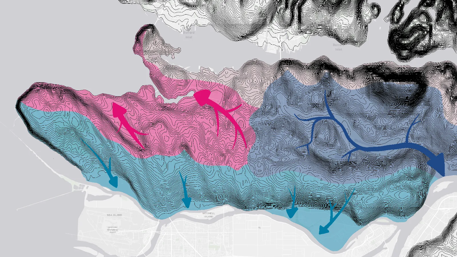
A topographic map of the Burrard Peninsula.
Three main topological features define how water flows in the Vancouver-Burnaby-New West area:
a chain of hills running along səl̓ilw̓ət (Burrard Inlet) from East Vancouver to Coquitlam, including Capitol Hill and lhuḵw’lkuḵw’áyten (Burnaby Mountain);
a ridge extending from t̕θəcəliʔqʷ (UBC) to sχʷeyəməɬ (New Westminster) along the southern half of the peninsula, with peaks at Little Mountain and the Metrotown area; and
weirdly enough, a barely perceptible incline between Nanaimo Street and Renfrew Street in East Vancouver.
These features divide the Burrard Peninsula into four watersheds, which determine where a falling raindrop will flow
north, into səl̓ilw̓ət (Burrard Inlet),
northwest, into False Creek/English Bay,
south, into stal̓əw̓ (the Fraser River), or
east, through Still Creek, Burnaby Lake, and the Brunette River, before returning west via stal̓əw̓ (the Fraser River).
Most of the historic streams of Vancouver have been developed over, so rainwater now is mainly conveyed through storm drains and groundwater. In contrast, Burnaby still has plenty of streams carrying rain through its watersheds.
I’ll be exploring these streams and attempting to trace them from source to mouth. Stay tuned for more!
This picture illustrates the danger of poorly-designed streets, which the Swedish government set out to improve in the 1990s. It was originally created by Swedish artist Karl Jilg, who was commissioned by the Swedish Road Administration to explain new Vision Zero initiatives.
The responsibility for preventing deaths and injuries on the road transportation system partly rests with the people who design that infrastructure, and
Deaths and injuries on the road ultimately come down to kinetic energy.
The picture is intended to turn the kinetic energy of a moving car into a height to show the consequences of simple human mistakes in the road system. Research shows that the highest acceptable speed on a street with active users like this is 30km/h.
Pedestrians navigate the dangerous chasms of city streets. (Karl Jilg /
Vägverket)
The image has been widely shared, thanks in part to a 2014 Vox article that used it to call attention to other pedestrian-hostile aspects about many cities’ street designs:
Most roads in the US are built for cars, not for pedestrians. This brilliant illustration shows just how lopsided the the proportions of a normal urban street corner really are.
The city sidewalk picture is just one of a series of four that Jilg illustrated for the Swedish government. The other one I found is set on a highway.
A car moving at highway speeds has a lot of kinetic energy. (Karl Jilg /
Vägverket)
I’m not sure whether Jilg did any calculations to create these, but a head-on collision between two cars at highway speed is approximately equivalent to a single car being dropped from a height of 200m. Sweden added median barriers to many highways in the late ’90s, which reduced the incidence of head-on collisions and the risk of fatalities by 80%.
I have unfortunately not been able to find the other two illustrations in the set. Jilg has, however, done other work for the Swedish government.
A less striking example of Jilg’s work. (Karl Jilg / Vägverket)
If you see a coyote in Vancouver, the officially recommended course of action is to yell “Go away coyote”.
Leah and I have really gotten into Magic: the Gathering. Our favourite ways to play are sealed deck and Jumpstart, both of which involve opening new packs and making decks out of what you open.
Since it would be wasteful (not to mention expensive) to buy new cards every time we play, we only buy a certain number of packs each set and re-use the cards we open to make our own packs for later games.
Cutout template for a 94mm × 67mm × 18mm tuck-flap box, which holds 20
unsleeved Magic cards with room to spare.
We originally tried coin envelopes and a product called Cubeamajigs, but neither was as nice or convenient as the side-loading papercraft boxes I made with my Cricut.
The above SVG image can be imported into Cricut Design Space to make boxes of your own. Or, if you want to make a box with different dimensions, a tool called Templatemaker can make similar patterns.
Here in Vancouver, the parking bylaw requires one 14m² parking space for every 20m² of supermarket floor space. Adding the necessary lanes to allow cars to get in and out, this law practically guarantees that grocery stores will be more parking lot than store.
In the late ’60s, the government sought to adopt O Canada as the national anthem. The music and original French lyrics had passed into the public domain, but the English version was still under copyright. The government settled the rights for a dollar.
Ironically, the copyright to the English lyrics would have expired anyways by the time the National Anthem Act was finally passed in 1980.