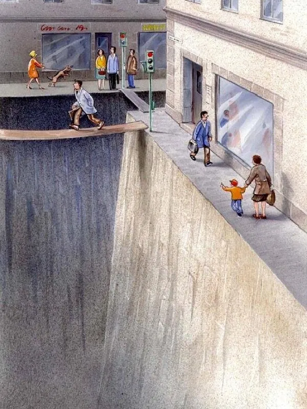
This picture illustrates the danger of poorly-designed streets, which the Swedish government set out to improve in the 1990s. It was originally created by Swedish artist Karl Jilg, who was commissioned by the Swedish Road Administration to explain new Vision Zero initiatives.
The ideas behind the initiatives were that
- The responsibility for preventing deaths and injuries on the road transportation system partly rests with the people who design that infrastructure, and
- Deaths and injuries on the road ultimately come down to kinetic energy.
The picture is intended to turn the kinetic energy of a moving car into a height to show the consequences of simple human mistakes in the road system. Research shows that the highest acceptable speed on a street with active users like this is 30km/h.

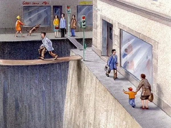
Pedestrians navigate the dangerous chasms of city streets. (Karl Jilg / Vägverket)
The image has been widely shared, thanks in part to a 2014 Vox article that used it to call attention to other pedestrian-hostile aspects about many cities’ street designs:
Most roads in the US are built for cars, not for pedestrians. This brilliant illustration shows just how lopsided the the proportions of a normal urban street corner really are.
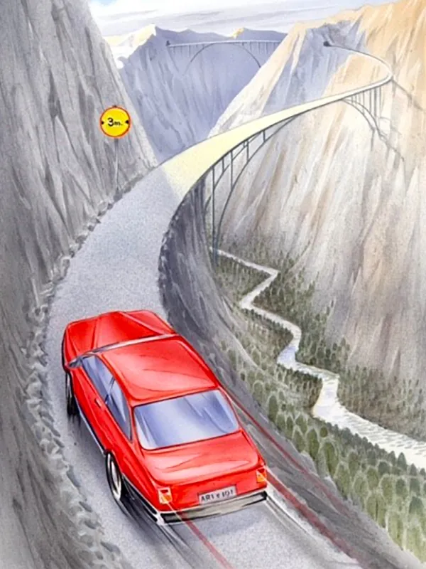
The city sidewalk picture is just one of a series of four that Jilg illustrated for the Swedish government. The other one I found is set on a highway.

A car moving at highway speeds has a lot of kinetic energy. (Karl Jilg / Vägverket)
I’m not sure whether Jilg did any calculations to create these, but a head-on collision between two cars at highway speed is approximately equivalent to a single car being dropped from a height of 200m. Sweden added median barriers to many highways in the late ’90s, which reduced the incidence of head-on collisions and the risk of fatalities by 80%.
I have unfortunately not been able to find the other two illustrations in the set. Jilg has, however, done other work for the Swedish government.

A less striking example of Jilg’s work. (Karl Jilg / Vägverket)
