-
-
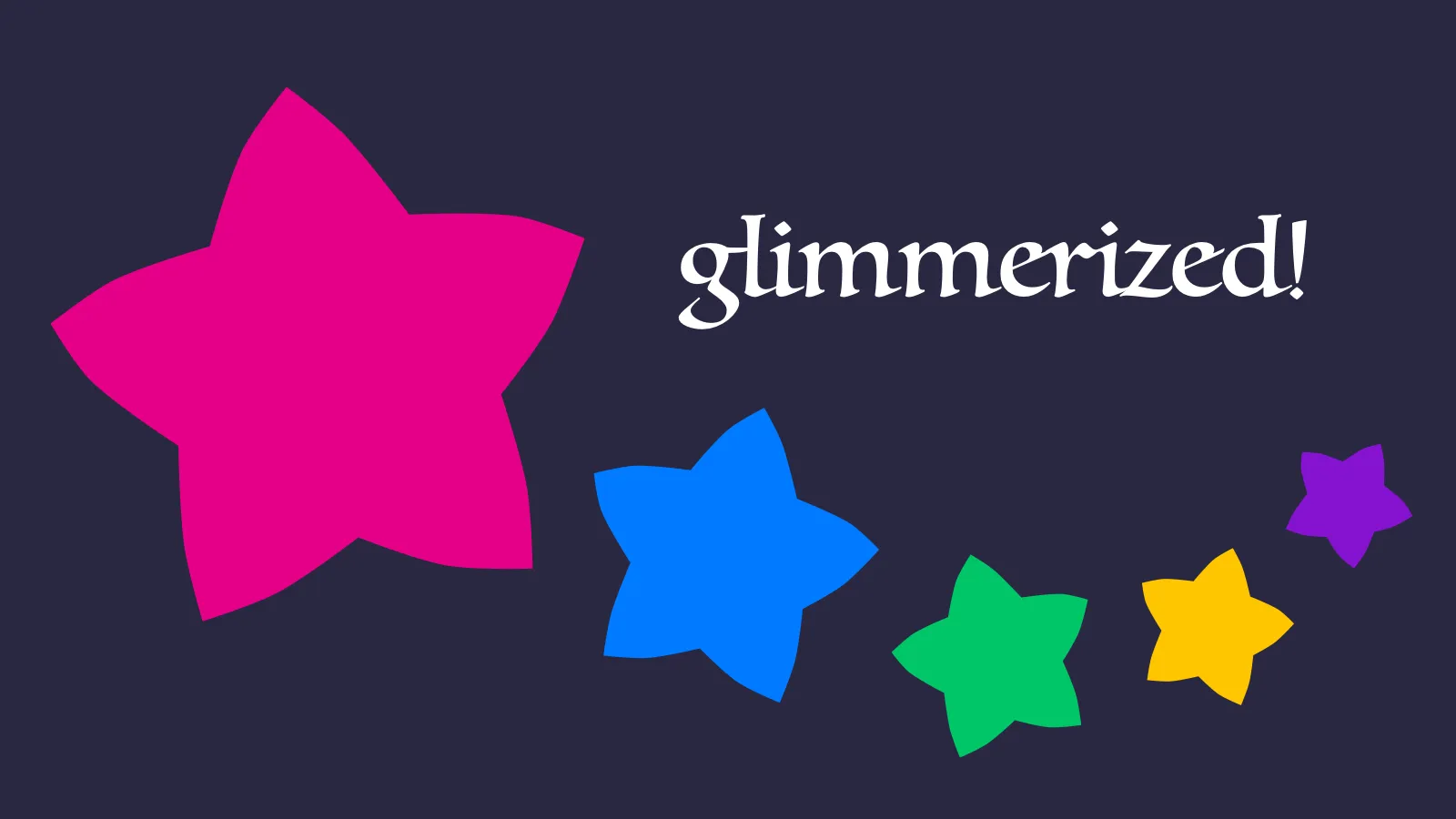
In stressful times, I sometimes cope by obsessing over finding the perfect colour palette. This has not necessarily been the healthiest of habits, but over the years I’ve converged on a delightful set of hues I’m happy to colour-code my life with.
I call the palette “Glimmerized”, and I’m publishing it here partly for my own future reference, and partly to discourage myself from tweaking it forever.
Glimmerized is based on five main colours: my favourite pink and blue, a purple in between, and a complementary green and yellow. The pink-green and blue-yellow combinations are inspired by opponent process colour theory and systems like NCS; I had those in mind when I created the Owl Beamer colour theme during another colour obsession phase a while back. But I didn’t attempt to choose perfectly opposing colours, lest I be tempted into deeper rabbit holes into the colour perception literature.
Instead, I chose a handful of colours I liked — with round coordinates in the OKLCH colour space — and built curves to let me generate any number of shades and tints of each hue.
R08 #e50088
oklch(0.6 0.25 355)
- R01
- R02
- R03
- R04
- R05
- R06
- R07
- R08
- R09
- R0a
- R0b
- R0c
- R0d
- R0e
- R0f
P08 #8613d1
oklch(0.5 0.25 305)
- P01
- P02
- P03
- P04
- P05
- P06
- P07
- P08
- P09
- P0a
- P0b
- P0c
- P0d
- P0e
- P0f
B08 #007aff
oklch(0.6 0.23 255)
- B01
- B02
- B03
- B04
- B05
- B06
- B07
- B08
- B09
- B0a
- B0b
- B0c
- B0d
- B0e
- B0f
G08 #00c669
oklch(0.7 0.23 160)
- G01
- G02
- G03
- G04
- G05
- G06
- G07
- G08
- G09
- G0a
- G0b
- G0c
- G0d
- G0e
- G0f
Y08 #ffc500
oklch(0.85 0.2 90)
- Y01
- Y02
- Y03
- Y04
- Y05
- Y06
- Y07
- Y08
- Y09
- Y0a
- Y0b
- Y0c
- Y0d
- Y0e
- Y0f
Glimmerized’s greyscale has a hint of purplish-blue to it.
K00 #0c061e
oklch(0.15 0.05 290)
- K00
- K01
- K02
- K03
- K04
- K05
- K06
- K07
- K08
- K09
- K0a
- K0b
- K0c
- K0d
- K0e
- K0f
- K10
Themes like Solarized, Dracula, and Fairyfloss taught me how nice it is to use colours you like when you spend all day looking at them. So I’m very happy to now use Glimmerized in my text editor, website, calendar, and to-do list — hopefully for a long time to come!
-
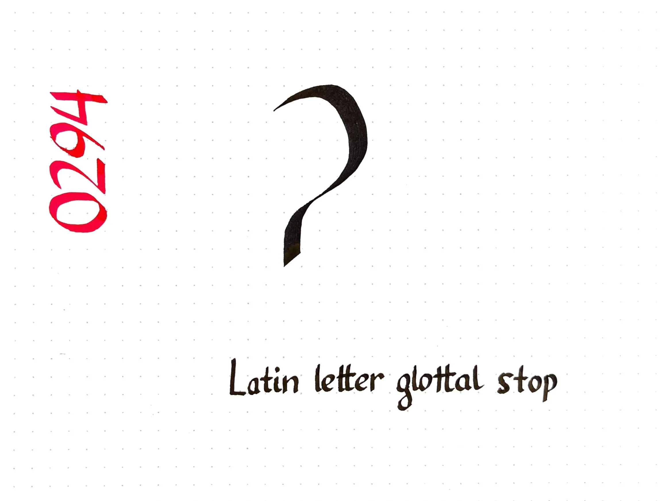
Today’s Unicode calligraphy highlights the International Phonetic Alphabet symbol for the glottal stop, the sound between the syllables of “uh-oh”. (It can also be heard if you say the phrase “glottal stop” in a Cockney accent!)
In Squamish orthography, the glottal stop is represented by the digit 7 instead of ʔ, as in Sḵwx̱wú7mesh.
-
-
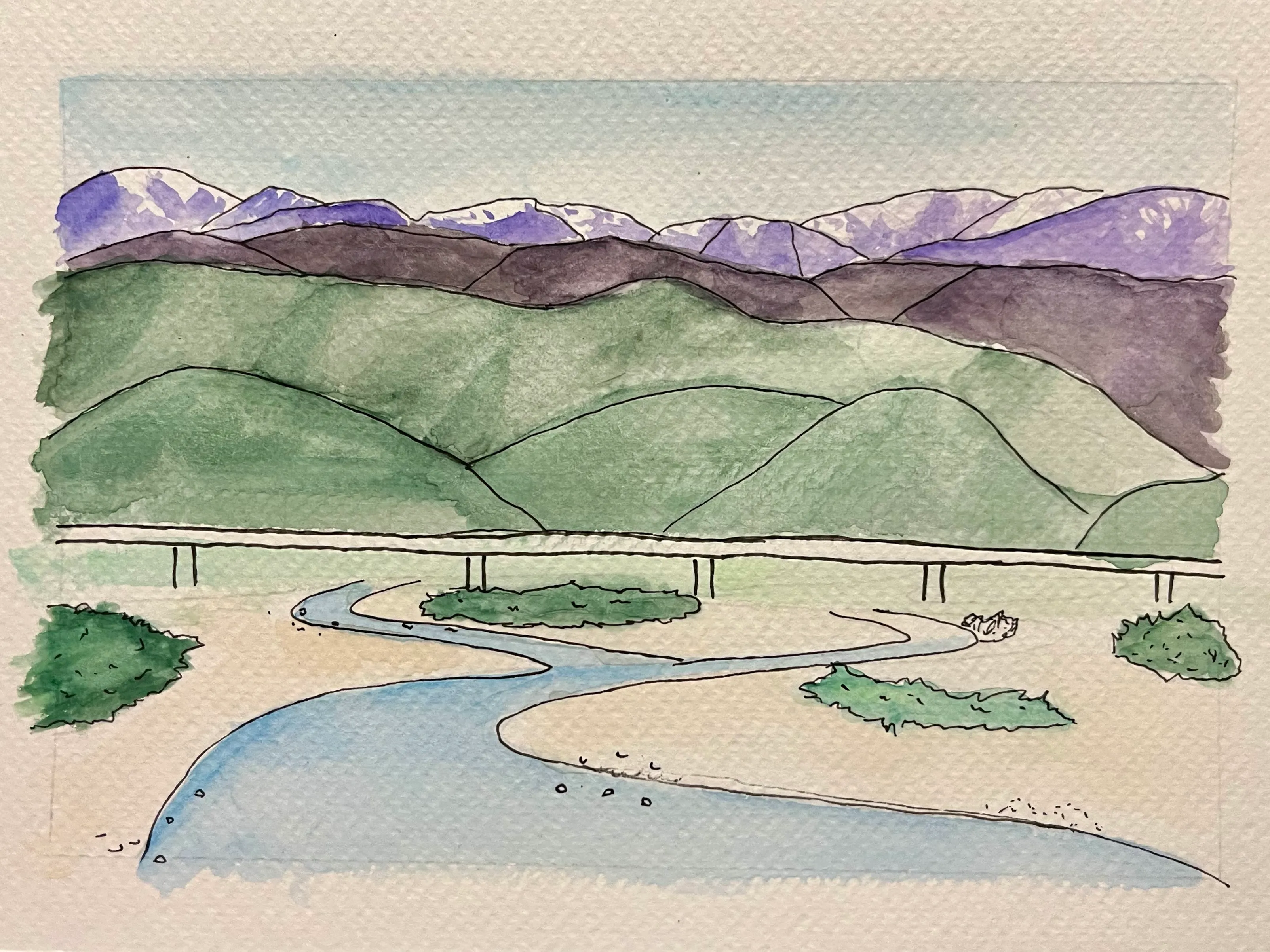
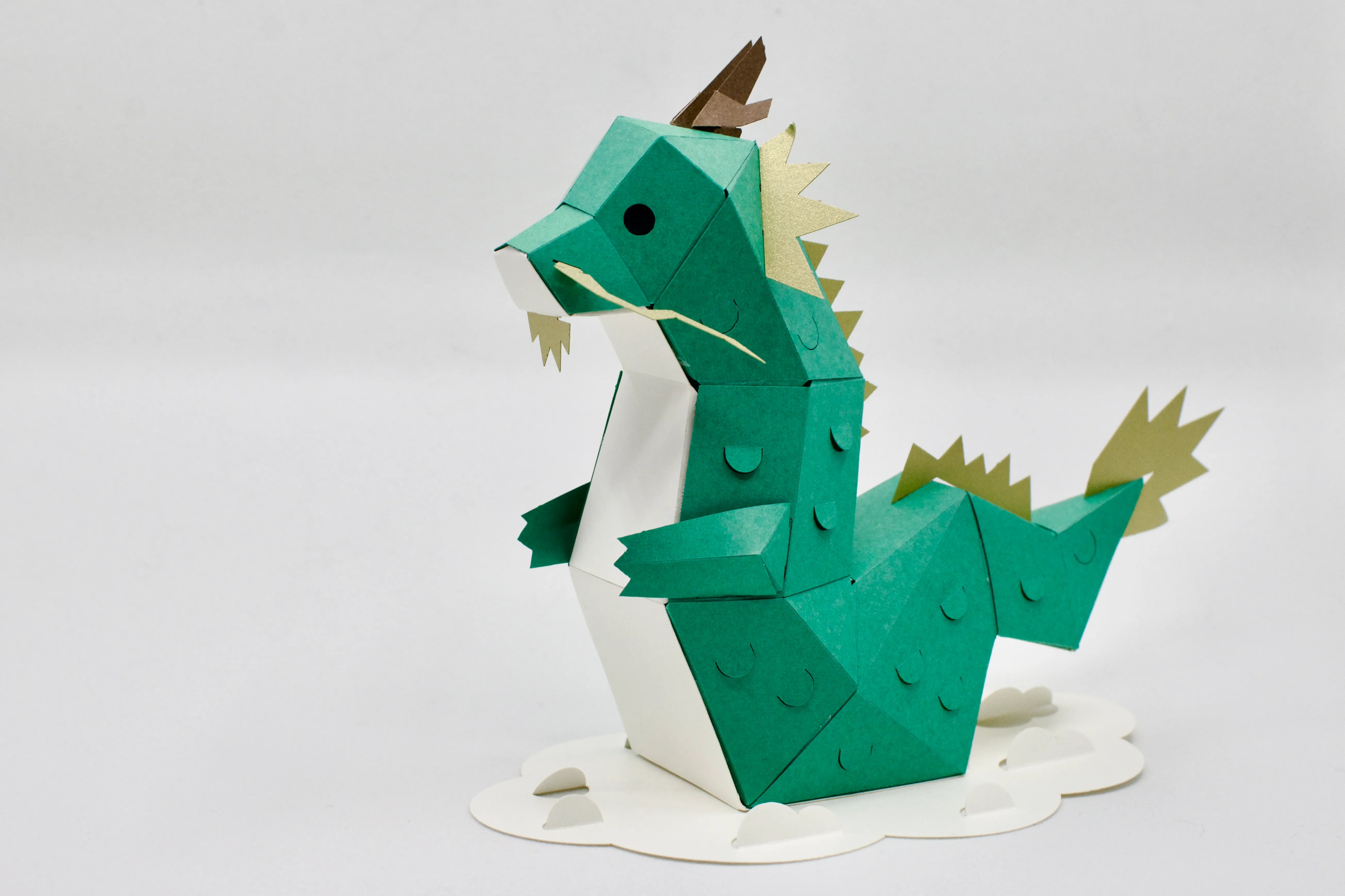
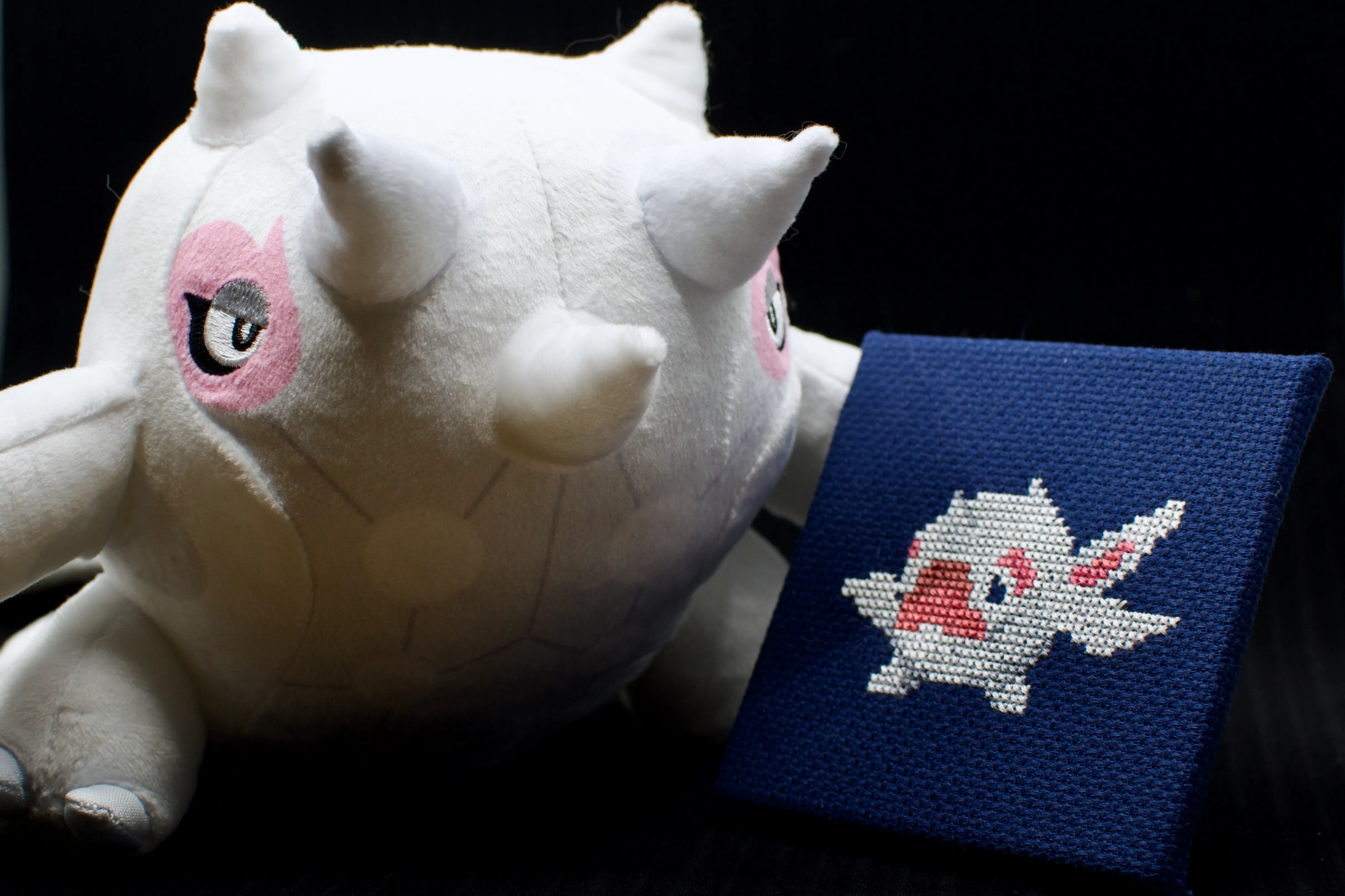
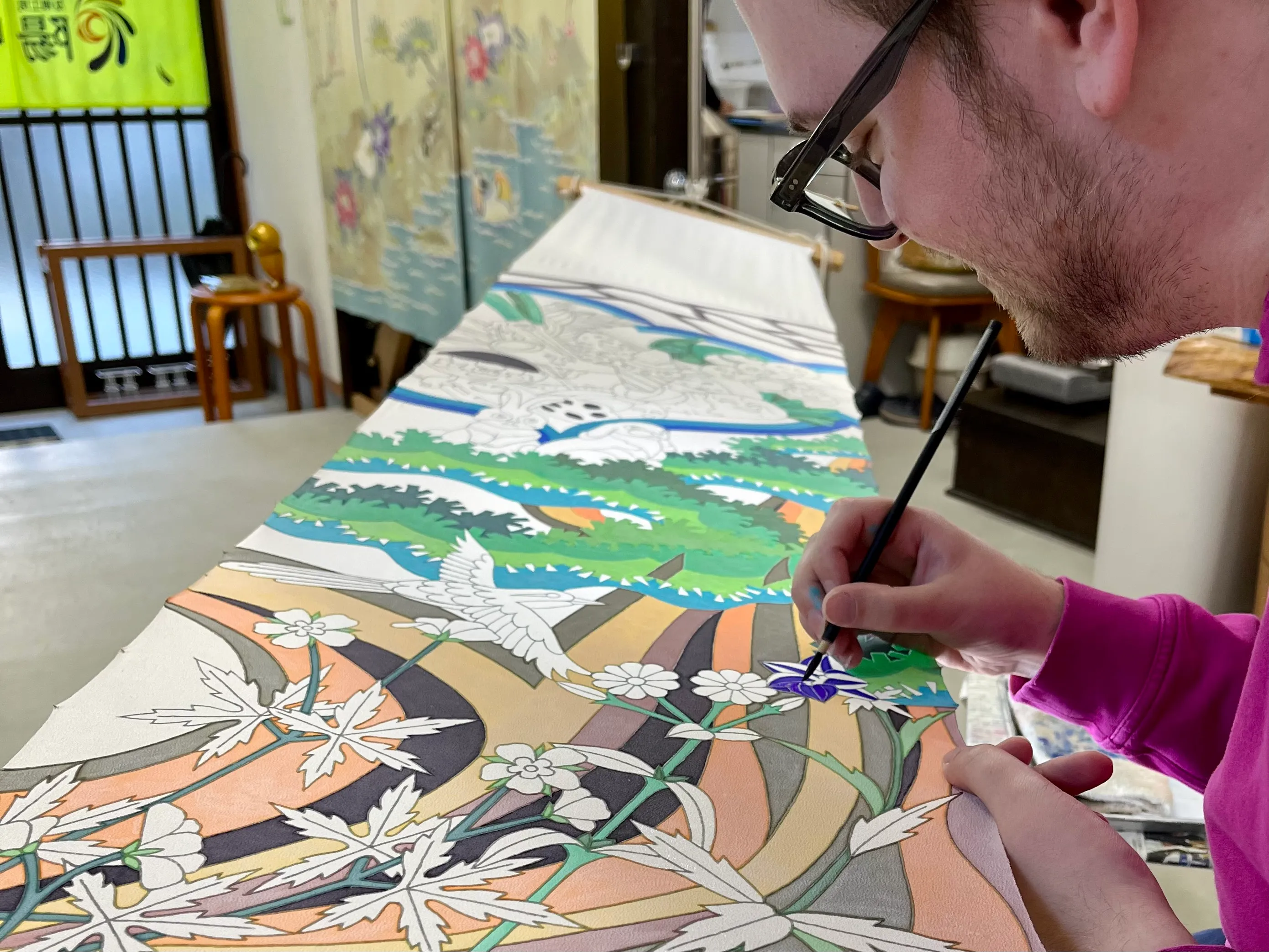
This weekend I finally faced my fears and did a watercolour painting, an art I’ve long wanted to try but was too intimidated to start. The result is not what I’d call a masterpiece, but I’m proud to be taking another step forward on my artistic journey.
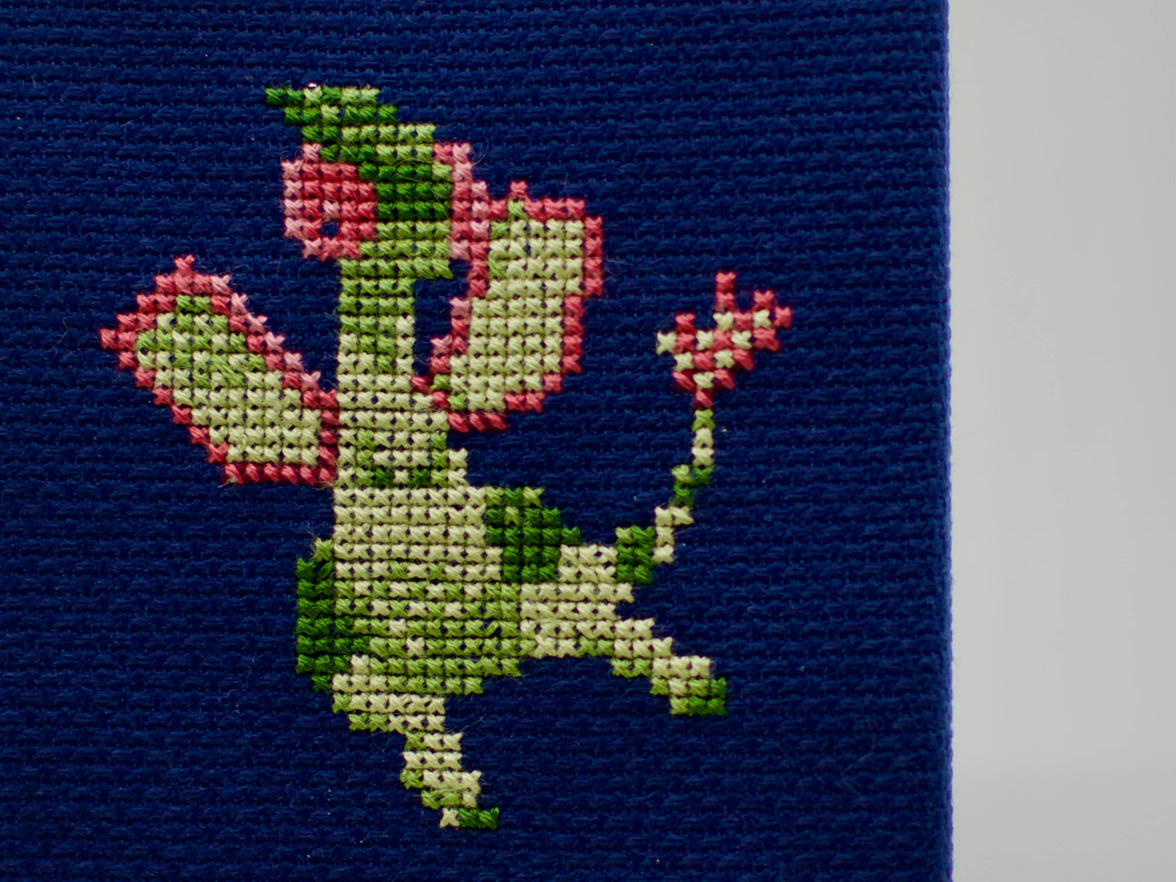
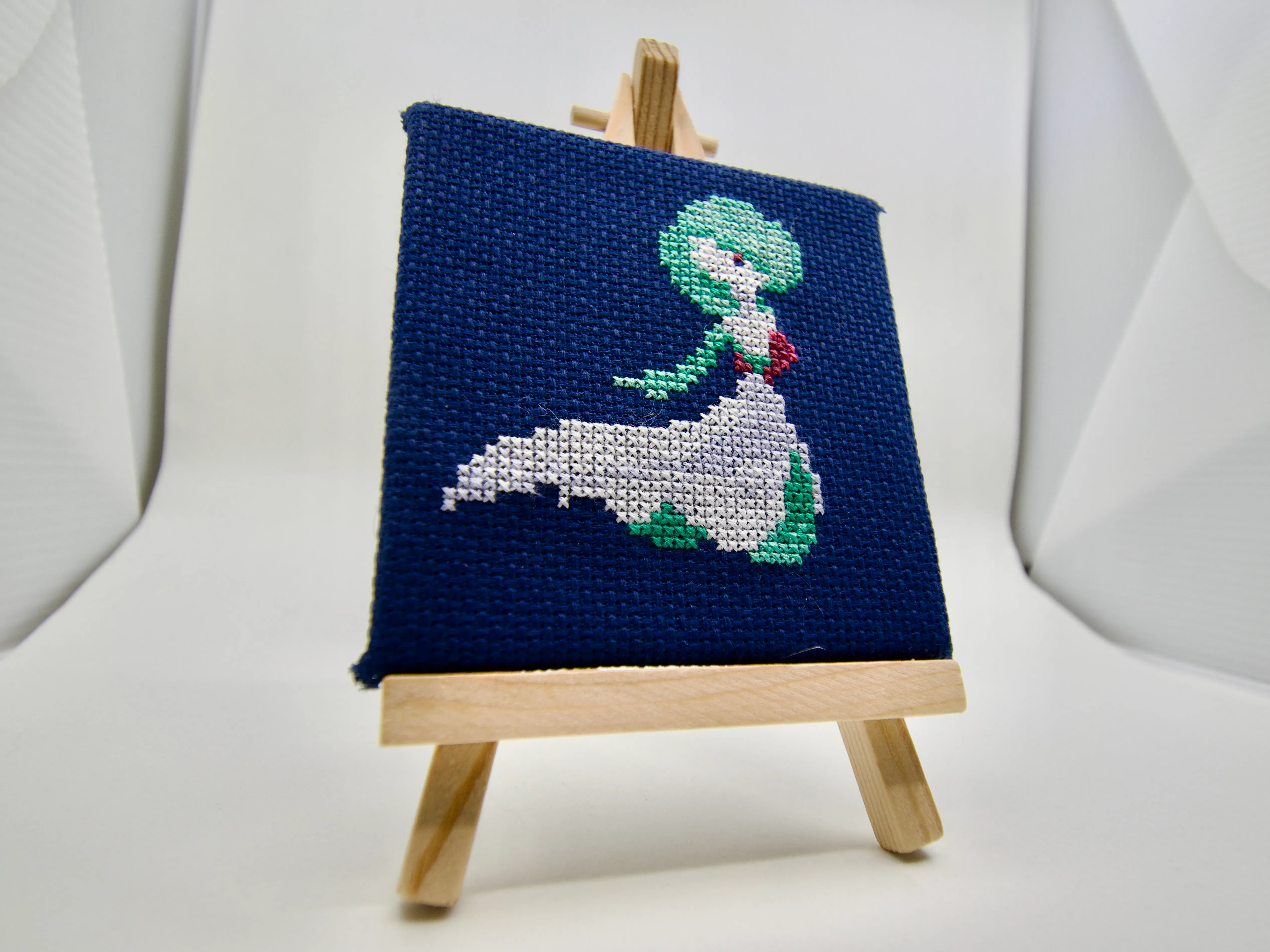
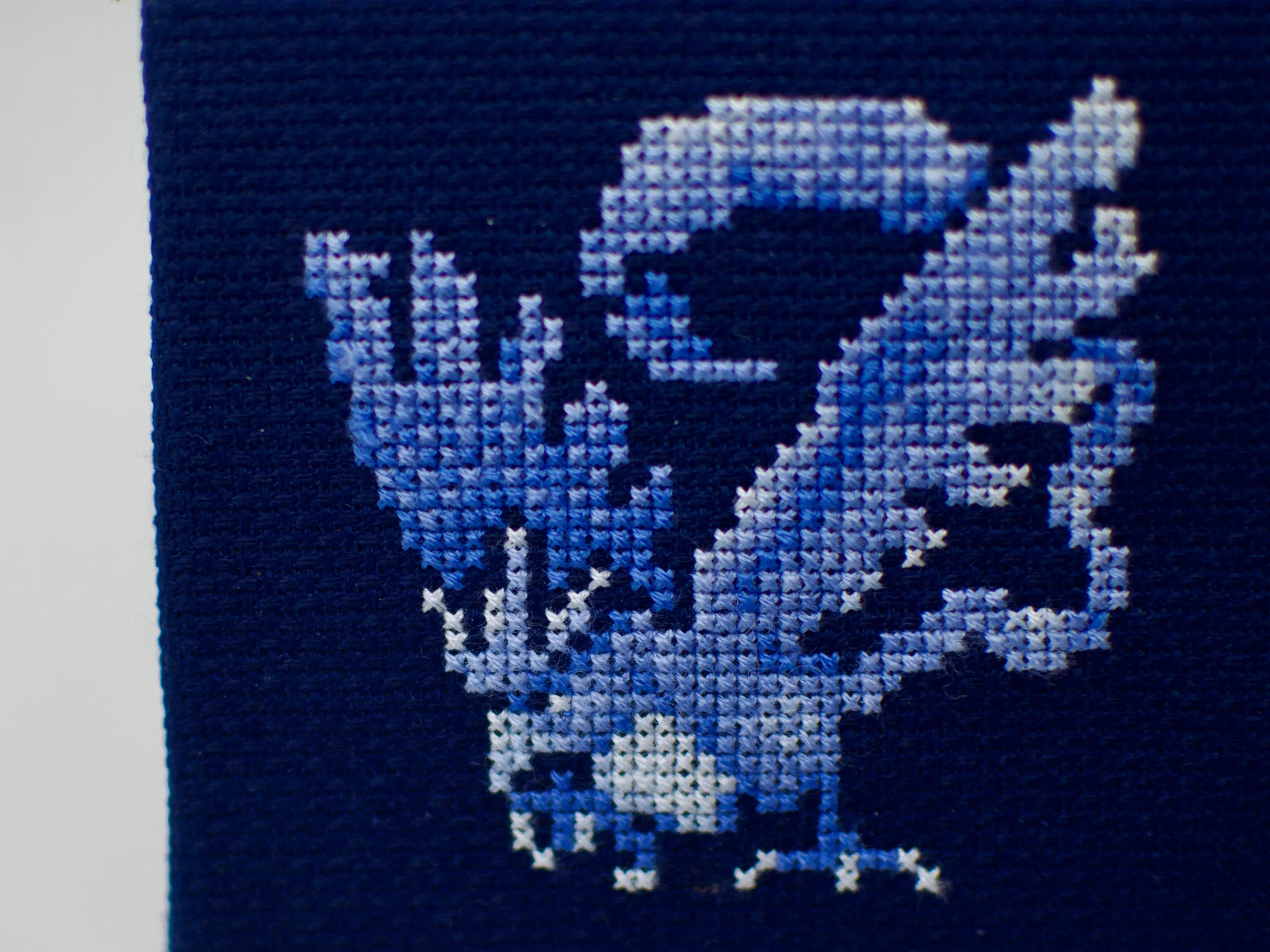
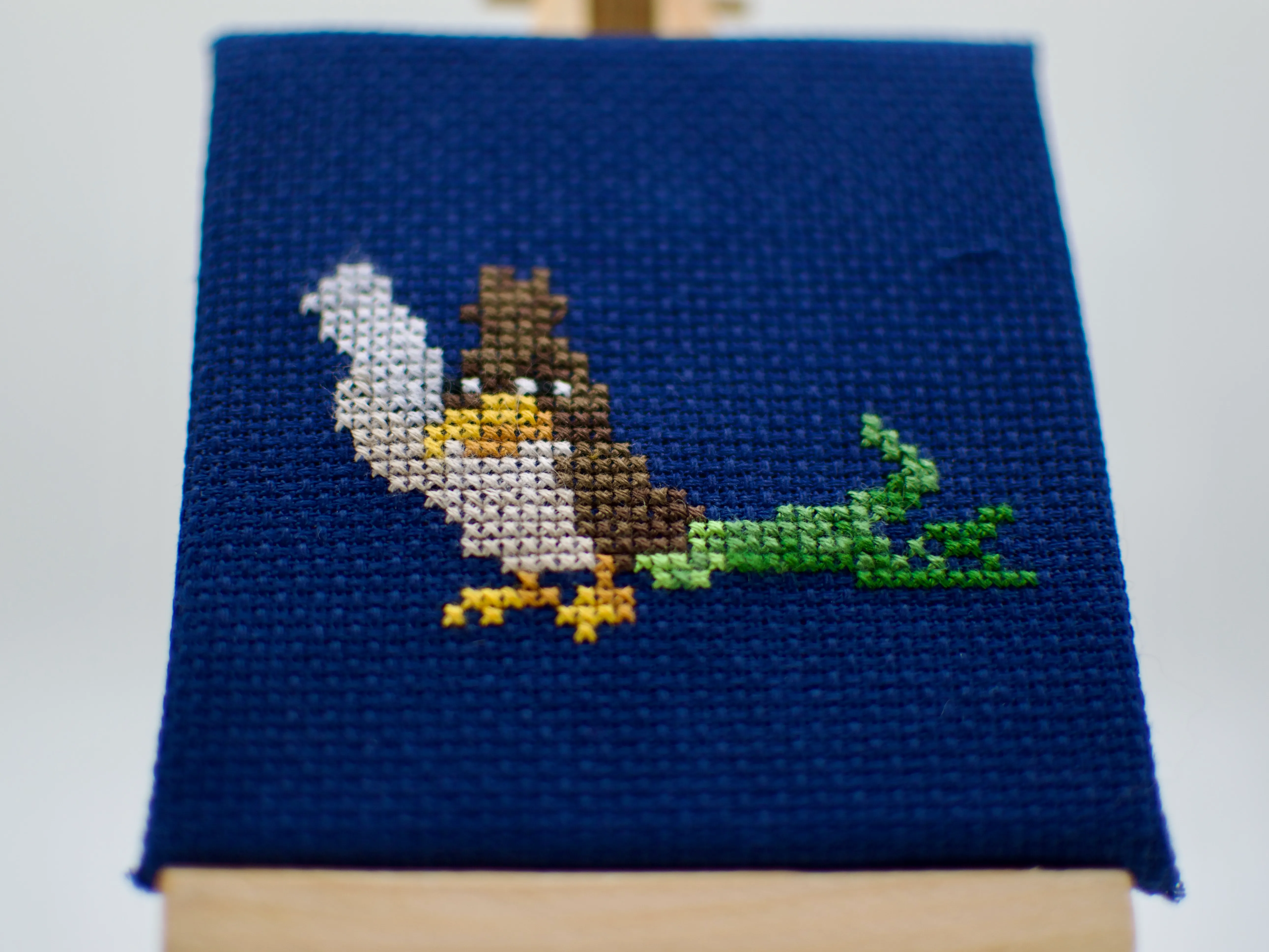
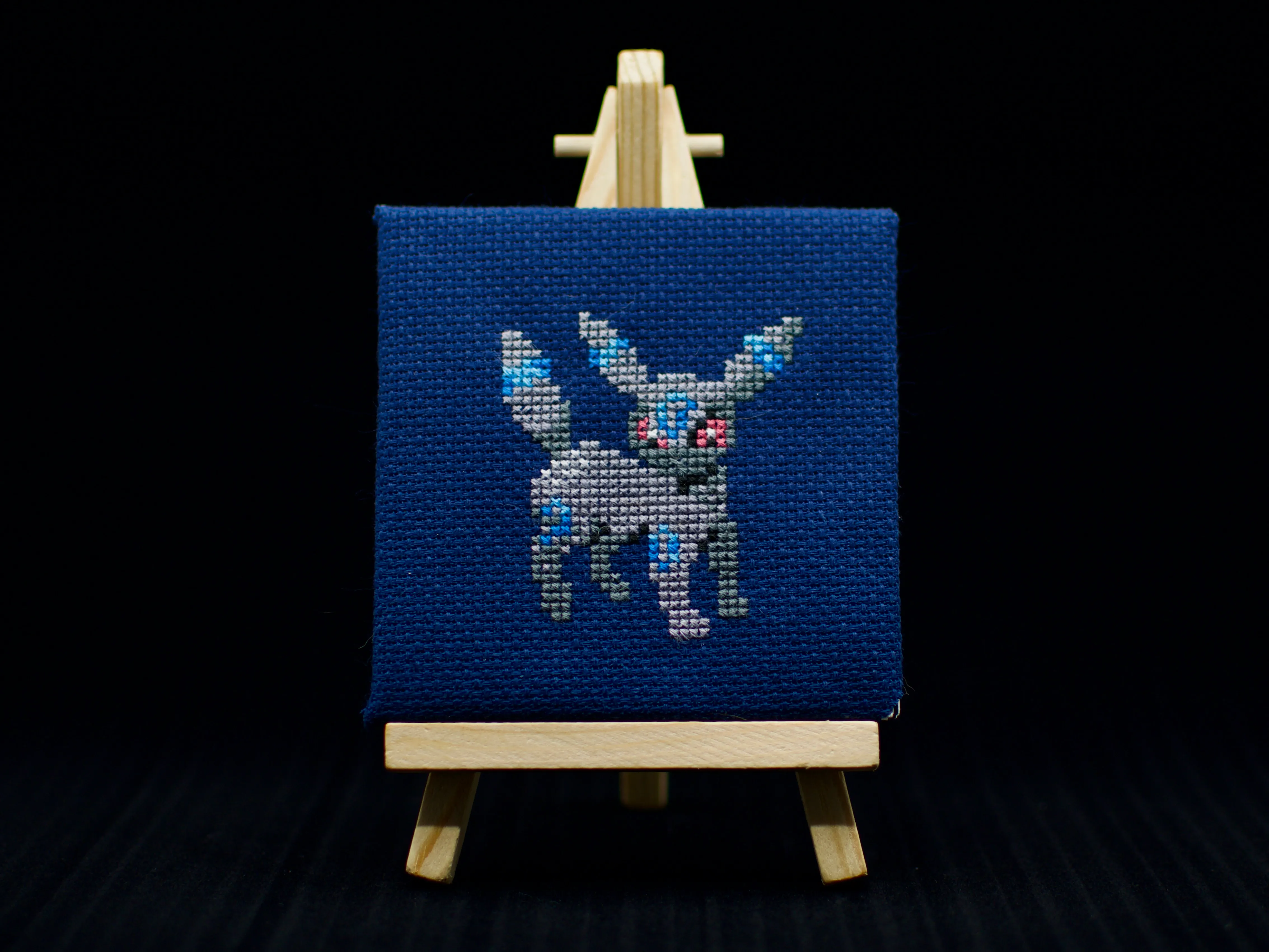
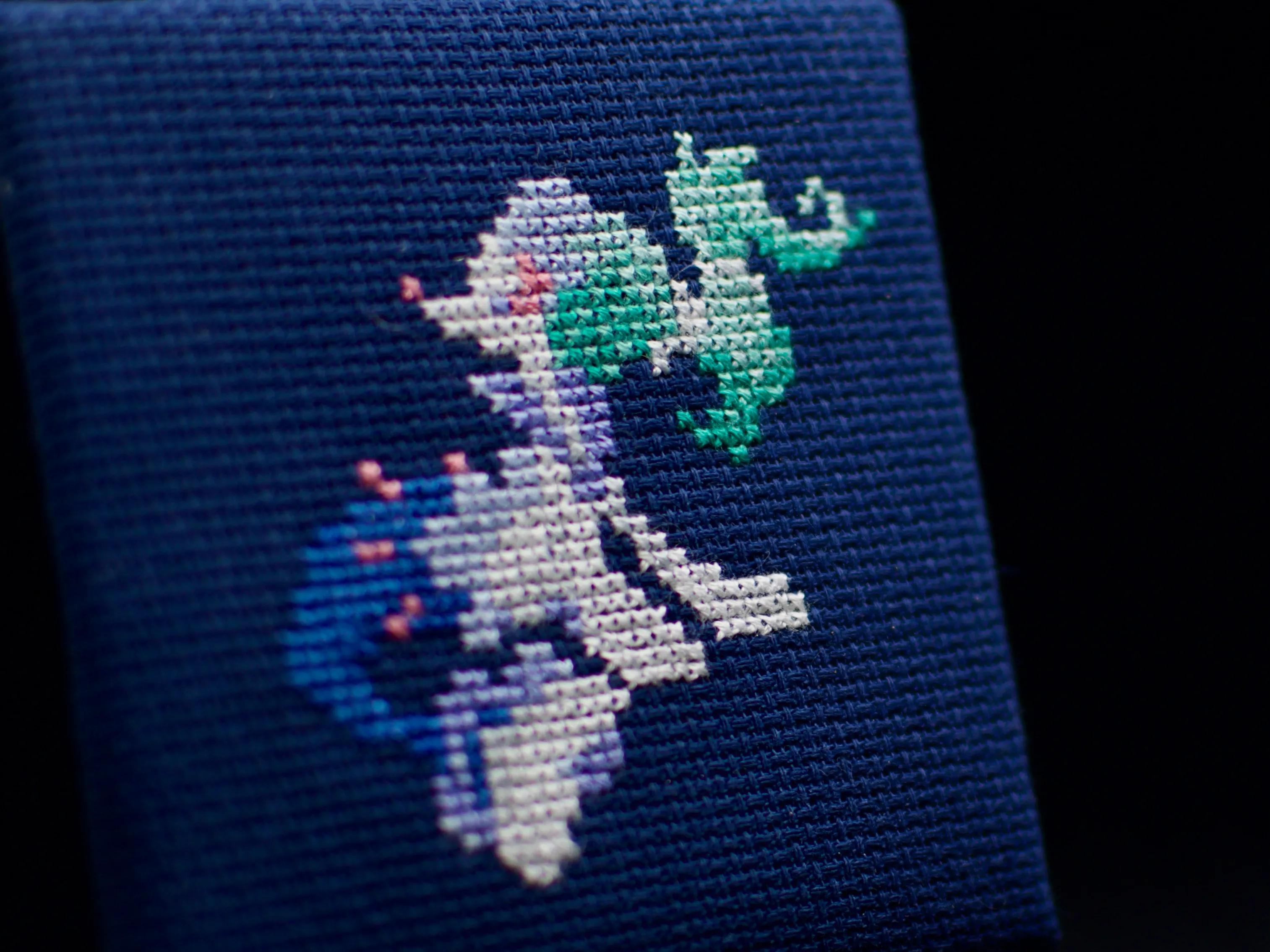
The first intimidating thing about starting any art is finding something to actually make. I procrastinated for a long time picking up cross-stitch and calligraphy before landing on Pokémon sprites and Unicode characters respectively as subjects.
Fortunately, painting has a lot of overlap with the landscape photography I already enjoy doing, so I was able to overcome that hurdle by scrolling through my camera roll.

A view from the Hokuriku Shinkansen.
Before I could paint the landscape, though, I first had to sketch the landscape. Sketching is a whole art in and of itself — one which I have little experience in — so I could easily fall into a rabbit hole trying to perfect my sketching skills before even picking up a brush.
Tracing, though, seemed a little less scary. I feel like I could trace the essential outlines of my photo without overthinking it too much, at least digitally.

My traced outline of the mountain landscape. I didn’t use all the details in the painting, but it was quick and satisfying to put together on my iPad.
Once the outline was done, I used my Cricut to exactly reproduce my digital penstrokes on a physical medium I could paint on. This was an overcomplicated solution, for sure, but it also came with the peace of mind that I could always reproduce the sketch if something went horribly wrong in the painting.
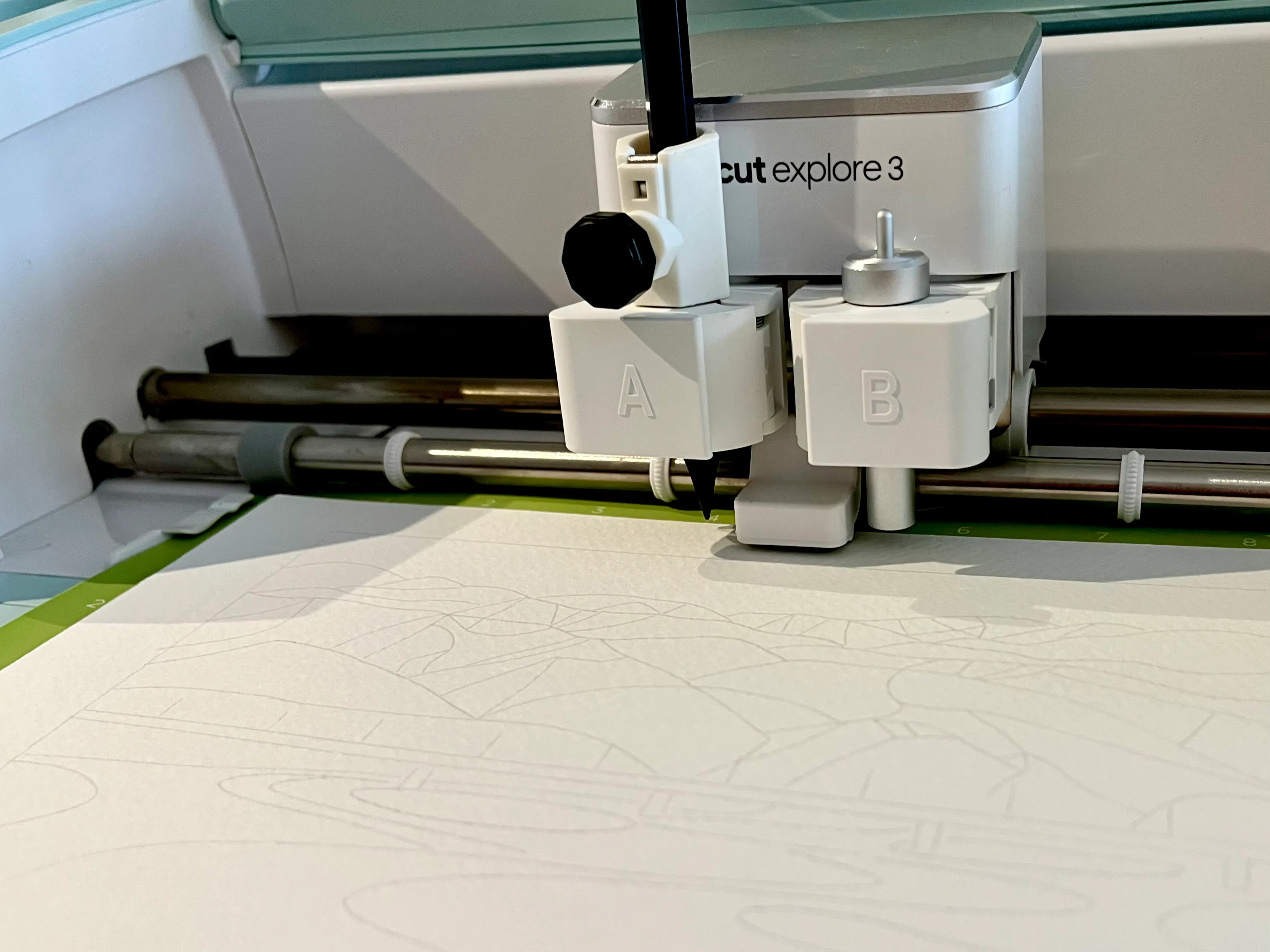
I used a third-party adapter to attach a metal pencil to my Cricut.
And that gave me the courage to paint my first landscape.
-
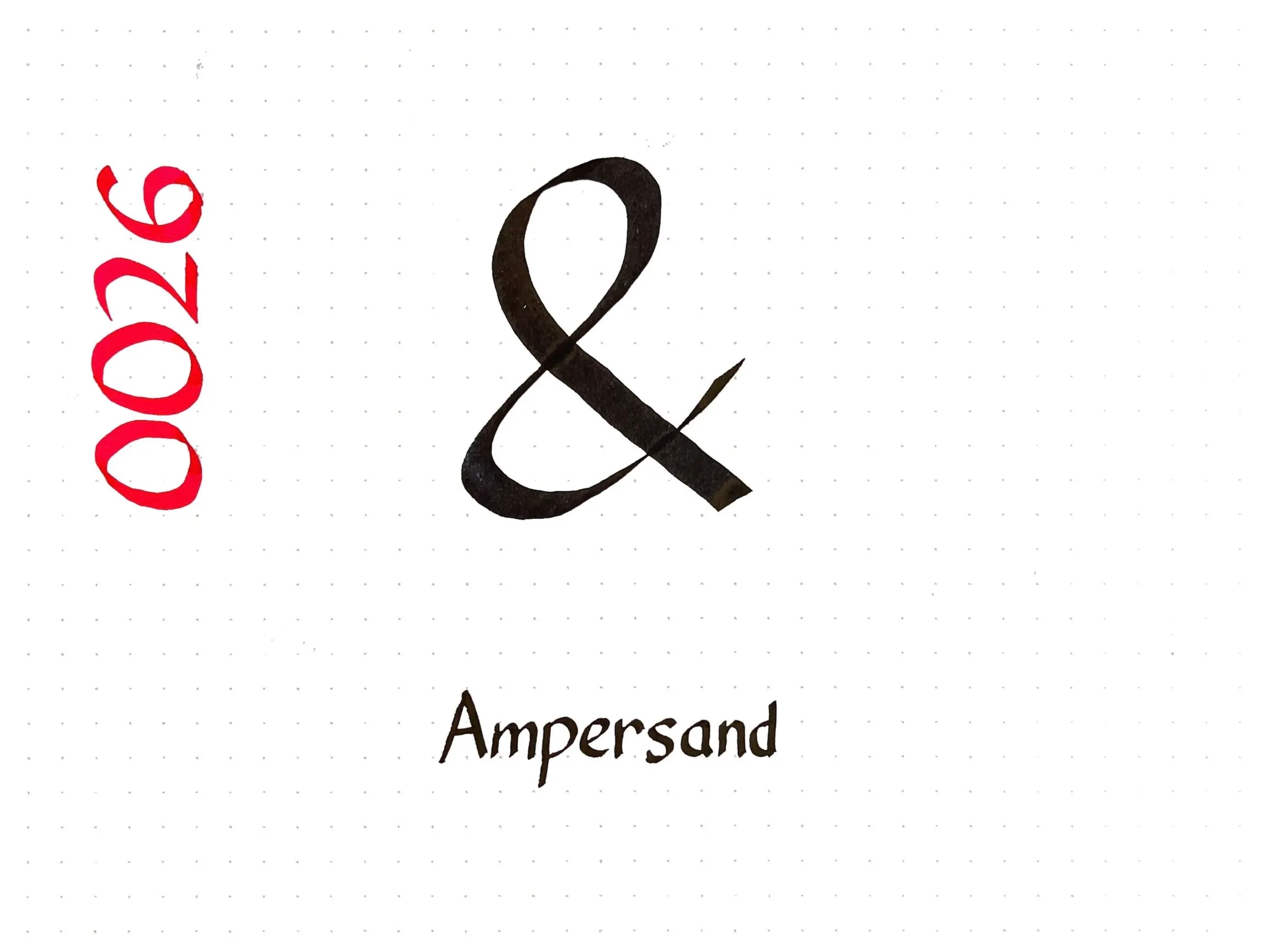
Today’s Unicode calligraphy is the good old ampersand. The name for the character comes from “and per se and”, but despite all sources agreeing on that fact, I couldn’t figure out what the longer phrase actually meant.
Looking at older sources, I think the phrase is supposed to be parsed ”& per se: and”. That is, ”& per se” means the character ”&” by itself, and the second “and” is a spelling-bee-style repetition to indicate that you have finished spelling the word “and”. So one might spell “wear and tear” out loud by saying:
W-E-A-R wear; & per se and; T-E-A-R tear
The same was apparently true for the words I, a, and O, so our national anthem would be spelled “O per se: O; C-A-N-A-D-A: Canada”.
-
-
-
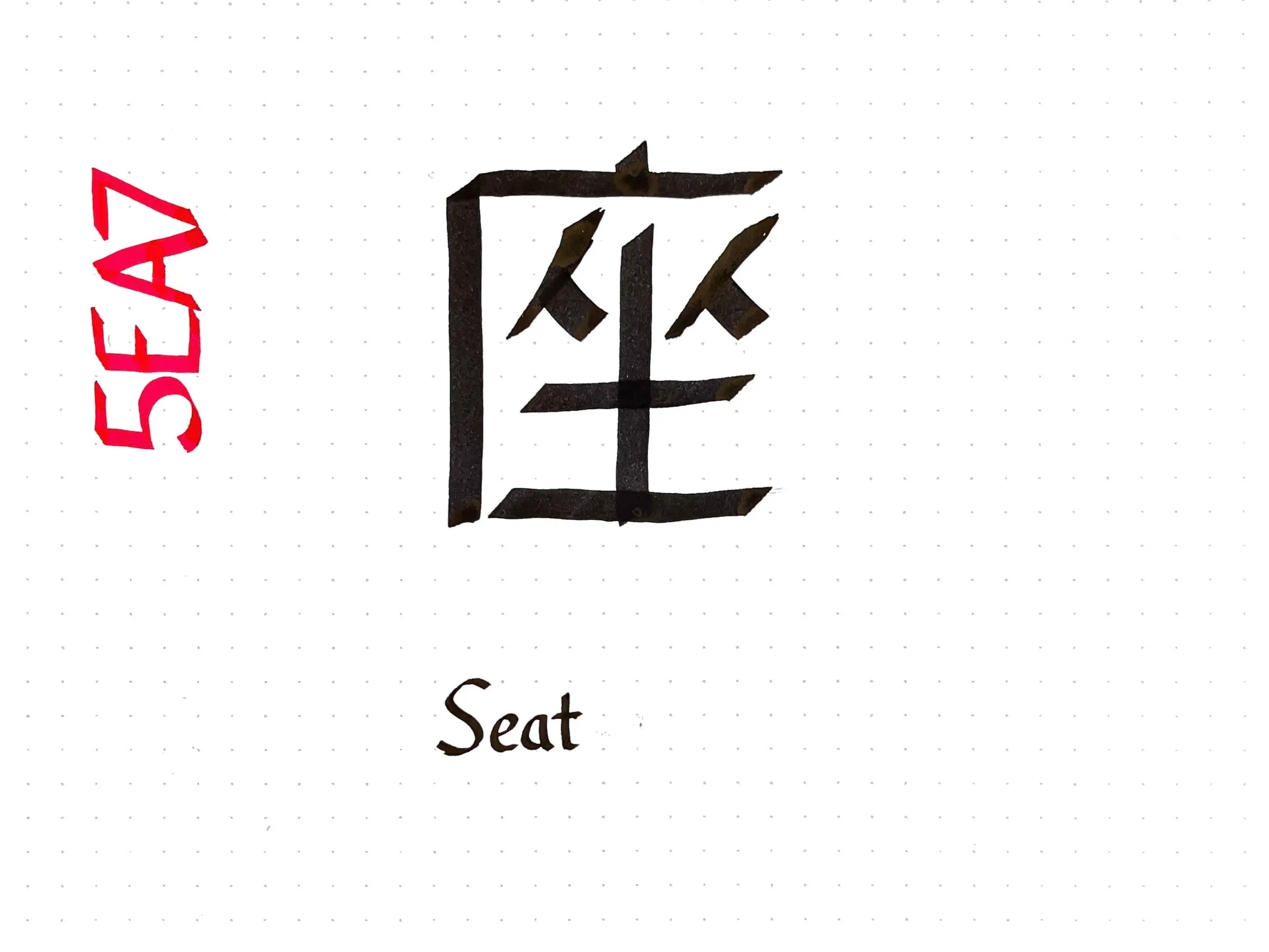
Today’s Unicode calligraphy entry is the kanji for “seat” 座. This one was difficult to write legibly: CJK characters are supposed to be written with a brush, which has a very different pattern of stroke width variation than a Western flat-tip calligraphy pen.
The seat character consists of four components, two of which (人) can represent people. A graphical pun based on rearranging the parts of 座 to evoke “social distancing” won the annual Kanji Creation contest for 2020.
-
-
-
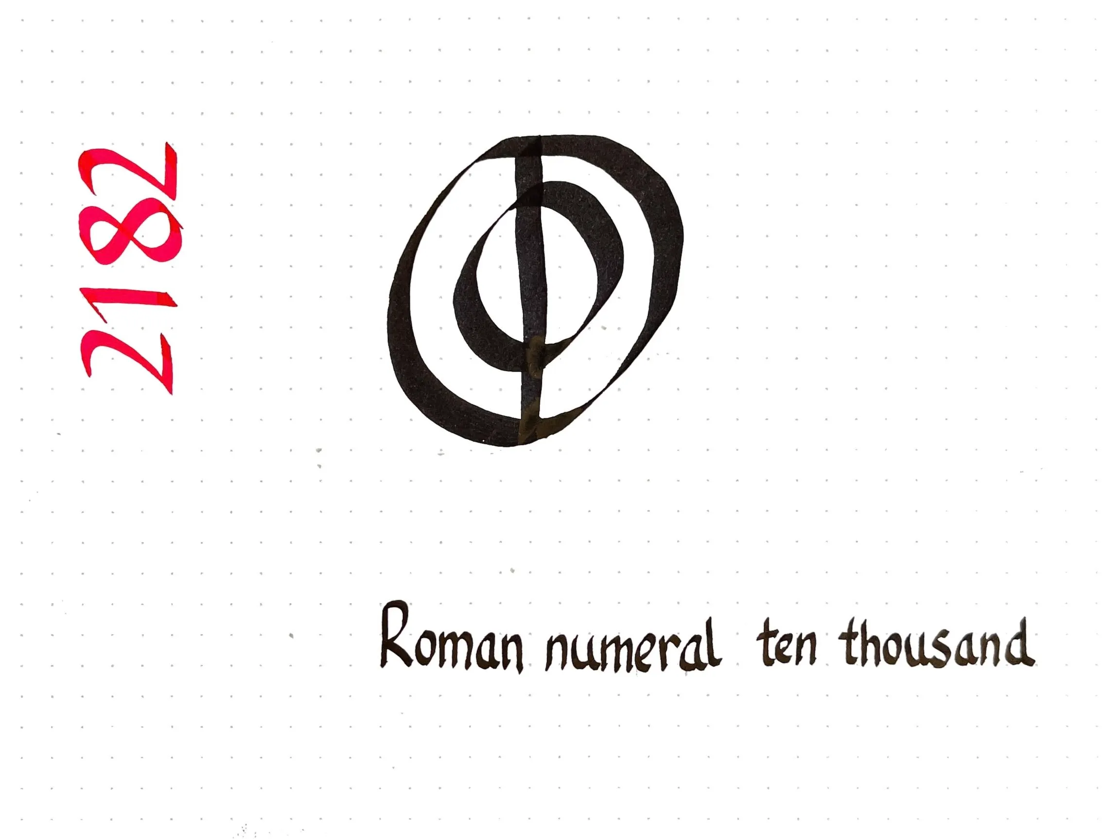
Today’s Unicode calligraphy is a roman numeral I had no idea existed!
As it turns out, the system of Roman numerals I learned as a child (I=1, V=5, X=10, L=50, C=100, D=500, and M=1000) is a medieval standard. The ancient Romans did not often write numbers much larger than a hundred, and when they did, they used a slightly different system.
Composite symbols with a backwards C were used for big numbers: IↃ=500, CIↃ=1000, IↃↃ=5000, and CCIↃↃ = 10000. The modern numeral for five hundred, “D”, comes from writing IↃ more concisely. There are also concise forms for one thousand (ↀ), five thousand (ↁ), and ten thousand (ↂ) although those forms are now of only historical interest.
-
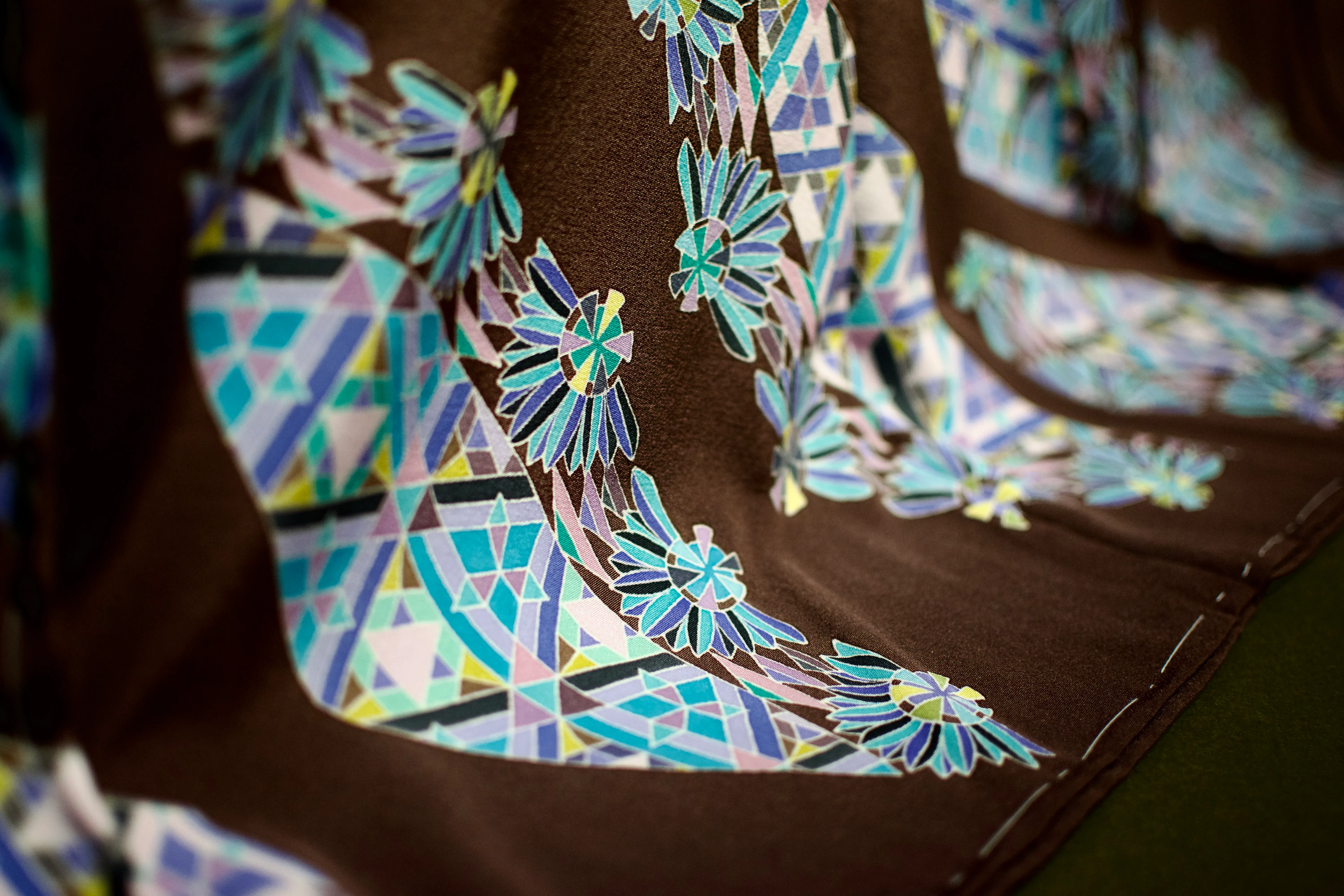
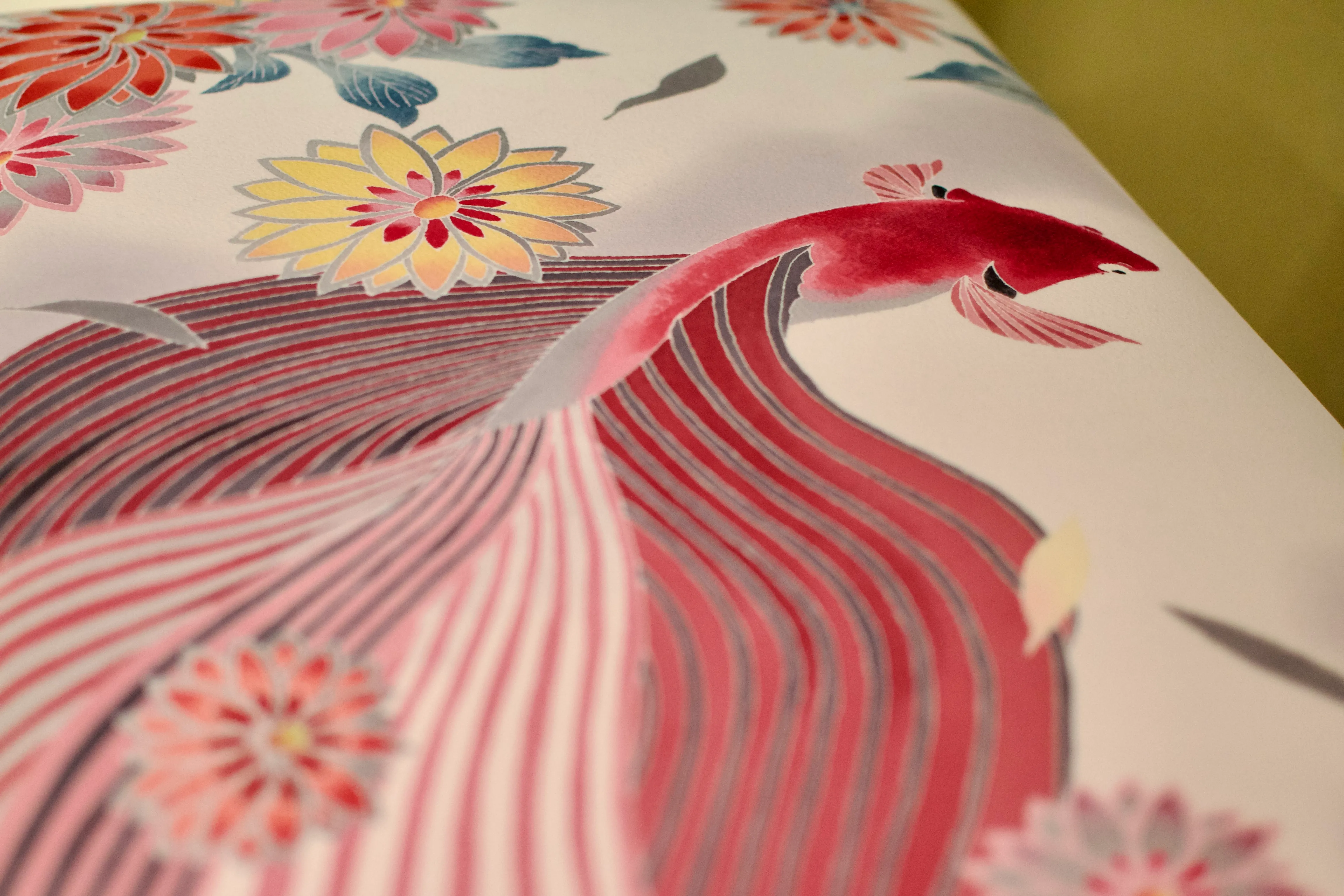
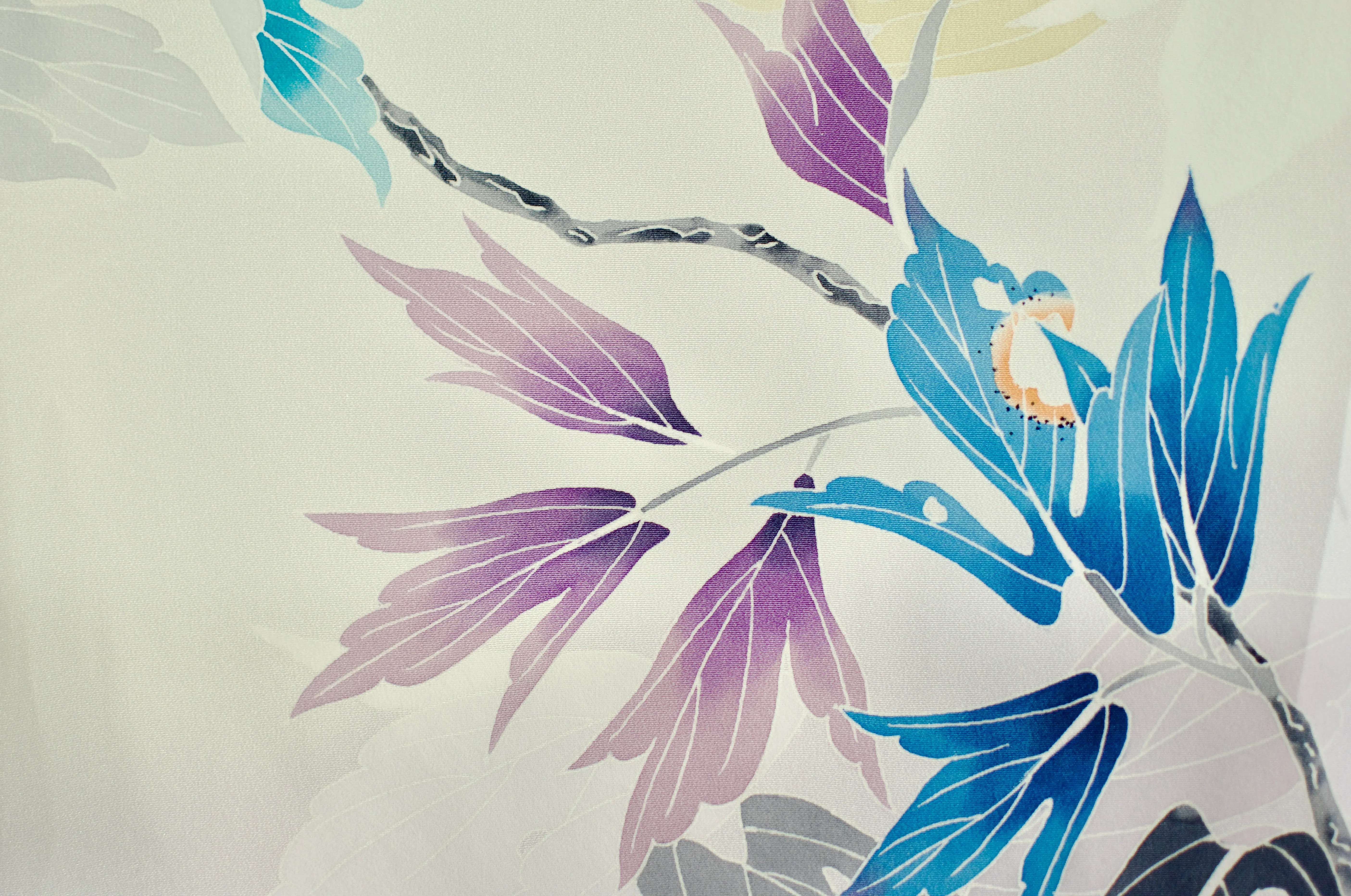
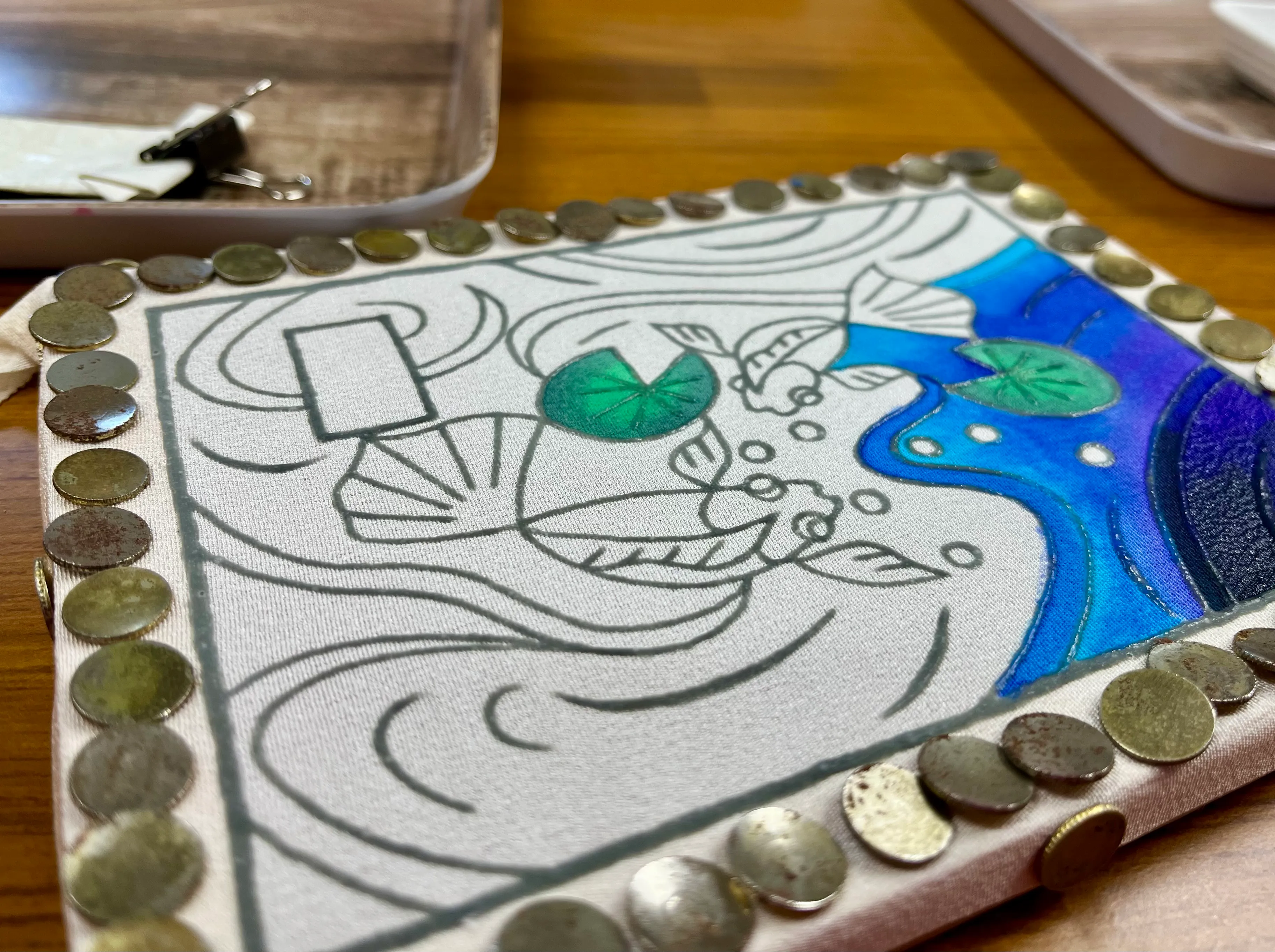
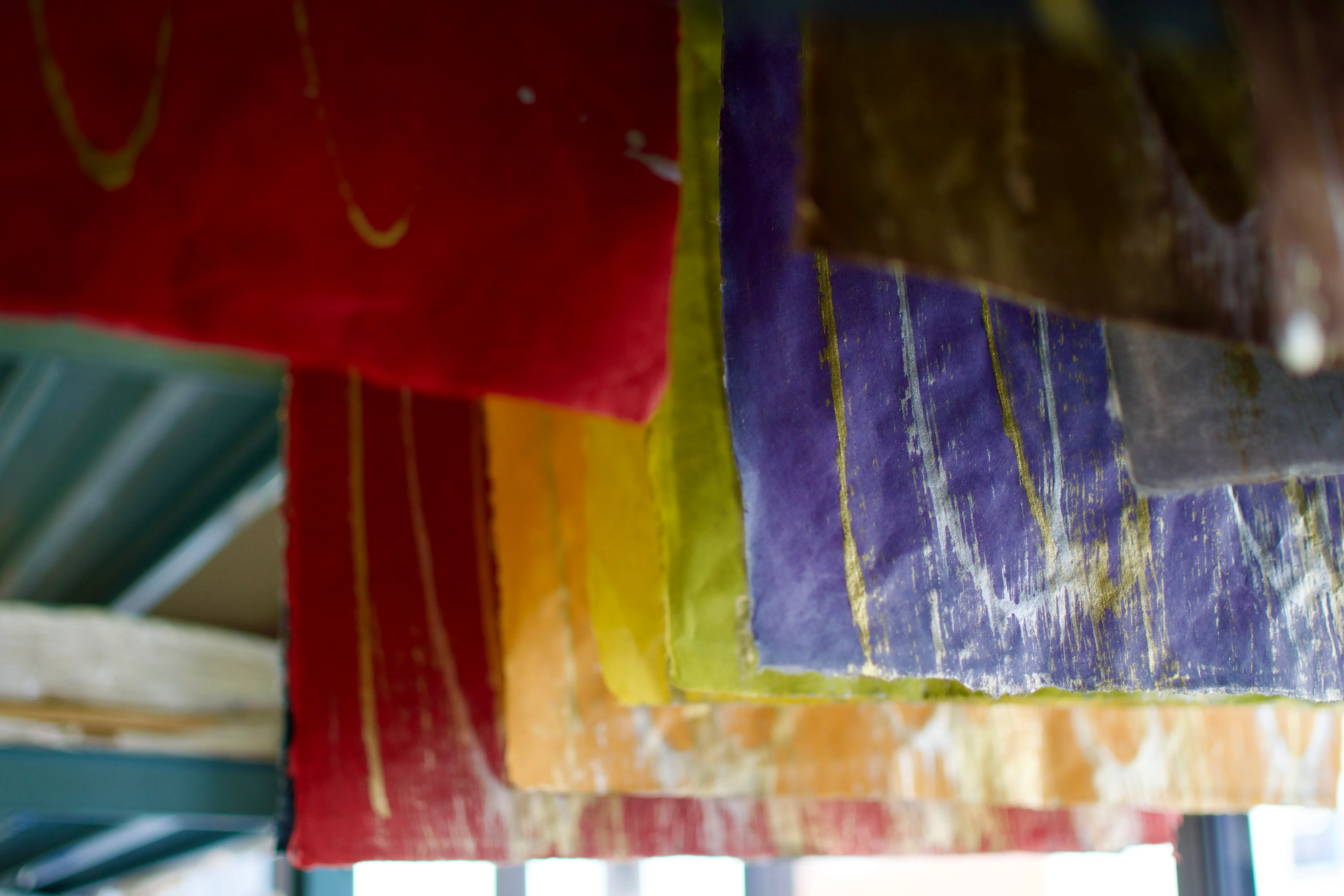
Yūzen (友禅) is a kimono dyeing technique that involves painting a pattern on the fabric inside the outlines drawn with a resist paste to prevent the dye areas from mixing together. In Kanazawa, we had the opportunity to learn and practice yūzen with the kind help of artist Hirano Toshiaki (平野利明) at the Yuzen Yomei studio.
Kaga yūzen — the style of yūzen unique to the historic province of Kaga — is characterized by lifelike designs such as insect-nibbled leaves.
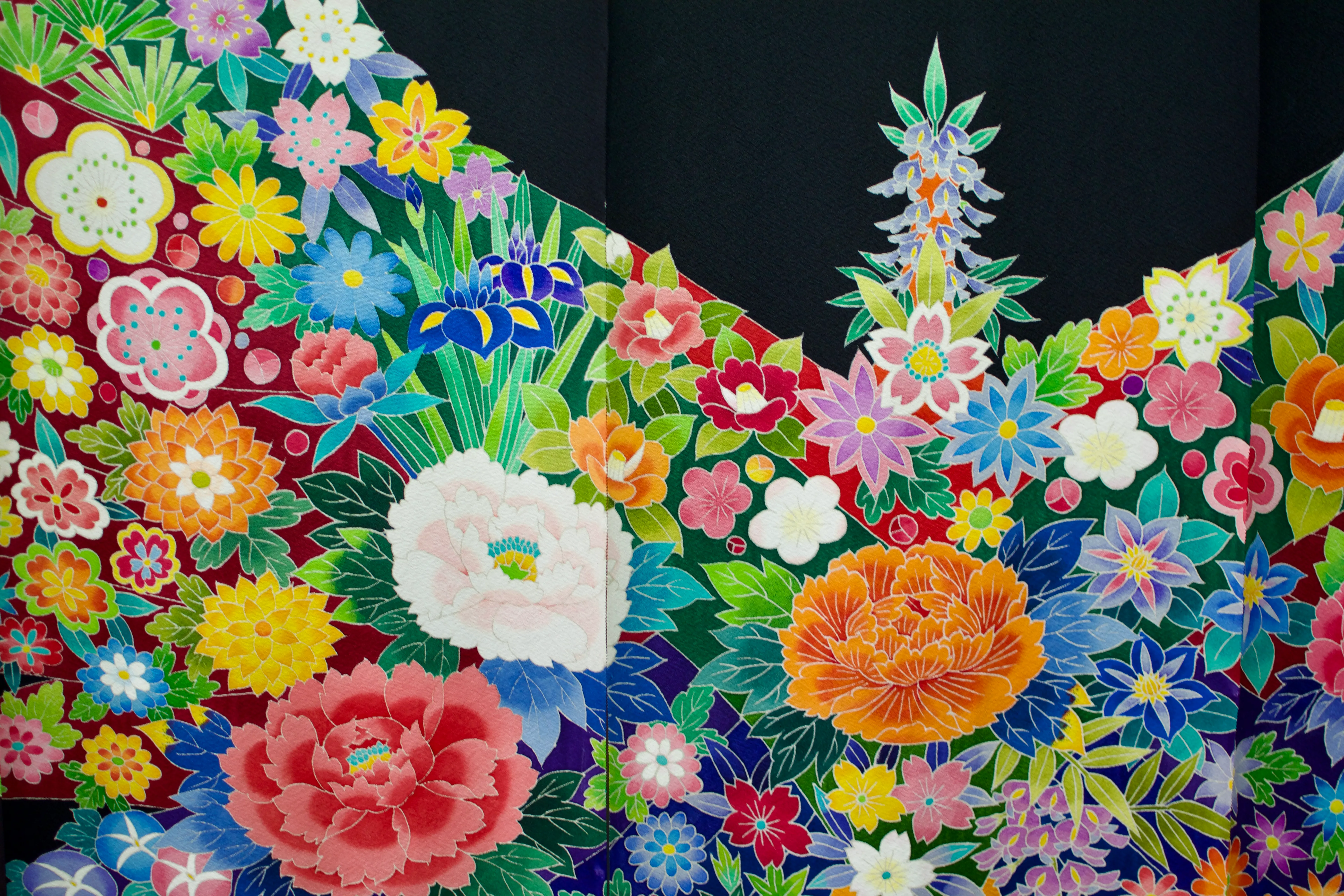
Examples of yūzen displayed at the Kaga Yuzen Kimono Center.
Although less time-consuming than earlier freehand techniques, yūzen is still a skill-intensive multi-step process. Thankfully, the artisans at Yūzen Yomei made things easy for us by creating and outlining the designs ahead of time, so we only needed to worry about the colouring process.
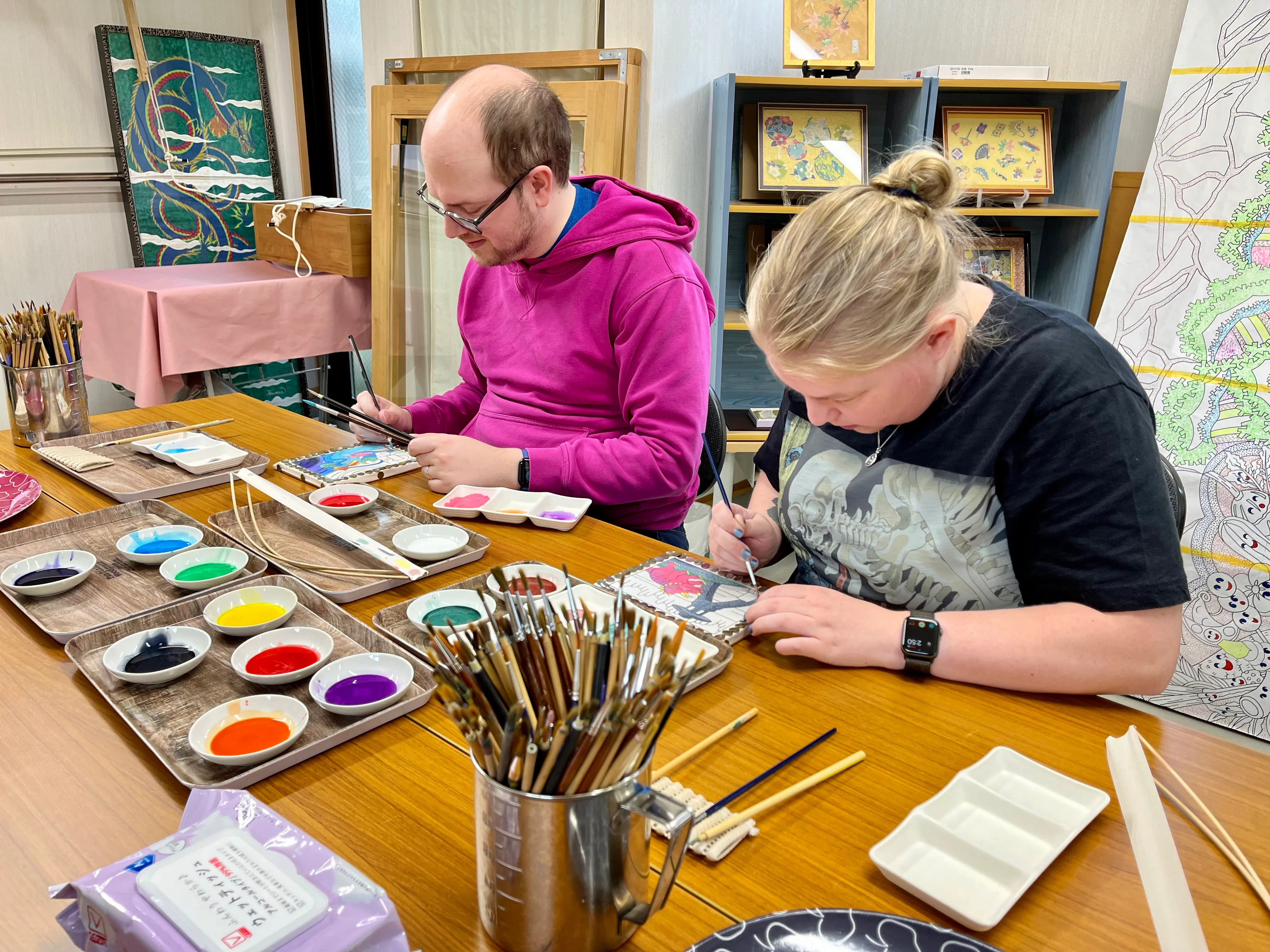
We are incredibly grateful to Hirano-sensei for welcoming us into the studio. It was a very special experience — the highlight of the entire trip — and I hope to one day return to see them again!
We were honoured to contribute to a large collaboration piece for a local hospital.
-
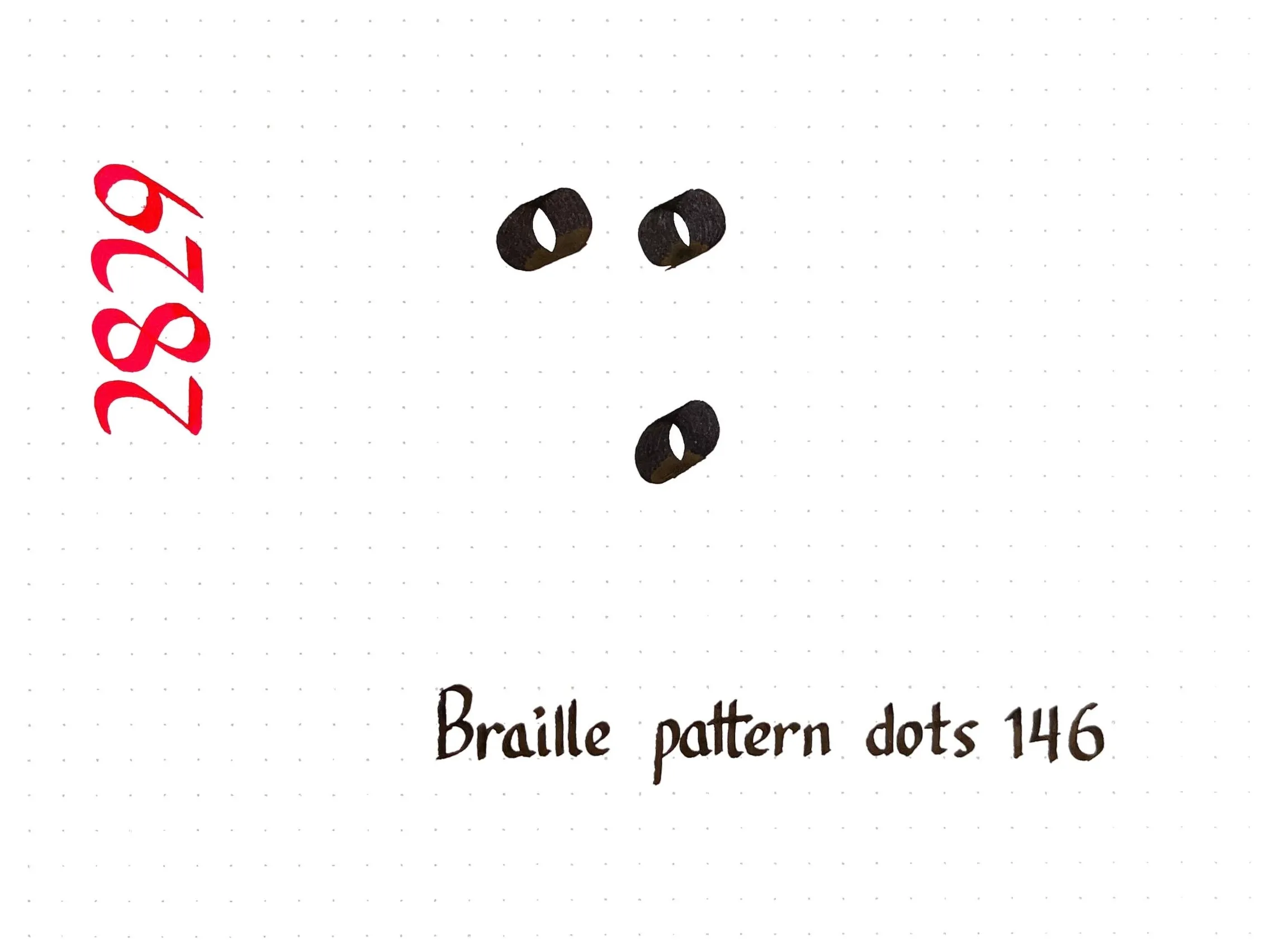
I need to practice my calligraphic dots and circles, so today’s character comes from Braille.
Did you know that Braille is slightly different in every language? The twenty-six letters of the Latin alphabet are generally the same across languages, but beyond that there is a lot of variation. For example, I wrote ⠩, which represents:
- the digraph “sh” or the word “shall” in English Braille,
- sounds similar to “sh” in Devanagari Braille (श) and Arabic Braille (ش),
- the accented letter î in French Braille,
- the digraph “ei” in German Braille and its equivalent “ει” in Greek Braille, and
- nothing at all in Spanish Braille!
Chinese, Japanese, and Korean have their own entirely independent Brailles. The symbol ⠩ represents the syllable く (ku) in Japanese Braille, the final “yan” in Mainland Chinese Braille, and the vowel ㅠ (yu) in Korean Braille.
-
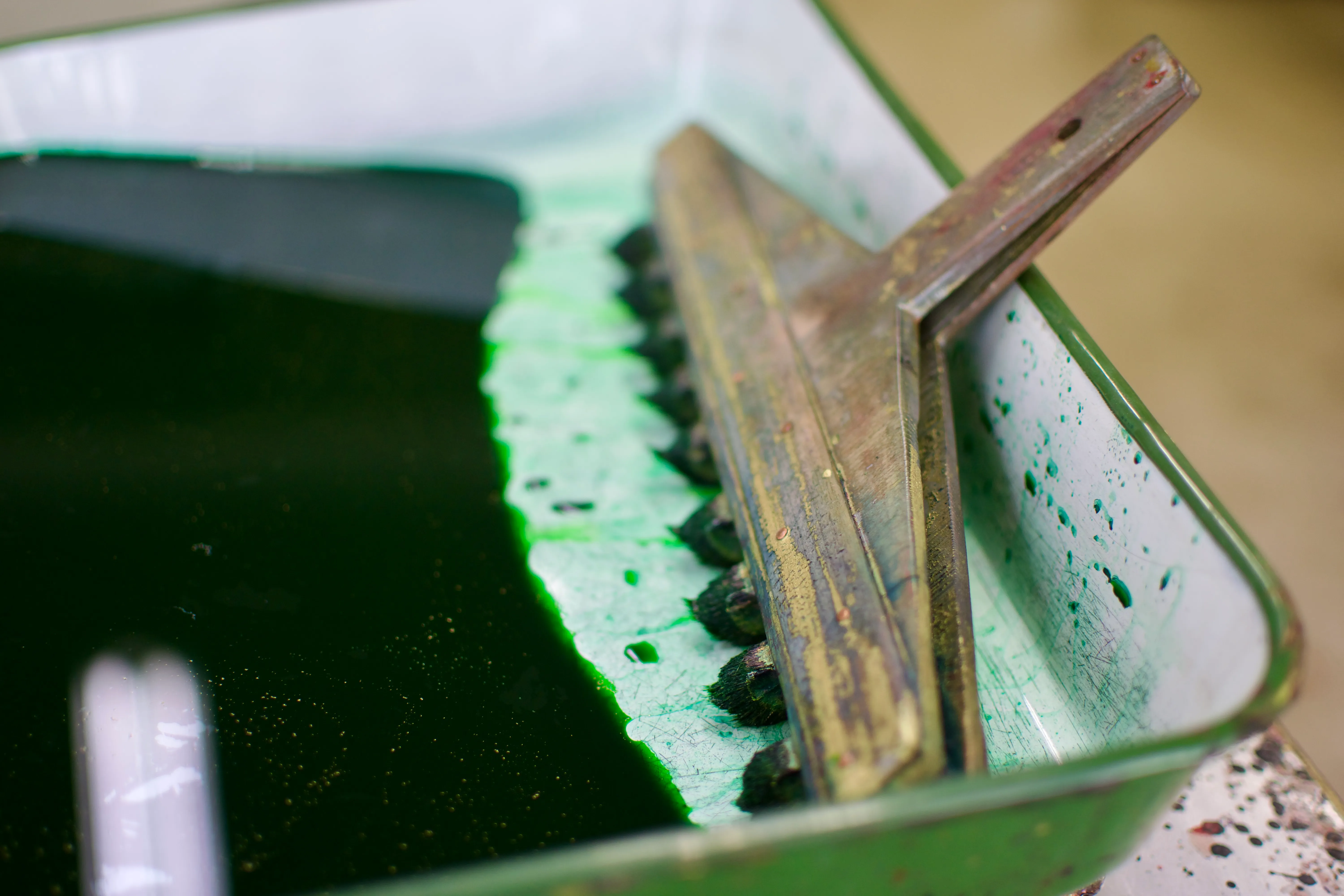
I visited the Ochanomizu Origami Kaikan (お茶の水おりがみ会館) as a fun little diversion in Tōkyō. The centre is part shop, part school, and part studio. I got to take some photos of the paper-dying process and took home some supplies that might inspire me to make some more origami soon!

Paper is dyed a solid colour and then flattened and compressed.
Origami paper can be dyed, painted, or both depending on the intended pattern. When I visited, the artisan was using a special multi-headed brush to paint green stripes on one side of the paper; the other side had already been painted gold using a very wide, soft brush to achieve a consistent finish. The result is a pattern perfect for folding into snake decorations for the upcoming new year!
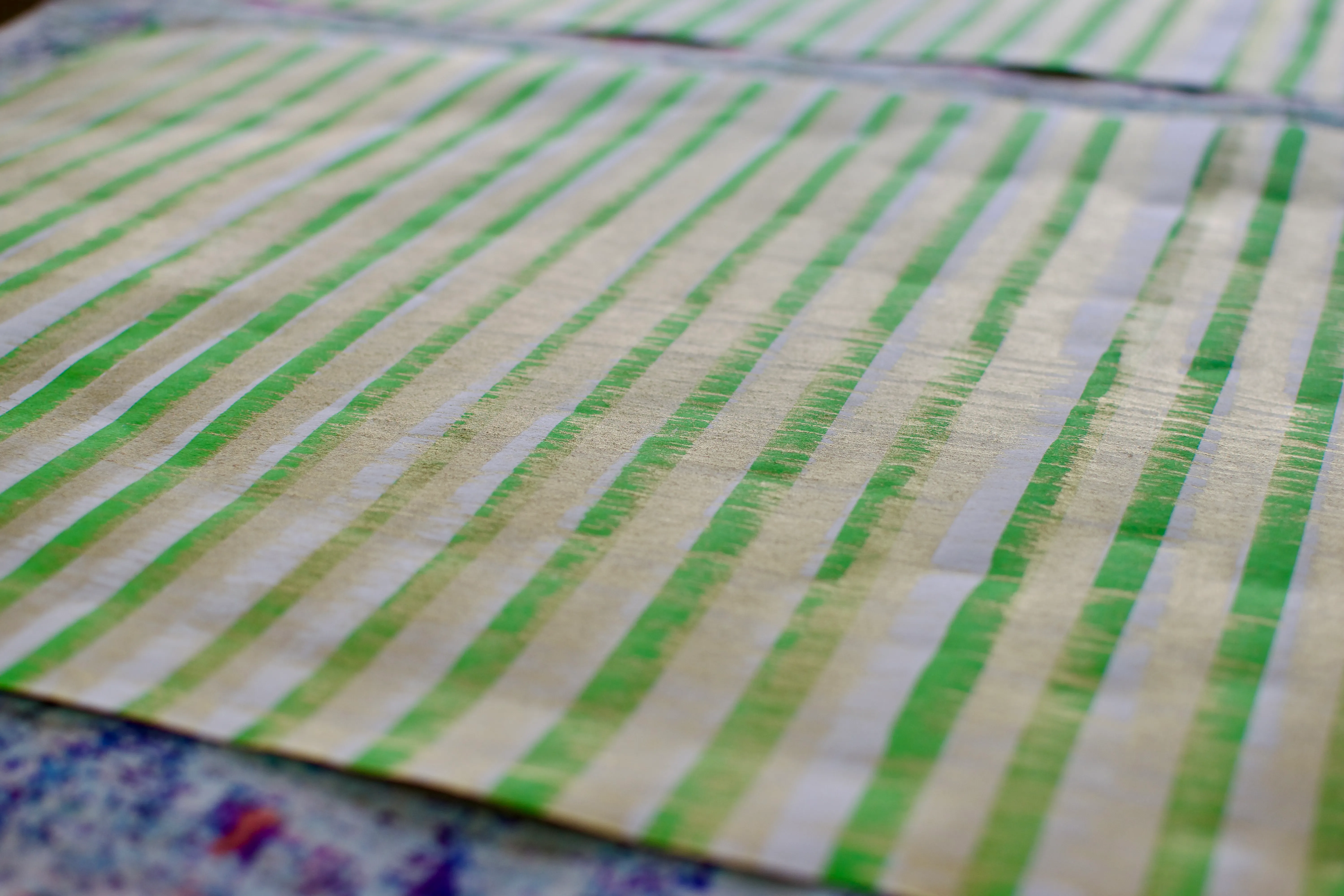
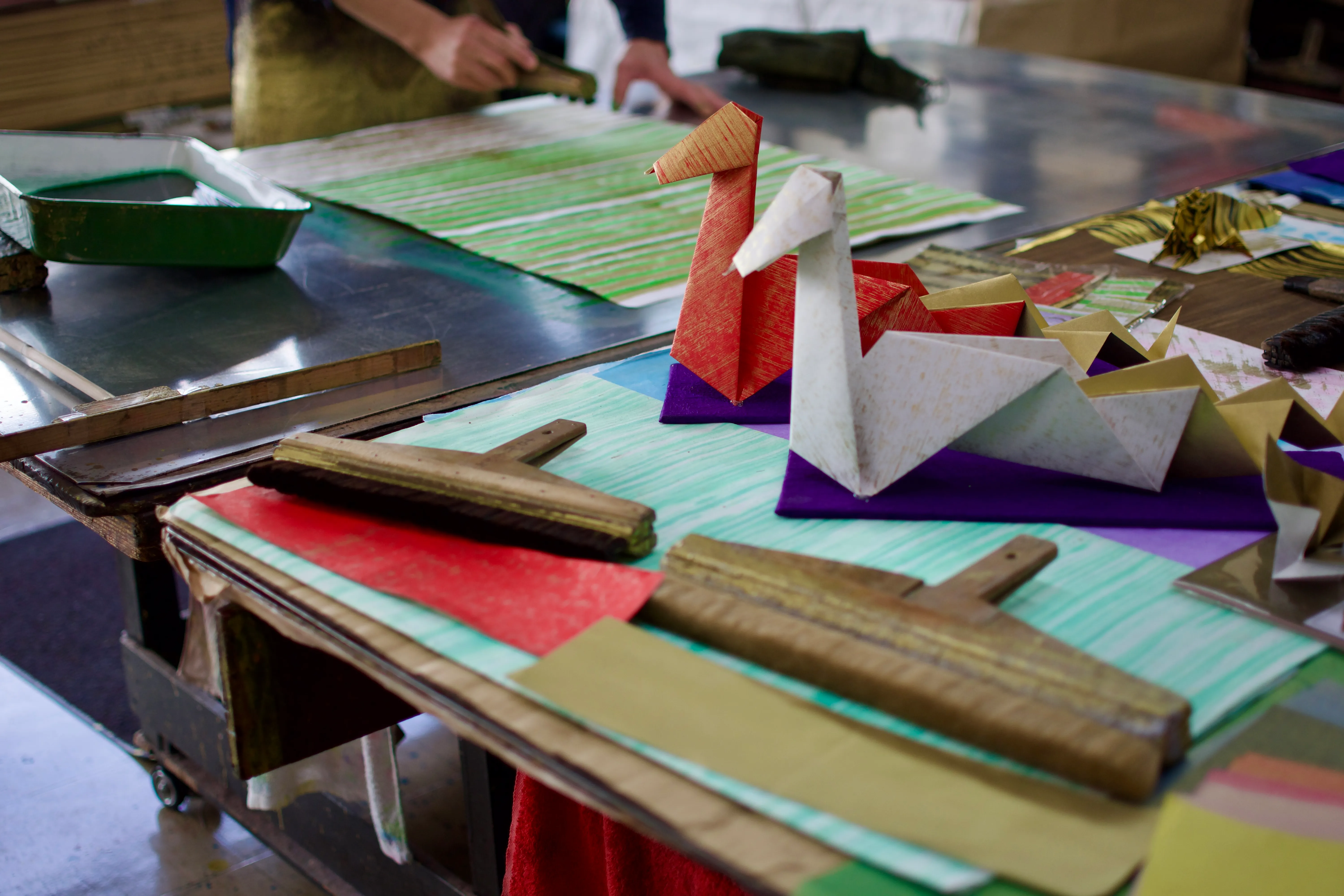
The tools, process, and results of making origami paper.
-
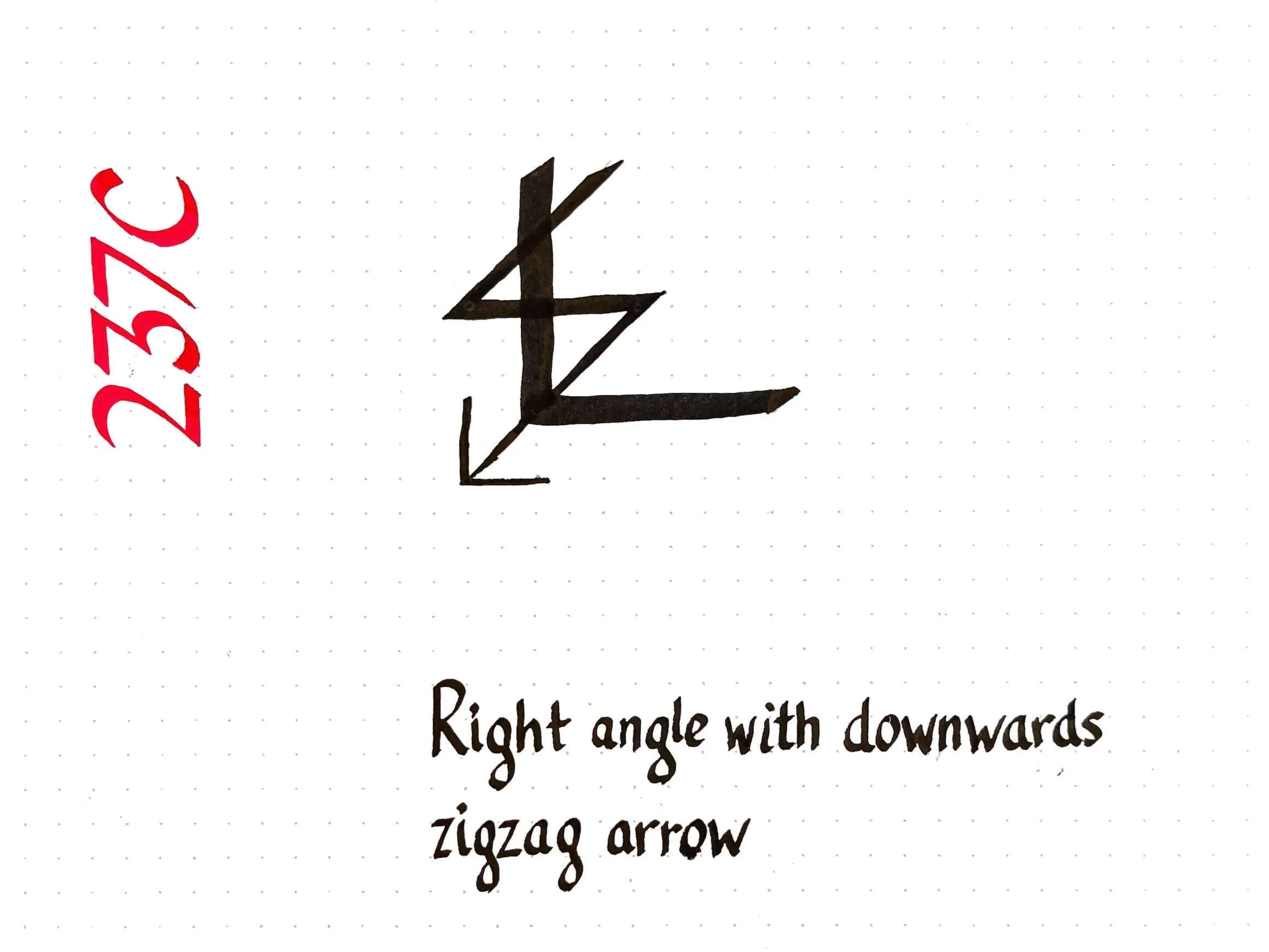
Calligraphy is one of several hobbies I’ve started dabbling with. I’m practicing by writing information sheets for random Unicode characters, which gives me an excuse to share some typographic trivia!
Today’s entry is U+237C RIGHT ANGLE WITH DOWNWARDS ZIGZAG ARROW, also known as angzarr. This is an unusual “ghost character” that nobody knows the meaning of. Jonathan Chan has an ongoing series of blog posts tracing the history of the character to the Monotype foundry between 1954 and 1963, but is no closer to discovering the original purpose.
-
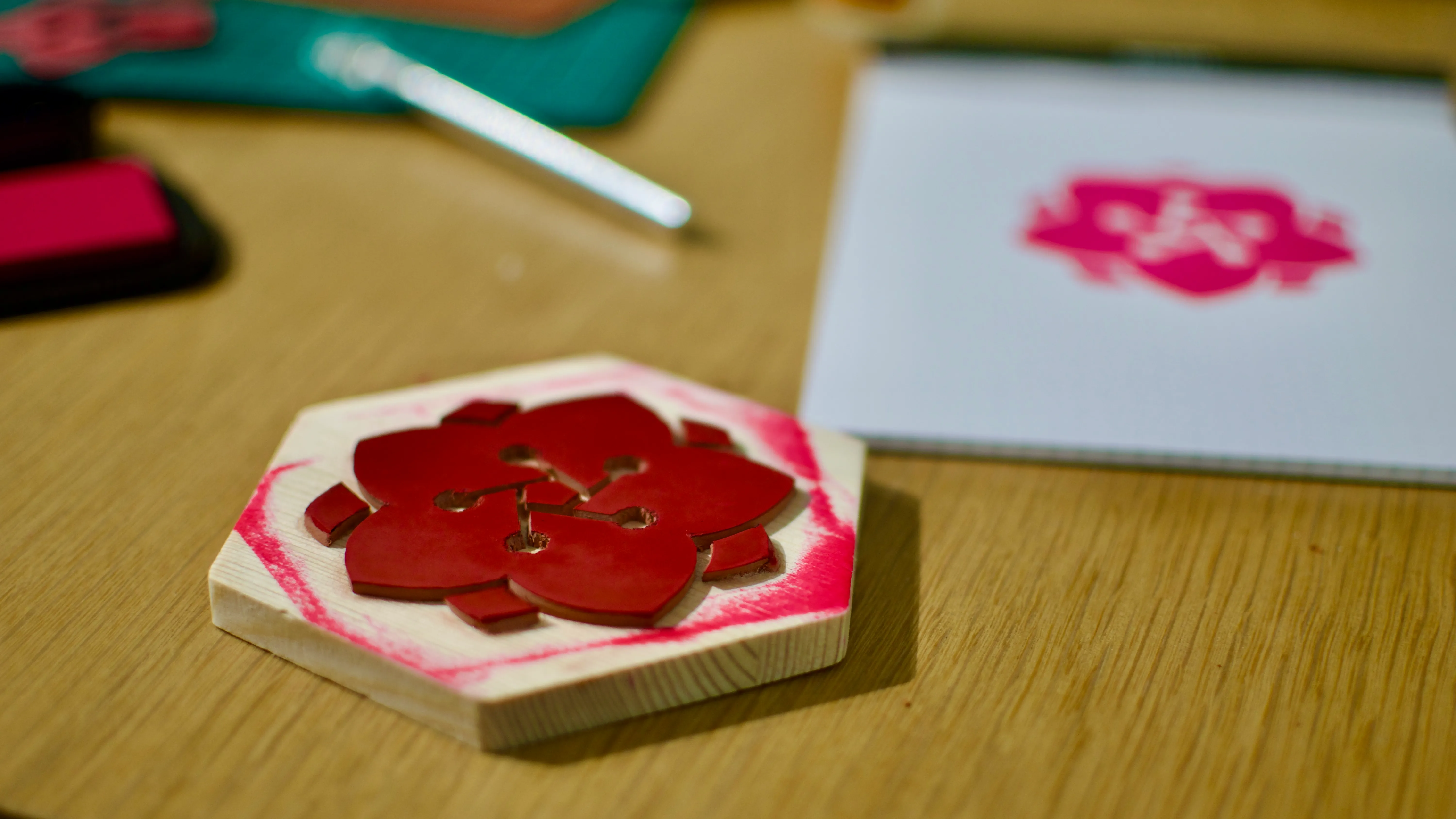
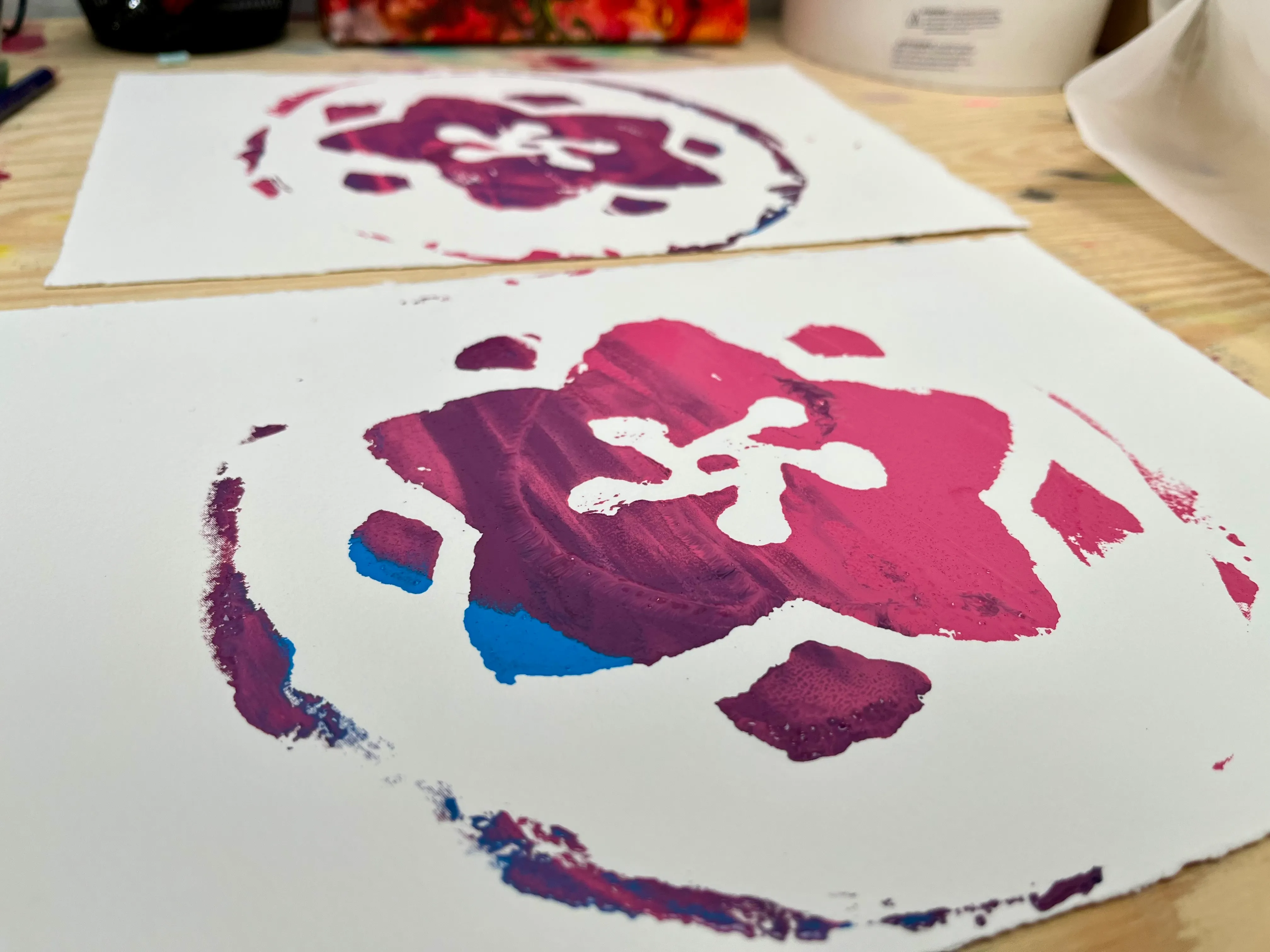
Before we left for Japan, I tried my hand at making my own stamp to use on the cover page of my eki stamp book. I think it turned out pretty well for my first attempt!
The stamp is made out of a 1/8” thick rubber gasket material. I used an X-Acto knife to carve it into a stylized rose design, glued it onto a wooden coaster, and sanded it down a bit to allow ink to stick to it.
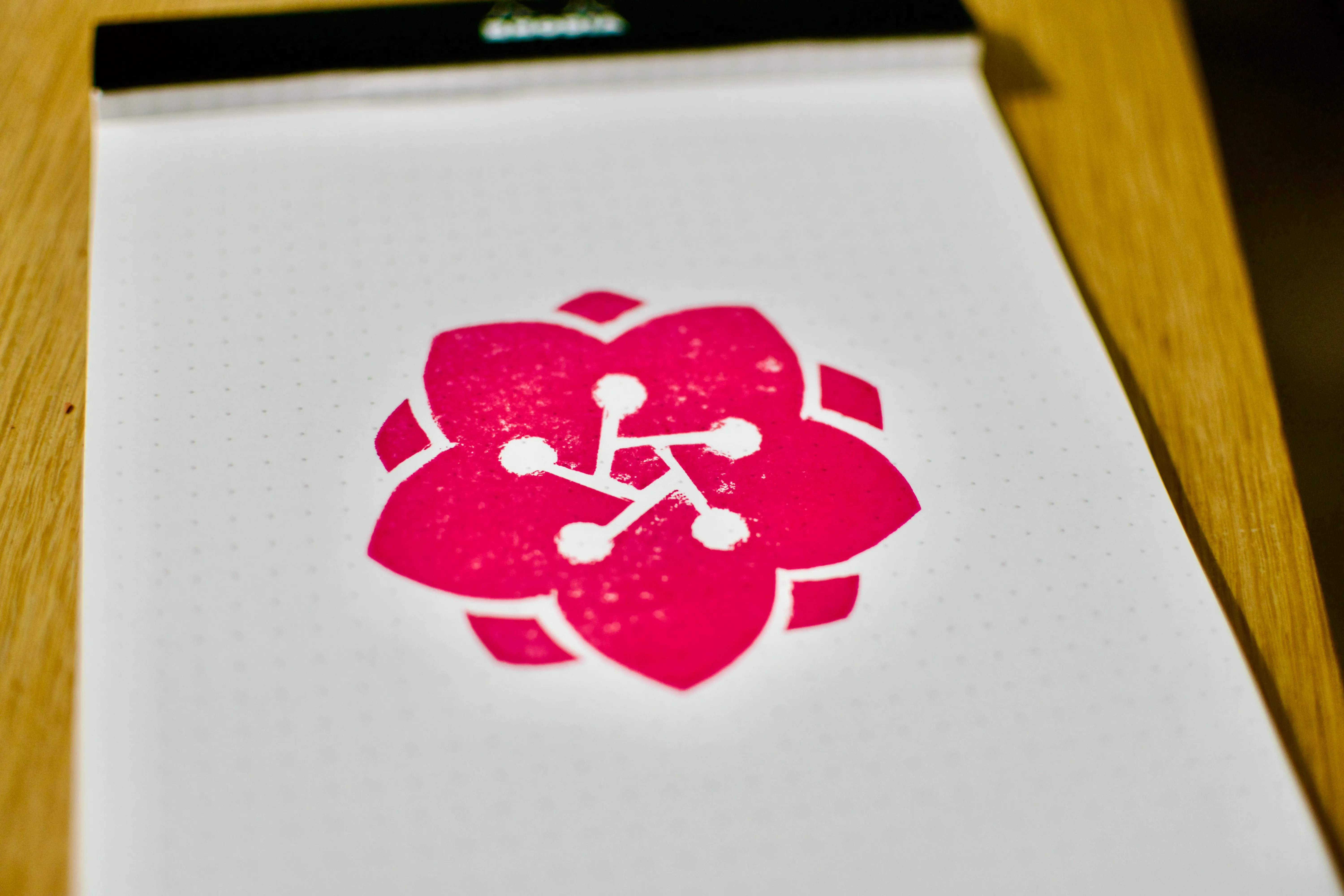
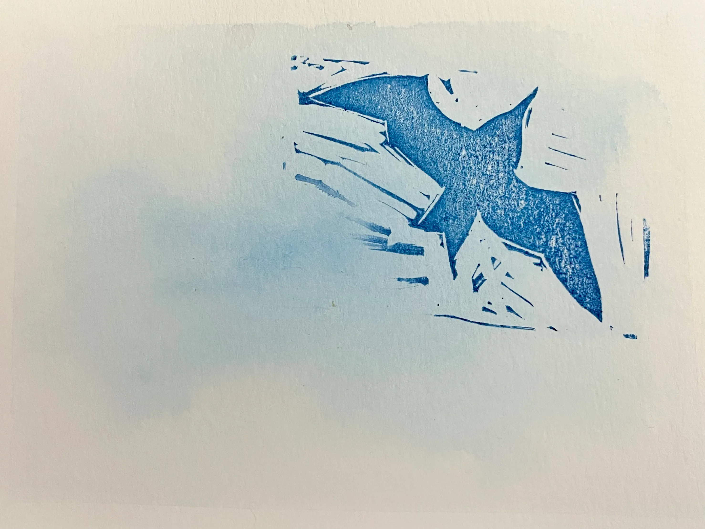
A test print in fuchsia ink
-
-
-
In 2007, New Zealand paint company Resene decided to name this specific shade of teal “zomp”.
-
-
-
-